Category Archives: 07a-Crafting an effective formal presentation

Designing and building a professional slide deck, using best principles of persuasion and slide-craft, using PowerPoint features efficiently and effectively

Being Intentional with your Data and Giving your Graphics a Voice!

I have a particular interest in evaluation in the workplace– the evaluation of employees, work output, employers, etc. In the types of programs I’ve been in, I have found in very useful. However, I’m sure that most companies don’t have the time to thoroughly evaluate their work in a systematic and organized way. I have always worked in the research/higher education end of business, and so I don’t personally have experience with how evaluation works in the corporate setting.  How does evaluation look like in your industry or company?

A few years ago, I came across this site and I have been a fan ever since. The group is called Evergreen Data and they focus on intentional reporting and data visualization. I work in public health/higher education, and the public health industry is very data-heavy. Data in public health is used for analysis, program planning, grant opportunities, research, etc. and so I have seen the benefits of its use in my industry. What does your company do with its evaluation data?

This particular site had a checklist on how you should layout your evaluation reports which I’ve found super helpful! The purpose of the checklist is to help identify what parts of an evaluation report can be enhanced through the use of graphics.

Here are some of the items they had in their checklist:

  • Text font and size (sans serif and size 9-11)
  • Text uniformity
  • Line spacing (between 11-13 points)
  • Headers/callouts
  • The number of different types of fonts that you should use (no more than three!)
  • Don’t make too “strong” or “bold” of bullet points
  • Alignment (be consistent!)
  • Make sure that items in page that are grouped together are related
  • Utilize white/empty space!
  • Use of pictures/graphics – individuals learn differently from one another
  • Use color changes for a purpose (are you being intentional by choosing to change the color of a font or header?)

Evergreen also has an additional checklist that’s used for data visualization. It’s specific to making your graphs speak for themselves! This is a great resource as well.

What are some of the tips you have when creating reports (not exclusive to evaluation reports)? What steps do you take to have your data share a “story” or a “point”? Are you intentional in your decisions in terms of report layouts, font, graphics, etc.? Do you find that you have to pay more attention to this? 
Score your Presentations

I recently came across an article which was published on Forbes on  how keeping a score  of  your presentations   and rating your presentations and I did some research on a company which tracks constantly  presentation score  ranging  from 1-5 of its business executives. It was an idea which was  conceived by  George Chambers  the CEO of Cisco who scores 4.5 on a scale of 1-5.Cisco is the worldwide leader in IT that helps companies seize the opportunities of tomorrow by proving that amazing things can happen when you connect the previously unconnected. Many companies tried to be customer friendly or customer oriented but CISCO continues to win many laurels and awards  compared to its peers because its obsession Presentation Skills.

When a Cisco executive delivers an internal presentation at company events and meetings or delivers a customer facing presentation, that executive is rated on his or her communication skills as soon as the presentation is over. Employees or customers are asked to give the executive a score ranging from 1 to 5 on the following:

1.  DELIVERY:  The presentation was delivered clearly

2.  CONTENT:  I understand how this solution/topic can be applied

First, the results offer an executive feedback on how effectively they’re delivering the Cisco story and, second, senior executives review the scores to evaluate a person’s leadership potential. According to Ricci, “The data and metrics motivate people to get better, even a little competitive with each other.

Cisco’s obsession with Presentation Skills

Beer and Infographics DO mix

I’ve been tinkering with Adobe InDesign and Illustrator. These programs are very powerful but can be equally as frustrating to manipulate – much more manageable after a couple beers.

I put together this standalone document to illustrate the rise of the craft and microbrewery industry. The content is engaging but I’m most interested in your thoughts on the formatting and design. Don’t worry about holding any punches – this is an early shot at the tool and feedback is helpful.

Thanks and here is the PDF:
Beer and Infographics

Presentation Tips From One Of The Masters: Steve Jobs

I used to love watching Steve Jobs unveil the new Apple products every year. I usually volunteered to cover the story at work, just so I could watch the announcement! He was always so passionate about what he did — and it certainly showed. I hope I can develop my presenting skills enough to convey the same excitement and conviction he did. I thought this article from Forbes was a great summary of his techniques he used: http://www.forbes.com/sites/carminegallo/2012/10/04/11-presentation-lessons-you-can-still-learn-from-steve-jobs/

One thing he always did so well was tell stories. He didn’t just explain why the iPod or iPhone was great; he wove a tale to make you understand why it was so great and want to buy it! You really felt like he was inspired by the product, and that you should be too.

He was also a master at keeping it simple. Jobs always managed to describe these complicated devices with simple, beautiful language that didn’t talk down to the audience. His slides were simple too: never cluttered with too many words or graphics. He let the images speak for themselves.

I also liked the way he stayed focused on his message. He never highlighted more than 3 things at a time. The human brain is only trained to process so much at once, so this enabled viewers to comprehend what he was saying in small, easily remembered parts.

If you have time, watch the video on the website of Jobs’ 2007 Apple talk. It’s worth it!

Alternatives to PowerPoint

PowerPoint Alternatives: Will PowerPoint Ever be Obsolete?

Will PowerPoint ever be replaced?  It has become commonly accepted in the business world that ‘PowerPoint’ is synonymous with ‘Presentation’. However, when is the last time that you (or me, or anyone for that matter) questioned the validity of that accepted standard, or even gave fleeting consideration to using a different presentation platform or software program?

So, that leads to the question of whether or not PowerPoint will ever become obsolete, outdated, or replaced by something newer and shinier. In researching thoughts on this topic by folks smarter than myself (such as Jeff Bezos, CEO of Amazon, in this article), I discovered a few things.

First of all, there are already many of alternatives to PowerPoint, and while they might not be household names, they can arguably match the functionality of PowerPoint, and perhaps even be more targeted towards your audience depending on the nature of the presentation. Some of the more popular alternatives to PowerPoint include Apple’s Keynote (which Steve Jobs popularized by using when rolling out new products), Google docs (free, ‘quick and dirty”), SlideRocket (great for folks in a sales environment), and perhaps most notably, Prezi (Intuitive, sophisticated, puts ‘slides in motion’, great for storytelling).

I am personally considering giving Prezi a try based on the positive reviews and feedback that I have read and would love to hear from anyone in our class who has tried the software first-hand. It does seem that one day PowerPoint might be replaced as the gold standard for delivering presentations, but that day is likely not going to come anytime soon, and we are likely better off improving our delivery method rather than changing the platform all-together.

So, what are your thoughts??


Articles for Reference:

http://www.forbes.com/sites/carminegallo/2012/09/07/jeff-bezos-and-the-end-of-powerpoint-as-we-know-it/

http://lifehacker.com/5888189/five-best-powerpoint-alternatives

http://www.customshow.com/best-powerpoint-alternatives-presentation-programs/

http://www.powtoon.com/blog/10-best-powerpoint-alternatives/


Takeaways from being an MP judge

Last night, I volunteered to judge the Delta presentations of the 2015 one-year MBA students. It felt good not being the presenter and  really good being the judge 🙂 Below are some key takeaways of mine.

Need for Visuals : I’m completely convinced of the need for more visuals and less text. It was very difficult to take in anything when the presentations are loaded with text. Some of the one’s were really really text heavy and it wasn’t easy to concentrate.  So you may ask, how much text is appropriate ? I felt one to two sentences per slide mixed with visuals to be more appealing.  Anything beyond that, I had difficulty moving back and forth between the screen and the presenter.

Need for Simplicity : Teams with simplicity in their slide-crafting kept me more engaged and more interested. Slides with just one data image helped me absorb the content. Whenever there was too much data on one slide, I checked out of the presentation for few minutes.  The problem with that is, even if the listener wants to check-in again it won’t be easy for him to follow. This is my take on the need for simplicity. This is an essential ingredient if you want your audience engaged totally.

Need for laughter : It’s very easy to get bored when you are just watching presentation after presentation.  If you know you will be in situations like that, it helps to have a slide that can make the audience laugh so that they can get back into the presentation

Need for honesty : When someone asks you a question at the end, it’s ok to say “yeah, we didn’t consider that issue”  instead of saying something to cover up. This helps building trust which, I believe, is the foundation for any business relationship

It was a great learning experience to be on the other side. My long trip from John Creek was well worth it. Thank You, Prof. Noonan for giving us this opportunity


The story behind your presentation

Just a quick one…

The beginning of this HBR article, How to give a killer presentation, is intriguing to the relationship of what many of us just experienced in our final presentations of MP.  Even though this article is shortened to non-subscribers, the intriguing part to me is the basis of the article – a story about a boy who had a story to tell.  The 90+ of us just finished our presentations, and it was amazing to see what some of my peers had to say.  Learning from each other is one of the biggest facets of this program, yet at the same time this isn’t just to learn about each others’ business knowledge, but to learn about the more personal part of each others’ lives.

Many of us gave great presentations, and as this article began, you have to begin with a good background to your story.  I think the key to this article is not just another subset of bulletpoints of how to do a process (although that’s probably where the article heads), but to make you think about what the baseline of any presentation needs to be – a good story.  A lot of times we can get caught up in the details – get caught up in the data.  Presenting the data is so critical, that we forget what the baseline is, and how to bring the story completely together, full circle.  Without a clearly stated statement at the beginning of your presentation, there’s a good chance you’ve already lost a large part of the story you’re trying to tell.

http://hbr.org/2013/06/how-to-give-a-killer-presentation/ar/1

Misleading Graphs & Statistical Lies

Graphs and Charts are everywhere, and are excellent tools to visually convey statistics, results, trends, data, etc. There are basically three groups of graphs out there that you’ll find on a regular basis:

1.) Graphs created by people who do know what they are doing

2.) Graphs created by people who don’t know what they are doing

3.) Graphs created by people who do know what they are doing and have manipulated it to intentionally deceive the viewer.

There’s a fine line between number 2 and 3 sometimes, and to be effective business leaders, one skill we must possess is the ability to call “BS”, whether intentional or unintentional. Below is a great book to help uncover a lot of deceptive tricks and a few some examples.

A great book that I highly recommend is: “How To Lie With Statistics“. It’s short, cheap, and uncovers numerous tricks people use with charts, graphs, numbers, and statistics to deceive the reader without breaking the rules.

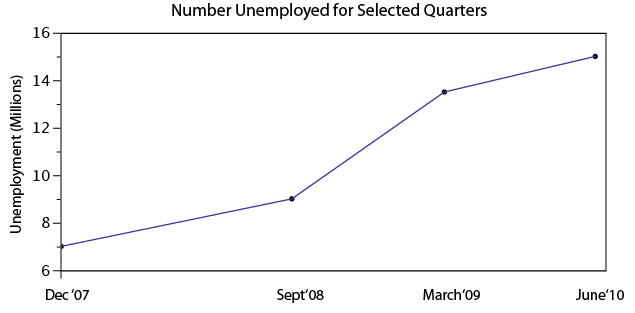
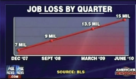
Not to pick on Fox News, but below is a graph that is severely misleading in both the title and the scale of the X-axis. The title leads you to believe the data is by consecutive quarter, and the inaccurate spacing on the X-axis leads to to believe the data is linear.

If you title and plot this data accurately, below is what you would get:

There are many types of errors or tricks that results in the display of data in an inaccurate way. Below are several categories and things to watch out for the next time somebody slaps a fancy looking report down on your desk:

USE OF THE 3D CHART:

Simple use of 3D charts distort the ratio of pies and the height of bars. Notice how Item A and C look more similar in the 3D chart, but flattened, C is less than half of A

ChartMisleading Pie Chart.pngSample Pie Chart.png

 IMPROPER SCALING:

Notice how the intent is to increase the value 3X (Y-Axis), while the perception is that it increased 9X

Improperly scaled picture graph.svg

Comparison of properly and improperly scaled picture graph.svg

The appropriate way to display the increase from 1 to 3 is shown below.

Picture Graph.svg

MISLEADING TRUNCATION:

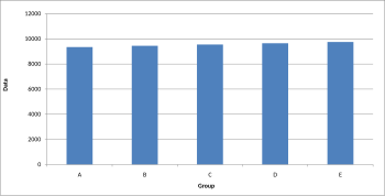
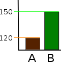
The truncation on the following graph leads the viewer to believe that group E is nearly twice the size of group A. While sometimes truncation is a great tool in certain situations, it is often misused.

Truncated Bar Graph.svg

Looking at the scale from 0 to 12,000 puts in perspective how slight of a difference there is between groups.

Bar graph.svg

IMPROPER AXIS RANGES:

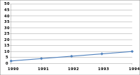
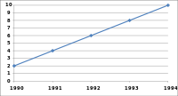
The graph immediately below makes you feel as though the growth over time has been slow and gradual, but a quick change of the axis values gives a completely different perception. Don’t always believe the slopes of lines as they are a function of the Axis values.

Line graph2.svg

Line graph3.svg

OMISSION OF SCALE:

When Scales are left off, the range of the axis is unknown and differences are easily exaggerated or minimized.

Bar graph missing zero1.svg    Example truncated bar graph.svg


Using PowerPoint Differently!

When I first started using PowerPoint, it was full of ClipArt stick figures and tons of text. Slowly, the art of presentation evolved (thankfully!), and ClipArt was no longer an acceptable way to add images to your slides. But, the evolution didn’t necessarily refine our presentation skills that much. The horrendous ClipArt images were only to be replaced by ‘slideuments’ and chart junk. Now, our slides were full of bar graphs and pie charts that didn’t explain anything and a text overload that bored the pants off of the audience. For this semster’s assignment, I turned to Garr Reynolds, author of Presentation Zen, to help with my information design skills. His book is available on Amazon and I highly recommend it to anyone who wants to work on their slide making skills. As a teaser, I am sharing a few of his tips here, some that I found particularly valuable.

Don’t be afraid to use Multimedia

I have seen multimedia being used effectively by many great presenters. Using video clips or even music can impact how the audience reacts to your presentation and how they retain it. A purely narrative style combined with a text heavy presentation can lose the audience’s interest quickly.

Simplify your visuals

If your visuals can’t be understood in 3 seconds, then redesign them to communicate your idea better. Some images or graphics looks great, but if they are too complicated, then it’s time to ditch them for a simpler design.

Less is More

This is something we have heard a lot in any talk/ article about effective presentation but it is an advbice worth repeating. Reduce the text on your slides. The slides should complement the narrator, not make you redundant. Another aspect of less is more is limiting the ideas to just one main idea per slide. It effectively takes the same amount of time to communicate 3 ideas on 3 slides that it takes to go through 3 ideas on one slide. But it will help your audience process each idea better when they are presented separately.

Back off on the Animation

Animation seems to be the shiny new toy everyone is playing with, but be careful not to overdo it. Animation on every slide can distract the audience from your narration.

Buy the book at : http://www.amazon.com/Presentation-Zen-Design-Principles-Presentations-ebook/dp/B00GXADSUU/ref=sr_1_2?ie=UTF8&qid=1407770573&sr=8-2&keywords=presentation+zen

How to pitch to VCs, and why accounting does not matter

While most of our class was enjoying accounting, I had a pleasure of taking Charlie Goetz’s Entrepreneurship class.  Charlie is a fascinating person – full of energy and entrepreneurial spirit , he could survive anywhere. He is also extremely successful, building multiple business from the ground up and selling them to wealthy investors for large sums of money (including a business that exclusively sold french fries).  While working  on a project in  his class, I finally realized that it is not just about ideas and execution – Charlie’s pitch and presentation were keys to his success. One might have the best idea and great execution – but if you can’t sell it to real people, especially people with money and connections, all those ideas will be worthless.

One presentation that each entrepreneur hopes to have is a pitch to a venture capitalist – that means your idea made it past the idea stage, and you have an opportunity to make it big. If you can sell your idea to a venture capitalist, you can sell your presentation to anyone, whether it is your boss,  Professor Noonan,  or even Dean Lewis. So how does one prepare for this presentation – “the Money Game” section at WSJ has few tips:

Present Yourself:

Modesty does not pay. Each presentation, whether to a venture capitalist or to your classmates, is a lot like a date. People want to know something about you,   they want to know why they should listen to you.  Going to straight to your presentation is a lot like like going on a date and saying “Let’s get it on”.

–  Tell it to mom:

Keep is simple.  Steve Jobs once said:

“Simple can be harder than complex: You have to work hard to get your thinking clean to make it simple. But it’s worth it in the end because once you get there, you can move mountains.”

When making a presentation, keep it simple and understandable. It is always easier to send more information to ones who need more details,  but once you loose your audience, it is impossible to get them back. One caveat – the assumption needs to be clearly explained, and your pitch needs to be grounded in reality.

Don’t Play with numbers:

Integrity is paramount. Whether pitching to a VC or your Boss, you cannot undermine their trust. A lot of presenters try to focus on the positive, but what one needs to show is they have though of the negatives and have a plan to address it.  It absolutely necessary that your audience can trust you.

Stay on the radar:

In class, the presentation may end on the day of the class. Yet in the real world,  this is just a start – persistence pays off.  Even if you receive a no at the first pitch, you should keep in touch with the investor.

Your can read the rest of the article at WSJ.

PS. Accounting is crucial to business, and multiple accounting scandals of the 2000s certainly proved that.  However, the is always a CPA when you need an accounting advice, but you are the one who needs to make the pitch.