Tag Archives: Presentation

Master Presenter

Since having reviewed my own end of the semester presentation and since having to think critically about how I can be a better presenter, I turned to an article in the Harvard Business review for assistance and found that it summarizes the MP process perfectly.  In the article, “How to Give a Killer Presentation” the author, Chris Anderson, outlines five measures that will accomplish creating a great presentation; he suggests speakers should frame their story, plan their delivery, develop their stage presence, design their medium, and play to their strengths.  All of which sounds familiar and commonsensical but when dissected it resonates intensely.  The article clarifies:

Frame your story (Figure out where to start and end)

o    All people are wired to tell and listen to stories so telling a story will best engage an audience.

o    Determine what the audience already knows and don’t waste time restating information that will prove to bore your audience.

o    Quickly introduce why you care/interested and don’t waste time trying to convince your audience to care/interested.

Plan your delivery (Decide to memorize, rehearse, or simply converse)

o    Use presentation to map out the direction of the presentation but do not use as talking points.

o    Memorizing scripted presentations are best but ONLY when antiquate preparation has been given.

o    A conversational tone works best over passionate or authoritative tones.

Develop your stage presence (No matter how well you deliver a presentation content is always more important)

o    Keeping your lower body still is the most successful way to appear more commanding.

o    Eye contact is the most important physical hallmark of a good presenter.

o    Introduce yourself to as many of the audience members before your presentation because doing so will ease your nerves, make you present, and lifts the veil of a unfamiliar audience.

Design your medium (Enhance your presentation and not distract)

o    In order to avoid being repetitive and to be found interesting by the audience do not read out bullet points on your slides.

o    Stop relying on Power Point as your only medium when so many new relevant options are at your disposal.

o    Enlist the help of an artist, ARCHITECT, photographer, or graphic designer to help develop visual communications.

Play to your strengths (Be authentic)

o    Prepare presentations well in advance to allow for proper rehearsal time.

o    Be choosey about who you select to rehearse in front of because not all criticism should be considered or is valuable.

o    Substance over style.  It is fairly easy to coach out problems with delivery but almost impossible to coach in substance to a subject or story.

Concurrently, the author points out that it may be hard to give a good presentation but it is easy to ruin a good presentation and warns us from doing these 10 things:

  1. Make a really long introduction
  2. Speak too slowly and dramatically
  3. Inform the audience how important you are
  4. Refer to your note cards or TV monitor too often
  5. Cram your slides with numerous fonts, bullet points, or illustrations
  6. Use technical jargon to impress the audience
  7. Speak at length about you and your organization
  8. Remain unaware of how much time you have or used
  9. Don’t bother rehearsing
  10. Don’t make eye contact with anyone and just look at the tops of their heads

Finally, to further summarize, let go of being perfect and really know your material well.   This allows you to conduct a conversational dialog by being present with the audience and to evolve your presentation in real time by reacting to the audience’s response.


Anderson, Chris. “How to Give a Killer Presentation.” Harvard Business Review: Magazine June 2013: n. pag. Print.

Tricks to Giving Phone Presentations

conference-phone

Being a great presenter is a great skill to have in front of a live audience.  However, the reality of large national and international corporations is that creating a live in-person audience is often impractical and costly. Technology has been making speaking to a physically absent audience more realistic with teleconferencing, video conferencing, and the like. However, an effective presenter also needs to have a great presence over the phone and through video conferencing equipment. The skill set is obviously similar, but here are some tips for nailing that presentation on your next conference call or video conference (which I have filtered and summarized below).

  • Check in to solicit comments or verbal acknowledgement that the audience is still with you. You may have lost the audience 10 minutes ago, and you don’t even know it.
  • Master the silence. Silence can be okay as long as it is not too long. Over the phone, it can still be used for dramatic effect.
  • Go around the horn to check in on different audience members to see that they are still following along. For instance, call someone out who you know should be listening, i.e. “Are there any questions from the Atlanta office?”
  • Don’t over answer questions. It is possible that a large portion of the audience already knows the answer and has decided to tune you out because you spent 5 minutes answering the question from the new guy who needs individual attention later.
  • Send out visuals beforehand. The addendum to the call should be sent in advance of the call to all attendees. Don’t forget page numbers and reference them in your call so the audience knows where you are.
  • Don’t read off the slides. Unlike a live presentation, the audience already has your slide deck and has probably looked ahead because you were supposed to send them the slides and exhibits before the call. Add color. Make it lively. Add value to the listeners. Keep the audience awake with a funny anecdote or an example that they couldn’t find using Google.
  • Remember to practice. Depending on the format, you may be tempted to write down what you are going to say and read it on the call. The audience can tell when something is scripted. Instead of sounding polished, you sound like an actor reading over his lines in a read-through. This is not a dress rehearsal – this is the real thing!

BIG cell phone

Inspiration:

http://blog.teamthinklabs.com/index.php/2011/12/21/7-tips-for-presenting-over-the-phone/

http://www.threetraining.com/three-tricks-to-powerful-phone-presenting/

http://brainzooming.com/7-tips-to-improve-conference-call-presentations/952/

Misleading Graphs & Statistical Lies

Graphs and Charts are everywhere, and are excellent tools to visually convey statistics, results, trends, data, etc. There are basically three groups of graphs out there that you’ll find on a regular basis:

1.) Graphs created by people who do know what they are doing

2.) Graphs created by people who don’t know what they are doing

3.) Graphs created by people who do know what they are doing and have manipulated it to intentionally deceive the viewer.

There’s a fine line between number 2 and 3 sometimes, and to be effective business leaders, one skill we must possess is the ability to call “BS”, whether intentional or unintentional. Below is a great book to help uncover a lot of deceptive tricks and a few some examples.

A great book that I highly recommend is: “How To Lie With Statistics“. It’s short, cheap, and uncovers numerous tricks people use with charts, graphs, numbers, and statistics to deceive the reader without breaking the rules.

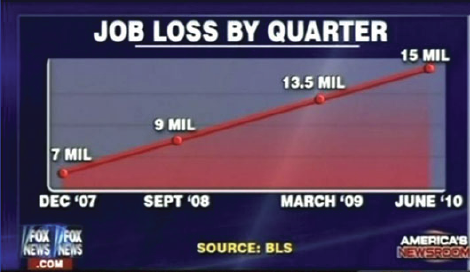
Not to pick on Fox News, but below is a graph that is severely misleading in both the title and the scale of the X-axis. The title leads you to believe the data is by consecutive quarter, and the inaccurate spacing on the X-axis leads to to believe the data is linear.

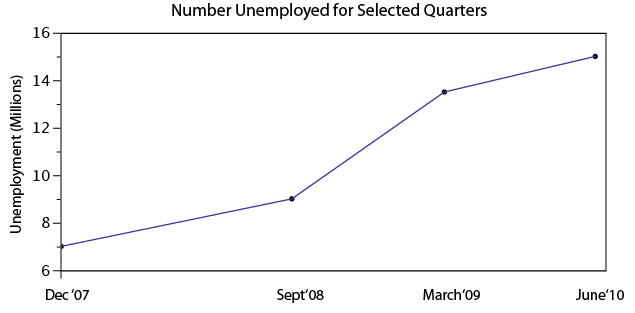
If you title and plot this data accurately, below is what you would get:

There are many types of errors or tricks that results in the display of data in an inaccurate way. Below are several categories and things to watch out for the next time somebody slaps a fancy looking report down on your desk:

USE OF THE 3D CHART:

Simple use of 3D charts distort the ratio of pies and the height of bars. Notice how Item A and C look more similar in the 3D chart, but flattened, C is less than half of A

ChartMisleading Pie Chart.pngSample Pie Chart.png

 IMPROPER SCALING:

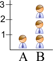
Notice how the intent is to increase the value 3X (Y-Axis), while the perception is that it increased 9X

Improperly scaled picture graph.svg

Comparison of properly and improperly scaled picture graph.svg

The appropriate way to display the increase from 1 to 3 is shown below.

Picture Graph.svg

MISLEADING TRUNCATION:

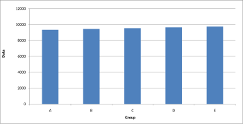
The truncation on the following graph leads the viewer to believe that group E is nearly twice the size of group A. While sometimes truncation is a great tool in certain situations, it is often misused.

Truncated Bar Graph.svg

Looking at the scale from 0 to 12,000 puts in perspective how slight of a difference there is between groups.

Bar graph.svg

IMPROPER AXIS RANGES:

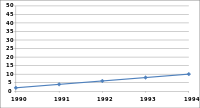
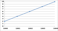
The graph immediately below makes you feel as though the growth over time has been slow and gradual, but a quick change of the axis values gives a completely different perception. Don’t always believe the slopes of lines as they are a function of the Axis values.

Line graph2.svg

Line graph3.svg

OMISSION OF SCALE:

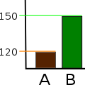
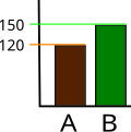
When Scales are left off, the range of the axis is unknown and differences are easily exaggerated or minimized.

Bar graph missing zero1.svg    Example truncated bar graph.svg


Using PowerPoint Differently!

When I first started using PowerPoint, it was full of ClipArt stick figures and tons of text. Slowly, the art of presentation evolved (thankfully!), and ClipArt was no longer an acceptable way to add images to your slides. But, the evolution didn’t necessarily refine our presentation skills that much. The horrendous ClipArt images were only to be replaced by ‘slideuments’ and chart junk. Now, our slides were full of bar graphs and pie charts that didn’t explain anything and a text overload that bored the pants off of the audience. For this semster’s assignment, I turned to Garr Reynolds, author of Presentation Zen, to help with my information design skills. His book is available on Amazon and I highly recommend it to anyone who wants to work on their slide making skills. As a teaser, I am sharing a few of his tips here, some that I found particularly valuable.

Don’t be afraid to use Multimedia

I have seen multimedia being used effectively by many great presenters. Using video clips or even music can impact how the audience reacts to your presentation and how they retain it. A purely narrative style combined with a text heavy presentation can lose the audience’s interest quickly.

Simplify your visuals

If your visuals can’t be understood in 3 seconds, then redesign them to communicate your idea better. Some images or graphics looks great, but if they are too complicated, then it’s time to ditch them for a simpler design.

Less is More

This is something we have heard a lot in any talk/ article about effective presentation but it is an advbice worth repeating. Reduce the text on your slides. The slides should complement the narrator, not make you redundant. Another aspect of less is more is limiting the ideas to just one main idea per slide. It effectively takes the same amount of time to communicate 3 ideas on 3 slides that it takes to go through 3 ideas on one slide. But it will help your audience process each idea better when they are presented separately.

Back off on the Animation

Animation seems to be the shiny new toy everyone is playing with, but be careful not to overdo it. Animation on every slide can distract the audience from your narration.

Buy the book at : http://www.amazon.com/Presentation-Zen-Design-Principles-Presentations-ebook/dp/B00GXADSUU/ref=sr_1_2?ie=UTF8&qid=1407770573&sr=8-2&keywords=presentation+zen

More Tips on Prezi

The class got a brief glimpse into what Prezi can do during the final MP class on Thursday, but I thought that I would provide a few tips, tutorials and links that I used to orient myself with the program.

In the simplest terms, there are four steps to make a presentation in Prezi:

1. Enter content onto the canvas (words, pictures, videos, etc.)

2. Frame the content with one of the shaped frames (circle, square, brackets) or an invisible frame.

3. Connect the frames in a path (similar to re-arranging slides on the left-hand side of the page).

4. Re-position the frames to convey relation (drag and drop the frames on the canvas).

You can see the whole tutorial on transitions between slides from this link:  http://prezi.com/-oebfwip4irw/the-official-prezi-transitions-tutorial/

When creating spacial relations, remember that you can convey relation in three ways:

1.  In the x-y direction, i.e. up, down or diagonal

2. Rotation (make sure that you don’t rotate slides too much, or the transitions may become confusing and difficult to follow. In general, its best to use rotations <45 degrees).

3.  Size/Depth.  The ability to zoom in and out can either be used to convey differences in size, relationship into or out of the page, or even both.

What other great things can you do with Prezi?

Turn those boring Power Points into Prezi’s!

Share your Prezi!

Check out the official Prezi blog for even more great tips!


What Not To Do

What Not To Do (When Giving a Presentation):

While most of us know what we “should” be doing when it comes to giving presentations, we oftentimes forget what we should NOT be doing. I have realized over time that what we should vs. should not do are not inherently mutually exclusive. You can be doing everything that you are “supposed to” (i.e. following best practices), but simultaneously be making common errors that can limit the effectiveness of your delivery.

I’m as guilty as anyone when it comes to checking the boxes for everything that a strong presentation should have, but I’ve started to realize that by diagnosing errors that I am more inclined to make, many of the recommended strategies subsequently fall in line naturally.

To frame this as a metaphor, I’m talking about targeting the disease, not making the anecdote stronger. I’ve found that this starts with getting back to the basics and building from there. So, what are some of the more common pitfalls in presentation delivery? After vetting several resources I’ve consolidated a list of quick anecdotes that I have found to be helpful to keep in mind:

  • Avoid reliance on slides. Slides are there to compliment your presentation and provide a framework, not the other way around.
  • Overload: Less is more. Too much talking and/or too much text will easily disinterest any audience, no matter how rich the content.
  • Avoid Apologies: If something goes wrong, there is a typo, you say something incorrectly, etc… JUST GO WITH IT. Odds are that no one else noticed and by drawing attention to it you are just calling out yourself (and your credibility).
  • Avoid filler words: This is public speaking 101, it sounds easy and we’ve heard it thousands of times, but it is absolutely critical. Unfilled airtime between sentences and ideas is okay. Specifically avoid “um”, “so”, “right”, and “you know” are very common and very distracting!
  • Going over your allotted time: Once you start to go long you begin to lose your audience. And once you even begin to lose your audience, it’s too late. This can cause the audience to miss your “big finish” and really tear down everything you’ve worked so hard to build.

While there are many more, these are just some of the most common problems that can hold you back from delivering the most effective presentation possible. We never get to a point where we are too advanced to worry about the basics. While one of these points are anything that you haven’t heard before, hopefully you will find some of these to be helpful reminders.


Helpful Resources:
http://www.inc.com/eric-v-holtzclaw/big-presentation-5-rookie-mistakes-to-avoid.html
https://www.youtube.com/watch?v=gNG0etmnwuk
http://blogs.hbr.org/2012/12/avoid-these-five-mistakes-in-y/


Storytelling Tips for Success

  • Don’t be afraid to show your vulnerable side.

Tell about your struggles or (mild) embarrassments. The audience will identify with a speaker who isn’t afraid to be self-deprecating. The audience will think you are more credible if they can relate to your failures. Ronald Reagan (see below) has told stories of walking down the street in a foreign country to explain to the audience what the people there are like. No one is perfect and the audience knows you aren’t either. As I stated in my previous post, the audience is rooting for you to succeed. If you portray yourself as an underdog, it will be even easier for them to like you because everyone likes rooting for an underdog.

Reagan’s Storytelling at its Finest

  • Make the audience feel like they were there.

Most importantly, it is better if you are telling a story that is actually true or that is nearly true. The purpose of the story is to set the stage for what the experience was like. Before television and movies, humans told other humans what happened in their lives by describing it to each other as if the other person was there. Use a lot of descriptive words. Set the mood. What was going through your mind as the events unfolded? As social media and other forms of instant, abbreviated content fills our minds and worlds (think texting, BuzzFeed articles, Instagram, snapchats, etc.), it will become increasingly important to be able to tell another person or group of people about an experience in a genuine human way.

  • Start with the end in mind.

The point of the story is not to entertain the audience. The purpose is for the audience to remember what you are trying to tell them. The medium of a story is easier for people to remember. It is ingrained in us from our prehistoric ancestors. They convinced people to do things based on stories and emotion, not with powerpoint slideshows or colorful charts and graphs. Make sure you the story brings you to the point and helps you drive it home. The story will make the audience much more likely to remember the presentation, and a good overall goal would have an audience member be able to convey it to someone who wasn’t even there by telling your story and relating it to the overall message. Of course practice is important. Professionals at the Advanced Publix Speaking Institute recommend practicing 30 times. TED presenter Dr. Jill Bolte-Taylor says she rehearsed her presentation 200 times before delivering it. What should I do if I don’t have time to practice it that many times? You should do the best you can and practice it as many times as you think you need to be successful. However, at some point you can sound over-rehearsed and you should just “do it live” for more authenticity.

Do it Live

Inspiration: http://www.gingerpublicspeaking.com/storytelling-public-speaking http://www.public-speaking.org/public-speaking-storydo-article.htm

Presentation Tips from Stand-Up Comedians

Stand-up comedians are some of the best public speakers around. They ooze confidence and make it look easy, and if you follow these tips for success, you can succeed in the business world, too.

  1. Know your audience. Would you give an X-rated stand-up routine to a church group? In business, would you give an overly technical presentation to a group of executives who don’t understand (or care) about all the details? I didn’t think so. It is very important to understand the context of your presentation.
    • The culture: What communication style do they prefer? From what starting point or base of knowledge do the people in the room have? In the business world – is it an internal presentation to superiors, to your direct reports, or is it external to members from a certain industry? Knowing the culture will help you relate better to the audience.
    • Their level of knowledge: Is English the native language of your audience? If not, keep the phrasing simple and speak clearly, but don’t insult them either by talking very loud and very slow. Are you giving a training to a room full of beginners? Avoid overly technical phrasing and start from the beginning so the whole audience can understand where you are coming from.
  1. Practice, practice, practice. So much of stand-up comedy is in the timing and the delivery. If you are telling a story in the wrong order or blurt out the ending out of sequence, the joke will fall flat.
  2. Don’t force it – be yourself. Dave Chappelle doesn’t pretend to be anyone other than himself, so why should you try to act like someone you’re not? The audience can gauge authenticity quite well, so it’s best not to pretend to be someone different than you really are.
  3. Be likeable. The audience is rooting for you to succeed. Who wants to go to a comedy show where all of the comics crash and burn? In the same way, you should understand the audience, come across as genuine and confident, and don’t be afraid to stumble. If you slip up, chances are that the audience hasn’t even noticed.
  4. Watch out for hecklers. Know your facts and figures well enough to be heckled. Whoever will be asking you questions at the end or in the middle of your presentation may be analogous to a heckler at a comedy club. Be confident and knowledgeable enough to respond succinctly but firmly to keep the presentation on track. Not all questions in a business presentation are from would-be-hecklers, so it is important to distinguish the two.  Stay on your toes. You never know who might be about to throw a (metaphorical) shoe at you like this guy did to George W. Bush.

Inspiration:

http://www.trainingmag.com/content/supercompetent-speaking-tailoring-your-presentation-your-audience

http://www.mrmediatraining.com/2012/04/25/want-to-learn-public-speaking-try-stand-up-comedy/

https://www.youtube.com/watch?v=I1g35RNrsoU

http://thecomedybook.wordpress.com/tag/presentation-skills-2/