Tag Archives: graphs

Misleading Graphs & Statistical Lies

Graphs and Charts are everywhere, and are excellent tools to visually convey statistics, results, trends, data, etc. There are basically three groups of graphs out there that you’ll find on a regular basis:

1.) Graphs created by people who do know what they are doing

2.) Graphs created by people who don’t know what they are doing

3.) Graphs created by people who do know what they are doing and have manipulated it to intentionally deceive the viewer.

There’s a fine line between number 2 and 3 sometimes, and to be effective business leaders, one skill we must possess is the ability to call “BS”, whether intentional or unintentional. Below is a great book to help uncover a lot of deceptive tricks and a few some examples.

A great book that I highly recommend is: “How To Lie With Statistics“. It’s short, cheap, and uncovers numerous tricks people use with charts, graphs, numbers, and statistics to deceive the reader without breaking the rules.

Not to pick on Fox News, but below is a graph that is severely misleading in both the title and the scale of the X-axis. The title leads you to believe the data is by consecutive quarter, and the inaccurate spacing on the X-axis leads to to believe the data is linear.
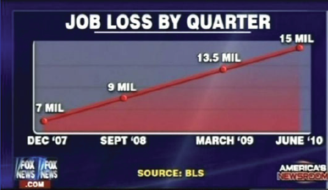
If you title and plot this data accurately, below is what you would get:
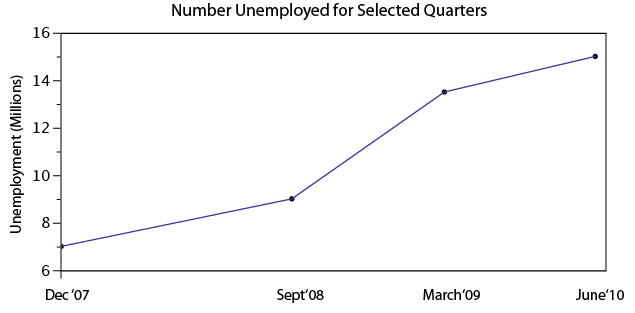
There are many types of errors or tricks that results in the display of data in an inaccurate way. Below are several categories and things to watch out for the next time somebody slaps a fancy looking report down on your desk:

USE OF THE 3D CHART:

Simple use of 3D charts distort the ratio of pies and the height of bars. Notice how Item A and C look more similar in the 3D chart, but flattened, C is less than half of A

ChartMisleading Pie Chart.pngSample Pie Chart.png

 IMPROPER SCALING:

Notice how the intent is to increase the value 3X (Y-Axis), while the perception is that it increased 9X

Improperly scaled picture graph.svg

Comparison of properly and improperly scaled picture graph.svg

The appropriate way to display the increase from 1 to 3 is shown below.

Picture Graph.svg

MISLEADING TRUNCATION:

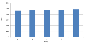
The truncation on the following graph leads the viewer to believe that group E is nearly twice the size of group A. While sometimes truncation is a great tool in certain situations, it is often misused.

Truncated Bar Graph.svg

Looking at the scale from 0 to 12,000 puts in perspective how slight of a difference there is between groups.
Bar graph.svg

IMPROPER AXIS RANGES:

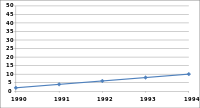
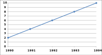
The graph immediately below makes you feel as though the growth over time has been slow and gradual, but a quick change of the axis values gives a completely different perception. Don’t always believe the slopes of lines as they are a function of the Axis values.
Line graph2.svg

Line graph3.svg

OMISSION OF SCALE:

When Scales are left off, the range of the axis is unknown and differences are easily exaggerated or minimized.
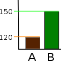
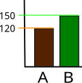
Bar graph missing zero1.svg    Example truncated bar graph.svg


Sharing a Helpful Resource

If your job is anything like mine, you use Microsoft Excel and/or PowerPoint on a regular (if not daily) basis. If you use either of these applications in conjunction with each other (which I know all of us have in our prior MP presentations), I have a very helpful resource to share with you.

One of the biggest challenges that I have faced is effectively incorporating data (particularly from Excel) into a concise PowerPoint presentation. Given that Excel and PowerPoint are both made by Microsoft, you would think that using these two applications in conjunction with one another would be fairly seamless and potentially even synergistic (1 + 1 = 3, right?).  However, integrating Excel and PowerPoint is not always straight forward, and conveying key takeaways rather than “data dumping” an entire financial model into your presentation can be a challenge. Additionally, I think that most of us are typically better at one than the other which doesn’t make things any easier.  I certainly have found this to be the case for myself, and while I have a strong background in using Excel, I have a lot of “room to grow” in terms of incorporating financial data from huge bulky models into a clean and concise presentation that conveys the underlying data effectively.

As I have searched for tools, resources, and articles giving guidance on this very topic, I have come across a particularly helpful website that I wanted to share with our class and hope that you will find it to be as useful as I have. This website is called ‘Think Outside the Slide’ and is as close to a “one stop shop” as I have found for guidance on just about everything relating to creating powerful presentations, with literally thousands of articles neatly organized by topic, as well as video tutorials if you’re more of a visual person. If you use Excel or PowerPoint at all, there is likely a specific article with tips and guidance on how to more effectively use the applications in a context relevant to you.

These are just a few that I have begun to frequently reference to give you a snapshot:

  • Using Excel Data in Powerpoint Presentations
  • Slide Design, Creation, and Editing
  • Linking Excel Data (and other content) to PowerPoint so that data in slides automatically updates
  • Tips on effectively cleaning up and animating graphs
  • Creating powerful visuals using Excel Data (waterfall graphs, diverging stacked bar charts, treemap diagrams, proportional shape comparisons, etc…)

For many business professionals, myself included, Excel and PowerPoint are critical tools, and learning to use data effectively in PowerPoint presentations can take time but is versatile skill with application to countless professions that can help to distinguish yourself from your peers/co-workers, and add value to your clients. I hope you find this to be a helpful resource, please feel free to share any other resources that you frequently use and have found helpful in your career. Thanks!

Helpful links referenced in this post:

http://www.thinkoutsidetheslide.com/free-resources/

http://www.thinkoutsidetheslide.com/using-excel-data-in-a-powerpoint-presentation/

http://www.thinkoutsidetheslide.com/articles/