Tag Archives: Presentations

How the Nixon-Kennedy Debate Changed the World

“It is not simply what we say, but how we say it, and how we look while saying it.”
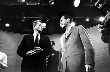
360_presidential_debate_0924

Jack Kennedy, left, and Dick Nixon before their 1st TV debate.

Today, I attended a training course on communicating assertively. It was filled with a lot of great takeaways, and the focus was around adapting your approach towards others for optimum results. The instructor brought up the three “V’s” when communicating with others: verbal, vocal, and visual. It is primarily the vocal (tone) and visual (appearance, facial expressions, body language) that impact communication. Together, these two V’s count for 93% of the impact. Of course, this is context dependent, but the statement led one of my colleagues to mention the famous Kennedy vs. Nixon debate.

In case you are unaware, this was the first presidential debate ever broadcasted on TV. The debate of course was also broadcasted on the radio, and for those listeners who were polled, more said that Nixon was the winner than Kennedy. For those who were lucky enough to watch the debate on TV, more said that Kennedy was the winner. The conclusion—Kennedy’s visual appearance and presence was superior to Nixon’s, and this made him the clear winner, at least to those who watched it on TV.

I was not around for this debate and have not had a chance to watch it yet, but from what I have read, some words used to describe Kennedy after the debate were handsome, dapper, calm, confident, and poised, while Nixon was described as sickly, clammy-faced, awkward, and sweaty. We all know that Kennedy went on to win the presidency, and many believe that this televised debate was what took him from a young, relatively unknown senator to a star in one night.

After hearing this story, I searched for some articles about this debate to investigate. Some argue that the polls used were not statistically significant, and I will leave that up to you to decide. In the end, I do believe that when it comes to communicating and presenting, tone and body language influence the verbal message. It is not simply what we say, but how we say it, and how we look while saying it. We all need to take this into consideration when presenting for impact.

Interesting Time Article on the debate and its impact on the world.

SCHUTZER, PAUL. Democratic and Republican presidential candidates Jack Kennedy, left, and Dick Nixon stand underneath glaring lights prior to beginning their 1st TV debate. Digital image. How the Nixon-Kennedy Debate Changed the World. Time, 23 Sept. 2010. Web. 14 Aug. 2014.

Life is a Negotiation, Come out on top

One of the most valuable lessons I have learned in my career is the power of being an effective negotiator.  Some people will say that their job doesn’t entail negotiations but I would argue every job involves negotiations.  Whether you are trying to make a sales pitch with a formal presentation, doing a price negotiation with a supplier, trying to get your cross functional team to use your project idea, or even trying to convince your boss you need a raise.  If you talk to anyone at work at some point you are doing some sort of negotiation.

Being persuasive is another way to view negotiations.  If you are trying to persuade someone of your point of view then you are doing a negotiation.  The quicker you realize you are negotiating with someone the quicker you can begin to use some of these tips of how to be more persuasive:

http://www.lifehack.org/articles/communication/how-persuasive-and-get-what-you-want-easily.html

For the basis of MP we are primarily talking about how to be more persuasive during presentations.  Every time we present in MP we are trying to persuade the audience to think our solution to the problem is the best solution out there.  Before you put together any presentation you should ask yourself “What do I want from the audience?” and then tailor your presentation to achieve that.

As I mentioned above I like to look at being persuasive as an important skill set to being successful in business.  Being an effective negotiator can get you on the projects you want, have the processes you want implemented, working with the people you want, and ultimately getting you that job and promotion you covet.

Some people don’t like negotiating, initially myself included, but the more you practice it and use these techniques the more natural it will become.  Before you know it you will be negotiating with people without even realizing it.

What have you negotiated for lately?

Alternatives to PowerPoint

PowerPoint Alternatives: Will PowerPoint Ever be Obsolete?

Will PowerPoint ever be replaced?  It has become commonly accepted in the business world that ‘PowerPoint’ is synonymous with ‘Presentation’. However, when is the last time that you (or me, or anyone for that matter) questioned the validity of that accepted standard, or even gave fleeting consideration to using a different presentation platform or software program?

So, that leads to the question of whether or not PowerPoint will ever become obsolete, outdated, or replaced by something newer and shinier. In researching thoughts on this topic by folks smarter than myself (such as Jeff Bezos, CEO of Amazon, in this article), I discovered a few things.

First of all, there are already many of alternatives to PowerPoint, and while they might not be household names, they can arguably match the functionality of PowerPoint, and perhaps even be more targeted towards your audience depending on the nature of the presentation. Some of the more popular alternatives to PowerPoint include Apple’s Keynote (which Steve Jobs popularized by using when rolling out new products), Google docs (free, ‘quick and dirty”), SlideRocket (great for folks in a sales environment), and perhaps most notably, Prezi (Intuitive, sophisticated, puts ‘slides in motion’, great for storytelling).

I am personally considering giving Prezi a try based on the positive reviews and feedback that I have read and would love to hear from anyone in our class who has tried the software first-hand. It does seem that one day PowerPoint might be replaced as the gold standard for delivering presentations, but that day is likely not going to come anytime soon, and we are likely better off improving our delivery method rather than changing the platform all-together.

So, what are your thoughts??


Articles for Reference:

http://www.forbes.com/sites/carminegallo/2012/09/07/jeff-bezos-and-the-end-of-powerpoint-as-we-know-it/

http://lifehacker.com/5888189/five-best-powerpoint-alternatives

http://www.customshow.com/best-powerpoint-alternatives-presentation-programs/

http://www.powtoon.com/blog/10-best-powerpoint-alternatives/


The story behind your presentation

Just a quick one…

The beginning of this HBR article, How to give a killer presentation, is intriguing to the relationship of what many of us just experienced in our final presentations of MP.  Even though this article is shortened to non-subscribers, the intriguing part to me is the basis of the article – a story about a boy who had a story to tell.  The 90+ of us just finished our presentations, and it was amazing to see what some of my peers had to say.  Learning from each other is one of the biggest facets of this program, yet at the same time this isn’t just to learn about each others’ business knowledge, but to learn about the more personal part of each others’ lives.

Many of us gave great presentations, and as this article began, you have to begin with a good background to your story.  I think the key to this article is not just another subset of bulletpoints of how to do a process (although that’s probably where the article heads), but to make you think about what the baseline of any presentation needs to be – a good story.  A lot of times we can get caught up in the details – get caught up in the data.  Presenting the data is so critical, that we forget what the baseline is, and how to bring the story completely together, full circle.  Without a clearly stated statement at the beginning of your presentation, there’s a good chance you’ve already lost a large part of the story you’re trying to tell.

http://hbr.org/2013/06/how-to-give-a-killer-presentation/ar/1

How to pitch to VCs, and why accounting does not matter

While most of our class was enjoying accounting, I had a pleasure of taking Charlie Goetz’s Entrepreneurship class.  Charlie is a fascinating person – full of energy and entrepreneurial spirit , he could survive anywhere. He is also extremely successful, building multiple business from the ground up and selling them to wealthy investors for large sums of money (including a business that exclusively sold french fries).  While working  on a project in  his class, I finally realized that it is not just about ideas and execution – Charlie’s pitch and presentation were keys to his success. One might have the best idea and great execution – but if you can’t sell it to real people, especially people with money and connections, all those ideas will be worthless.

One presentation that each entrepreneur hopes to have is a pitch to a venture capitalist – that means your idea made it past the idea stage, and you have an opportunity to make it big. If you can sell your idea to a venture capitalist, you can sell your presentation to anyone, whether it is your boss,  Professor Noonan,  or even Dean Lewis. So how does one prepare for this presentation – “the Money Game” section at WSJ has few tips:

Present Yourself:

Modesty does not pay. Each presentation, whether to a venture capitalist or to your classmates, is a lot like a date. People want to know something about you,   they want to know why they should listen to you.  Going to straight to your presentation is a lot like like going on a date and saying “Let’s get it on”.

–  Tell it to mom:

Keep is simple.  Steve Jobs once said:

“Simple can be harder than complex: You have to work hard to get your thinking clean to make it simple. But it’s worth it in the end because once you get there, you can move mountains.”

When making a presentation, keep it simple and understandable. It is always easier to send more information to ones who need more details,  but once you loose your audience, it is impossible to get them back. One caveat – the assumption needs to be clearly explained, and your pitch needs to be grounded in reality.

Don’t Play with numbers:

Integrity is paramount. Whether pitching to a VC or your Boss, you cannot undermine their trust. A lot of presenters try to focus on the positive, but what one needs to show is they have though of the negatives and have a plan to address it.  It absolutely necessary that your audience can trust you.

Stay on the radar:

In class, the presentation may end on the day of the class. Yet in the real world,  this is just a start – persistence pays off.  Even if you receive a no at the first pitch, you should keep in touch with the investor.

Your can read the rest of the article at WSJ.

PS. Accounting is crucial to business, and multiple accounting scandals of the 2000s certainly proved that.  However, the is always a CPA when you need an accounting advice, but you are the one who needs to make the pitch.


What Not To Do

What Not To Do (When Giving a Presentation):

While most of us know what we “should” be doing when it comes to giving presentations, we oftentimes forget what we should NOT be doing. I have realized over time that what we should vs. should not do are not inherently mutually exclusive. You can be doing everything that you are “supposed to” (i.e. following best practices), but simultaneously be making common errors that can limit the effectiveness of your delivery.

I’m as guilty as anyone when it comes to checking the boxes for everything that a strong presentation should have, but I’ve started to realize that by diagnosing errors that I am more inclined to make, many of the recommended strategies subsequently fall in line naturally.

To frame this as a metaphor, I’m talking about targeting the disease, not making the anecdote stronger. I’ve found that this starts with getting back to the basics and building from there. So, what are some of the more common pitfalls in presentation delivery? After vetting several resources I’ve consolidated a list of quick anecdotes that I have found to be helpful to keep in mind:

  • Avoid reliance on slides. Slides are there to compliment your presentation and provide a framework, not the other way around.
  • Overload: Less is more. Too much talking and/or too much text will easily disinterest any audience, no matter how rich the content.
  • Avoid Apologies: If something goes wrong, there is a typo, you say something incorrectly, etc… JUST GO WITH IT. Odds are that no one else noticed and by drawing attention to it you are just calling out yourself (and your credibility).
  • Avoid filler words: This is public speaking 101, it sounds easy and we’ve heard it thousands of times, but it is absolutely critical. Unfilled airtime between sentences and ideas is okay. Specifically avoid “um”, “so”, “right”, and “you know” are very common and very distracting!
  • Going over your allotted time: Once you start to go long you begin to lose your audience. And once you even begin to lose your audience, it’s too late. This can cause the audience to miss your “big finish” and really tear down everything you’ve worked so hard to build.

While there are many more, these are just some of the most common problems that can hold you back from delivering the most effective presentation possible. We never get to a point where we are too advanced to worry about the basics. While one of these points are anything that you haven’t heard before, hopefully you will find some of these to be helpful reminders.


Helpful Resources:
http://www.inc.com/eric-v-holtzclaw/big-presentation-5-rookie-mistakes-to-avoid.html
https://www.youtube.com/watch?v=gNG0etmnwuk
http://blogs.hbr.org/2012/12/avoid-these-five-mistakes-in-y/


Effective Data Visualization

One of the most critical items in crafting in effective presentation is the proper visualization of supporting data.  A good picture will both engage the audience and highlight the salient features embedded within the data.  As a scientist, I have sat through numerous talks with poorly executed visualizations—tables overcrowded with numbers (most of which are irrelevant), plots containing too many overlapping and indistinguishable lines, indecipherable figures, etc…  The result of these was, almost uniformly, audiences who were uninterested and unwilling to believe the conclusions because they couldn’t understand any of the data being presented.  Even though there are plenty of examples of what not to do, sometimes it can be hard to find positive examples, especially for presenting the complex data or results that come out of business analysis.  While looking for ways to develop my visualization skills, I recently encountered this blog post: http://www.targetprocess.com/articles/visual-encoding.html, which has a few good rules-of-thumb for creating presentations:

  • Humans do better comparing relative areas, so if you want to map data to a shape, you should map it to its area.
  • Use no more than a dozen colors to encode categories effectively.  If there’s more, it becomes difficult to differentiate them.
  • A diverging color scale should have different colors for positive and negative values.
  • A planar chart is best for representing simple two variable data sets.

As an example of how good data visualization can help build a story and highlight underlying trends and relationships, here are, what I think, are two effective uses of a particular visualization type called a heat map.  In a heat map, data are plotted on a plane (usually projected onto an image of some particular area) and colored according to frequency or some other variable.  This representation helps quickly highlight where important areas (geographic or other) are on the map.

From The New York Times, a good visualization of basketball players shooting and scoring patterns: http://www.nytimes.com/interactive/2012/06/11/sports/basketball/nba-shot-analysis.html

And finally, a visualization of where all the action is on a typical World of Tanks game on the Abbey map: http://www.vbaddict.net/heatmaps/abbey/12


Give a Killer Presentation, TED Style

How to Give a Killer Presentation

If a 12-year-old boy can successfully present an idea/invention to hundreds of adults, can you effectively present quarterly financials to your manager?  The answer is “probably,” and the TED Talks curator, Chris Anderson, has a couple of tips that will help you present like a 12-year-old kid!

We have an obvious affinity for the TED Talks videos and why not?!  The subjects are mesmerizing and the presenters are passionate.  Many of them are professional speakers and others are at TED presenting for the first time in their lives.  TED developed a process to help inexperienced presenters prepare, and it typically begins six to nine months before the event.  (How long have you been working on your MP presentation?)  Here are a couple of tips from Chris, and be sure to watch the first video about Richard Turere (twelve years old!) and how he’s saving Africa from lions.

Frame Your Story:  Conceptualizing and framing what you want to say is the most vital part of preparation

  • As a presenter, you are about to take your audience on an adventure.  Your biggest decision is selecting where to start and where to end.
  • Don’t assume your audience is prepared for the journey. Quickly introduce the topic and explain why the journey is going to be AWESOME, why you care about it, and why they should too.
  • Use specific examples to flesh out your ideas and avoid abstract language.
  • Some journeys are too long (like baseball season).  Limit the scope of your presentation and don’t try to over explain.  For example, if you only watch Major League Baseball during the months of April and October, you’ll still get the gist of the season.

Plan Your Delivery:  Memorizing a presentation is the best way to go

  • Do not read, EVER.
  • Keep it natural and connect with the audience.
  • Pay attention to your tone and sound conversational.  Talk to the audience, don’t talk at them.
  • During the journey, don’t annoy your companions by projecting ego.  No one likes a Conceited Cathy or Pompous Phil.

Develop Stage Presence:  Stage presence is coachable and takes practice

  • While presence is important, getting the words, story, and substance right are more important.
  • Making eye contact is the most important physical act on-stage.
  • Swaying side-to-side or shifting your weight around can be distracting to the audience.
  • Nervousness affects everyone. Here are a couple tricks to deal with it:

o   Stay out in the audience until the moment you go on; this keeps your mind engaged.

o   Spend time before you present striding around, standing tall, and extending your body; this will make you feel more powerful.

o   Breathe deeply before you go on-stage.

  • Nervousness can be a powerful way to connect with the audience by showing vulnerability and authenticity.

Plan the Multimedia:  The best TED speakers don’t use slides at all

  • There are tons of technology aids, so experiment!

Putting It Together:  Practice, Practice, Practice

  • Practice on your own and in front of an audience.
  • If you rehearse to an audience, choose people who are experienced presenters and will offer constructive feedback.

In sum, Anderson presented to a TED audience for the first time after curating for nine years.  Here are his parting comments on his experience:

Presentations rise or fall on the quality of the idea, the narrative, and passion of the speaker.  It’s about substance, not speaking style or multimedia pyrotechnics.”


http://hbr.org/2013/06/how-to-give-a-killer-presentation/ar/5


Data Visualization – Tableau

For starters, check out this video

I sometimes struggle with conveying my analysis (say, in Excel) into a presentation (say, in PowerPoint). The best way to capture the attention of your audience and to deliver an effective presentation is through data visualization. No matter how sound and detailed your analysis, if it is not communicated well to your audience then all of your hard work in performing that analysis was wasted.

Presenting data in a visual format can often be the quickest and most effective ways to convey results of your analysis and capture the attention of your audience. This can communicate a message that may have taken hours to develop in a matter of seconds if done correctly.

One of my favorite new data visualization resources that I am learning to use is called Tableau. Tableau is a software company that was founded in 2003 and does nothing other than data visualization. The company had sales of $34.2 Million in 2010 which grew to an astonishing $232.44 Million in 2013 and the company went public. It is now traded on the NYSE (ticker: DATA). It is extremely intuitive and the product looks amazing. Here is a great video that gives you an overview of the capabilities of Tableau (also linked above).

There are some really revolutionary and interesting methods to communicate data visually that are becoming more and more accepted in business and is thought by many as a way for companies to distinguish themselves among their peers. Often times my company might be similarly positioned to perform work for a given client, and I have seen that a lot of the work we have “won” has come from an effective pitch that highlights the strengths of our organization in a visually compelling manner that engages the client and shows that we can “give meaning to numbers” which is a skill that is hard to quantify.

I would be curious to get any thoughts on your experience with data visualization software and any recommendations you might have.


Other helpful data visualization links:

http://www.scientificamerican.com/article/the-data-visualization-revolution/

http://blogs.hbr.org/2014/04/the-quick-and-dirty-on-data-visualization/

http://fortune.com/2011/11/15/how-tableau-software-makes-business-data-beautiful/

Beyond Powerpoint: Innovative Presentation Tools

The most common presentation software, Microsoft Powerpoint, has remained largely unchanged for the past two decades, and has several well-known drawbacks that impede the ability of presenters to tell their story to the audience.  Fortunately, a new generation of presentation software has recently been developed.  Below I’ve highlighted a several innovative presentation tools designed to promote dialogue,  introduce real-time data into presentations, and foster collaboration between people creating presentations.

Presentation Structure

Powerpoint forces the presenter to present to the audience in a linear format.  The problem with a linear format is that many concepts require multiple dimensions  to display the interconnected nature of the subject matter.  Enter Prezi, a new presentation software to create a ‘spacial narrative’ that not only allows for a 2 or 3 dimensional presentation flow and visualization, but also allows the presenter to stop at any point, and ‘zoom’ to any portion of the overall presentation.  Prezi is especially great for more interactive, discussion based meetings, or for subject matter that does not have a distinctly linear format.   Links to some great ‘sample’ Prezi presentations are provided below.

Real Time Data

A blog article from the Harvard Business Review website called “Presentation Tools That Go Beyond ‘Next Slide Please'” by Nolan Browne notes that ‘presentation tools have largely been static, creating an artificial boundary between the presentation and the outside world.”  Power point slides are great for capturing the state of things at a particular moment in time, similar to how a balance sheet captures the financial situation of a company at the end of a quarter. For presentations that touch on subject matter that is constantly changing, this can cause a lot of extra work in changing the content, or require that the presenter present out of date information.  Several new tools are working to help bring real-time data into presentations.  Zoho Show, a component of Zoho Docs, an online suite of productivity tools similar to Microsoft Office, allows users to insert live media and data from a variety of online sources directly into a presentation.

Collaboration

Powerpoint impedes collaboration in several ways.  First, its difficult to collaborate with others when creating a new presentation.  Presenters either have to create slides separately, and then splice them together to create a whole presentation.  This method usually leads to a presentation with an uneven flow due to differences in writing, style, format etc. of the different presenters slides.  Alternatively, presenters either have to meet in real time to create the presentations, or email revisions back and forth, which can be difficult to manage.  Online collaboration tools like Dropbox and Google Drive help with this issue by creating a centralized document that the presenters can share.

Powerpoint also inhibits in-meeting collaboration between those in the meeting.  For example, if a presenter would like to collaborate with the meeting participants during the presentation to edit a graph, they either need to use the cumbersome and slow feature to imbed an excel plot within Powerpoint, or open up a separate excel file.  A new program called Plotly allows users to create interactive graphs that foster collaboration and discussion about the data.  Google Drive allows multiple users to use a single document at one time, and shows where each users cursor is on the document so that each participant can keep track of where the other users are concentrating.

Here are several sample Prezi presentations.  My goal for this MP course is to create at least one Prezi presentation for my job and gather the meeting participants feedback on the experience.

Source:

Browne, Nolan. “Presentation Tools That Go Beyond “Next Slide Please””Harvard Business Review. N.p., 24 Apr. 2014. Web. 12 July 2014.