Tag Archives: Excel

Introducing…. Power Pivot (with Excel)

I think everyone can agree that pivot tables are great excel tools which make analyzing and sorting massive amounts of data a life saver. However, over the course of the past couple years I have been introduced to Power Pivot. Yes, Power Pivot. Pivot tables on steroids. At first, I was pretty intimidated because of the sheer size and complexity on the surface. But after spending some time learning and taking “lunch n’ learn” course at work, Power Pivots and I are becoming friends. My favorite part is being able to run pivot tables essentially off other pivot tables. At work, we’ve also created many tools that allow our leaders to simply and easily run their own reports for specific requests, which saves everyone time. (The analyst teams refresh the data regularly as needed).

I’ve included a couple links below about Power Pivot, and would encourage all to consider using the valuable tool the next time you are looking to crush some colossal data. It’s available as a free add-on for Excel 2010 and now comes standard on Excel 2013.

Happy Pivot Tabling!


WJEM


https://www.youtube.com/watch?v=URy_uQYS49s

http://info.110consulting.com/blog/bid/374825/Top-10-Benefits-of-Using-Excel-PowerPivot

http://blogs.office.com/2010/10/01/top-5-ways-powerpivot-helps-excel-pros/

Every Spreadsheet Has An Error

If your job is anything like mine, you’ve had to work on a massive data dump, sorting and manipulating to find “a story.” The size of the data files can sometimes be intimidating and there sometimes is that concern in the back of your mind that some formula or reference within your Excel workbook went rogue.

As we strive to be more proficient in our Excel skills and more efficient in our tasks, coming across a headline such as “Every Spreadsheet Has an Error” can certainly sound alarming! However, as I read the article in greater depth, I found the points to serve as good guidelines to help check my work.
http://www.forbes.com/sites/billconerly/2013/04/25/every-spreadsheet-has-an-error-7-lessons-motivated-by-reinhart-and-rogoff/
Some of the tips suggested in the link are:

1) Use assumption variables – Similar to what we learned in Decision Analysis class, create a section within your workbook with all your assumption variables. Create links within the workbook to these assumptions. This will ensure that when you have to change your assumptions in the future you will not have to search all your data for every occurrence that may be affected.

2) Link, don’t copy – Create links to raw data so that you can go back and check your manipulated data against the original document.

3) Create double-check formulas – “If, then” and “true, false” statements are great for checking your work!

4) Format to Tell Differences – Conditional formatting helps to highlight differences in the data. They also help to identify trends and patterns in your data. I’m a big fan of using colors when doing conditional formatting.

5) Graph Your Data – When possible, graph your data. A line chart for instance will give you a quick visual to not only spot any irregularities in your data, but also to help find “the story.”

6) Document – Create notes of the steps or sources that you used to create your end product. This habit can save a ton of time when you have to do an update. Notes are also helpful for others who may have to replicate your report. We have a saying at my workplace, “a detailed source line is not for the client, it’s for us!”

7) Be Suspicious – Check your work. See if you can find an error.

Hopefully, by following some of these tips, you found all of your errors!

Misleading Graphs & Statistical Lies

Graphs and Charts are everywhere, and are excellent tools to visually convey statistics, results, trends, data, etc. There are basically three groups of graphs out there that you’ll find on a regular basis:

1.) Graphs created by people who do know what they are doing

2.) Graphs created by people who don’t know what they are doing

3.) Graphs created by people who do know what they are doing and have manipulated it to intentionally deceive the viewer.

There’s a fine line between number 2 and 3 sometimes, and to be effective business leaders, one skill we must possess is the ability to call “BS”, whether intentional or unintentional. Below is a great book to help uncover a lot of deceptive tricks and a few some examples.

A great book that I highly recommend is: “How To Lie With Statistics“. It’s short, cheap, and uncovers numerous tricks people use with charts, graphs, numbers, and statistics to deceive the reader without breaking the rules.

Not to pick on Fox News, but below is a graph that is severely misleading in both the title and the scale of the X-axis. The title leads you to believe the data is by consecutive quarter, and the inaccurate spacing on the X-axis leads to to believe the data is linear.
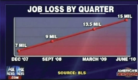
If you title and plot this data accurately, below is what you would get:
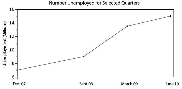
There are many types of errors or tricks that results in the display of data in an inaccurate way. Below are several categories and things to watch out for the next time somebody slaps a fancy looking report down on your desk:

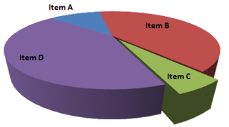
USE OF THE 3D CHART:

Simple use of 3D charts distort the ratio of pies and the height of bars. Notice how Item A and C look more similar in the 3D chart, but flattened, C is less than half of A

ChartMisleading Pie Chart.pngSample Pie Chart.png
 IMPROPER SCALING:

Notice how the intent is to increase the value 3X (Y-Axis), while the perception is that it increased 9X

Improperly scaled picture graph.svg

Comparison of properly and improperly scaled picture graph.svg

The appropriate way to display the increase from 1 to 3 is shown below.

Picture Graph.svg

MISLEADING TRUNCATION:

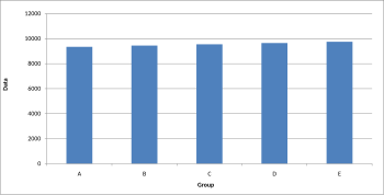
The truncation on the following graph leads the viewer to believe that group E is nearly twice the size of group A. While sometimes truncation is a great tool in certain situations, it is often misused.

Truncated Bar Graph.svg

Looking at the scale from 0 to 12,000 puts in perspective how slight of a difference there is between groups.
Bar graph.svg

IMPROPER AXIS RANGES:

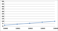
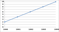
The graph immediately below makes you feel as though the growth over time has been slow and gradual, but a quick change of the axis values gives a completely different perception. Don’t always believe the slopes of lines as they are a function of the Axis values.
Line graph2.svg

Line graph3.svg

OMISSION OF SCALE:

When Scales are left off, the range of the axis is unknown and differences are easily exaggerated or minimized.


Bar graph missing zero1.svg    Example truncated bar graph.svg


My Challenges with Excel

C.S. Lewis (1898-1963), Fellow and Tutor in English Literature at Oxford University, and Chair of Medieval and Renaissance English at Cambridge, was an intellectual giant of the 20th century. In later life, reflecting on challenges he faced in his younger days, Lewis remarked:

I could never have gone very far in any science, because in the path of every science the lion mathematics lies in wait for you. Even in mathematics whatever could be done by mere reasoning as in simple geometry I did with delight. But the moment calculation came in I was helpless. I grasped the principles but my answers were always wrong. Yet though I never could have been a scientist, I had scientific as well as imaginative impulses and I loved ratiocination*.”

To be candid, I have some apprehension when it comes to Excel . . . made all the more pressing because of how central excel skills are to the practice of finance. So when I consider my excel challenges I draw much encouragement from these thoughts of C.S. Lewis.

Although I have a deep passion for finance, and have worked in investment management for 10 years, my position at work has been more about interpreting and leveraging excel generated data, rather than performing the actual work of creating spreadsheet models myself.

The result is that up till now, my excel skills have languished.  Thus I’m grateful that our MBA program has forced me to improve. In this spirit, (and acting on the advice of professor Noonan) I’ve set out to build my own personal top 10 excel skillset, that will be useful to my financial career.  Some of these may seem rather obvious, but excel is my self-selected focus area and I figured that I could subject my list to public opinion and scrutiny, in the hope that collaborative discussion might occur. I also thought that some of this material might be useful for those considering a financial career.

Rough draft of “Top 10” excel skills for investment management and financial planning for high net worth individuals, families, trusts, and charitable foundations:

  1. Precision tree
  2. Sensitivity analysis, useful for evaluating insurance policies
  3. Goal Seek
  4. Historical market and financial instrument analysis
  5. Excel integration with Word and PowerPoint
  6. Configuring excel for pleasant appearance and functionality
  7. Mortgage / Bond / Annuity amortization schedules
  8. Learning to manipulate and efficiently sort data – this is hugely important for many areas within our business such as ranking client positions, asset allocation decisions, analysis of individual positions, and assessing performance in order to prioritize investment decisions
  9. Graphing portfolio performance vs. relevant market benchmarks
  10. Leveraging excel with proprietary finance software used by major financial enterprises. (our firm uses Advent)

When I reflect on the challenges of the first year of MBA school, I am glad that I have improved in several of theses areas and incorporated them into different assignments and projects. Our cohort has aided much of my improvement.

For example, during first semester, I was fortunate to be on a team with Shehzad Shabuddin, who was quite generous with his time and patient with helping me make progress on excel. Shehzad’s blog post, The Excel trap, reminds us of the dangers of reducing life to data and mathematics. Excel-ing in Real Estate by Bob Caperton and the article by Barry Slaymaker on MBA level excel skills were both particularly helpful. I’m also hopeful that I can persuade Joe Song to give me some Excel lessons between now and graduation.

One of the most powerful lessons I have learned in life (and a “key content” area of MP) is the importance of surrounding yourself with others whose complementary strengths have the capacity to offset your personal areas of weakness.  My next blog post will examine a leader who intimately understood just how powerful this principal is, and became a great, and most unexpected, actor in history.

*Ratiocination, noun. – the process of logical reasoning. [1520-30]

MBA-Level Excel Skills

Beyond the MBA top 20 supplied by Professor Noonan, I have located a handful of academic resources indicating which Excel skills MBA students should have when they graduate, and in some cases, before they begin their studies. While this information may not be a direct resource to gain these skills, it paints a picture of the expectations that the business world will have for us when we complete our studies.


Duke’s Fuqua School of Business identifies a number of skills that incoming MBA students should have on the Computer Skills section of their MBA ready website at http://www.fuqua.duke.edu/student_resources/mba_ready_executive/computer_skills/#doc2

One of the skills that has caught my attention here, and an area in which I lack experience, is referencing across worksheets and workbooks. While referencing across worksheets is relatively intuitive for me, references across workbooks will definitely require some additional research on my part. Additionally, Duke requests that students are familiar with text file imports into Excel. While I feel that minor research can reveal a process for this, my interest is piqued by this requirement.

Indiana University’s Kelley School of Business and their Kelley Direct online program provide a slightly different set of recommendations on their Prerequisite Excel Skills page at http://kelley.iu.edu/onlineMBA/Admissions/Prerequisites/page36896.html . Here we find a grouping of skills and specific functions that are required. While many of these functions should be familiar to most of us, I am not sure how many within our cohort spend time parsing text or using reference functions. To that end, I am sure that the nature of one’s background is likely what is driving what and when these functions may be used.

Finally, the Anderson School of Management at UCLA, http://www.anderson.ucla.edu/degrees/mba-program/admit-central/curriculum-and-academics/pre-mba-preparation provides significant opportunities for incoming MBA students to refine their skills in advance of their studies, from assessments to online courses and on campus workshops. While this site does not directly speak to the Excel requirements of it students, it does exemplify the importance that the university places on these skills. Also, you will find a link to an online tools page at the bottom of the above linked page.


What does all of this mean? First and foremost, I believe that this solidifies the concept that excel skills are paramount to success in business school and business in general. Secondly, one could interpret this information as a gauge of where the Excel skill lie for those you will be competing with post-graduation. Finally, I see this information as a sign that Goizueta may be lagging behind some of the top schools in their stated value of Excel. Perhaps I have forgotten by this time, but I do not recollect any Excel requirements being addressed during the orientation or onboarding process and I am fairly sure that there was no foundations course in Excel. Please correct me if I am wrong about this, but I think Goizueta would be well served to sharpen the focus on this key skillset.

Excel-ing in Real Estate

I learned early in my first semester that my skills with Microsoft Excel were in need of serious improvement.  By the second semester, I realized that I might be the least proficient Excel user in the entire program.  This is sort of embarrassing considering that I was a finance major and work in the commercial real estate business.  That being said, I am determined to improve.

This MP project is very timely for me.  It coincides with the need for me to analyze several prospective investments for my company.  Recently I have taken the time to review Professor Noonan’s slides and from that decided on some of the skills that I plan to acquire.  I have since learned how to use pivot tables as well as the sensitivity analysis feature.  I found some youtube videos that really helped me fine tune these skills:

Pivot Table

Sensitivity Analysis

I recently used sensitivity analysis as part of my analysis in evaluating an apartment complex.  See below:

$                     264,976.47 37,000 38,000 39,000 40,000 41,000 42,000 43,000
15,000    258,823.53    270,588.24    282,352.94    294,117.65    305,882.35    317,647.06    329,411.76
16,000    247,058.82    258,823.53    270,588.24    282,352.94    294,117.65    305,882.35    317,647.06
17,000    235,294.12    247,058.82    258,823.53    270,588.24    282,352.94    294,117.65    305,882.35
18,000    223,529.41    235,294.12    247,058.82    258,823.53    270,588.24    282,352.94    294,117.65
19,000    211,764.71    223,529.41    235,294.12    247,058.82    258,823.53    270,588.24    282,352.94
20,000    200,000.00    211,764.71    223,529.41    235,294.12    247,058.82    258,823.53    270,588.24
21,000    188,235.29    200,000.00    211,764.71    223,529.41    235,294.12    247,058.82    258,823.53


The left-hand column (starting with 15,000) refers the Operating Expenses and upper row (beginning with 37,000) refers to Revenue.   The info in the middle shows the resulting value (based on an 8.5 Cap rate).  If you’re not in the Real Estate business, a cap rate is NOI/VALUE, essentially a measure of the rate of return.  This proved fairly helpful as I went over it with our current apartment manager to confirm our offer.

I also did analyses for revenue sensitivity to price and vacancy and the Operating Expense sensitivity to some of the specific expenses.  The Revenue sensitivity illustrates how much vacancy we could bear under certain price levels.  The Operating Expense analysis displays the critical expenses.

I am well aware that, for most of you, this is very basic.  I am just glad to address this weakness.

Sharing a Helpful Resource

If your job is anything like mine, you use Microsoft Excel and/or PowerPoint on a regular (if not daily) basis. If you use either of these applications in conjunction with each other (which I know all of us have in our prior MP presentations), I have a very helpful resource to share with you.

One of the biggest challenges that I have faced is effectively incorporating data (particularly from Excel) into a concise PowerPoint presentation. Given that Excel and PowerPoint are both made by Microsoft, you would think that using these two applications in conjunction with one another would be fairly seamless and potentially even synergistic (1 + 1 = 3, right?).  However, integrating Excel and PowerPoint is not always straight forward, and conveying key takeaways rather than “data dumping” an entire financial model into your presentation can be a challenge. Additionally, I think that most of us are typically better at one than the other which doesn’t make things any easier.  I certainly have found this to be the case for myself, and while I have a strong background in using Excel, I have a lot of “room to grow” in terms of incorporating financial data from huge bulky models into a clean and concise presentation that conveys the underlying data effectively.

As I have searched for tools, resources, and articles giving guidance on this very topic, I have come across a particularly helpful website that I wanted to share with our class and hope that you will find it to be as useful as I have. This website is called ‘Think Outside the Slide’ and is as close to a “one stop shop” as I have found for guidance on just about everything relating to creating powerful presentations, with literally thousands of articles neatly organized by topic, as well as video tutorials if you’re more of a visual person. If you use Excel or PowerPoint at all, there is likely a specific article with tips and guidance on how to more effectively use the applications in a context relevant to you.

These are just a few that I have begun to frequently reference to give you a snapshot:

  • Using Excel Data in Powerpoint Presentations
  • Slide Design, Creation, and Editing
  • Linking Excel Data (and other content) to PowerPoint so that data in slides automatically updates
  • Tips on effectively cleaning up and animating graphs
  • Creating powerful visuals using Excel Data (waterfall graphs, diverging stacked bar charts, treemap diagrams, proportional shape comparisons, etc…)

For many business professionals, myself included, Excel and PowerPoint are critical tools, and learning to use data effectively in PowerPoint presentations can take time but is versatile skill with application to countless professions that can help to distinguish yourself from your peers/co-workers, and add value to your clients. I hope you find this to be a helpful resource, please feel free to share any other resources that you frequently use and have found helpful in your career. Thanks!

Helpful links referenced in this post:

http://www.thinkoutsidetheslide.com/free-resources/

http://www.thinkoutsidetheslide.com/using-excel-data-in-a-powerpoint-presentation/

http://www.thinkoutsidetheslide.com/articles/

Storytelling for the number cruncher

As someone who works in Excel everyday and prides myself on an ability to crunch any numbers or run any analysis, creating a “story” and selling that to an audience doesn’t come naturally. For me, I’d rather use a line graph or bar chart and let that do the convincing. But if Brandon Smith taught me anything, it’s that using a story works for persuasion.

So I came across an article written a few months ago in HBR by Harrison Monarth (author of The Confident Speaker and Breakthrough Communication) where he writes about the power of storytelling as a strategic business tool. An example he uses to illustrate the power of storytelling is from the latest Super Bowl commercials for Budweiser. In one advertising study looking at the effectiveness of ads based on content or structure, a researcher at Johns Hopkins noted “regardless of the content of the ad, the structure of that content predicted its success.” So I’m thinking: it’s not what you say, but how you say it? Monarth concludes by writing “A story can go where quantitative analysis is denied admission: our hearts. Data can persuade people, but it doesn’t inspire them to act; to do that, you need to wrap your vision in a story that fires the imagination and stirs the soul.”

Working in the healthcare industry, I found it particularly interesting when Monarth notes an example of how patients change their behavior for the better based on stories their physicians tell them, rather than presenting the data.

Does anyone have specific examples of storytelling in a presentation to actually change behavior or implement a proposal? I’d love to use these tactics, but am still a little skeptical my company’s executives could be moved to action by a story vs. data. What works in your industry?

Excel: The Hammer to Every Business Nail?

My organization is a small firm engaged in supplying doors and hardware to the commercial construction industry, so we have little need for capabilities related to Excel, right? Well, not exactly….

Leadership at my company is aging and is mired in the view of technology from a decade ago, but they are in love with Excel (although they are only familiar with the most basic functions and capabilities).  Their solution to EVERY issue is to use Excel spreadsheets to find solutions, manage information, or make a decision. In turn, those of us that are tasked with executing and managing these issues have begun to refer to Excel as “The Hammer”.  You see, even if a bullet proof case can be made for managing information through Access, SharePoint, or other industry specific software, leadership wants to use Excel. After all, it is the hammer to every nail!

This leads me to one of the main reasons that I feel that improving my Excel spreadsheet skills will be critical: efficiency. Efficiency with Excel allows me to better handle my workload, more effectively represent the data I have compiled, and more quickly derive time sensitive conclusions to complex issues. Currently, I feel like my skills lead me to taking circuitous routes to reach my destinations, so this is the reason my goal is to spend the summer improving efficiency. There are countless Excel methodologies and formulas that I plan on skimming briefly to gain an understanding of their power, but I intend to focus my personal journey on isolating the key skills such as the top 20 list and polishing my techniques.

One of the techniques that I will be using this semester is to learn by teaching at my workplace. Few of my coworkers and direct reports have Excel skills beyond rudimentary data entry and I have been looked to as an “expert” in the past. Although I hardly deserve the expert label, I find that teaching the software allows for introspection that reveals my weaknesses. In the past 2 weeks, I have spent time with experienced and beginner users working through the basic methodologies and applications for pivot table use. Pivot tables allow our estimators to estimate more quickly, our project managers to more accurately manage material, and our engineers to more effectively isolate and coordinate the details of a project. My goal is to employ my “learn by teaching” idea throughout the summer, hopefully resulting in not only an increased skillset that I can leverage moving forward, but also effecting positive change on our organizational efficiencies.

I invite any comments on my plan or the nature of my post. If you have never tried it, experiment with learning by teaching and see if it works for you. Time to get back to swinging my hammer…