Tag Archives: Data

Being Intentional with your Data and Giving your Graphics a Voice!

I have a particular interest in evaluation in the workplace– the evaluation of employees, work output, employers, etc. In the types of programs I’ve been in, I have found in very useful. However, I’m sure that most companies don’t have the time to thoroughly evaluate their work in a systematic and organized way. I have always worked in the research/higher education end of business, and so I don’t personally have experience with how evaluation works in the corporate setting.  How does evaluation look like in your industry or company?

A few years ago, I came across this site and I have been a fan ever since. The group is called Evergreen Data and they focus on intentional reporting and data visualization. I work in public health/higher education, and the public health industry is very data-heavy. Data in public health is used for analysis, program planning, grant opportunities, research, etc. and so I have seen the benefits of its use in my industry. What does your company do with its evaluation data?

This particular site had a checklist on how you should layout your evaluation reports which I’ve found super helpful! The purpose of the checklist is to help identify what parts of an evaluation report can be enhanced through the use of graphics.

Here are some of the items they had in their checklist:

  • Text font and size (sans serif and size 9-11)
  • Text uniformity
  • Line spacing (between 11-13 points)
  • Headers/callouts
  • The number of different types of fonts that you should use (no more than three!)
  • Don’t make too “strong” or “bold” of bullet points
  • Alignment (be consistent!)
  • Make sure that items in page that are grouped together are related
  • Utilize white/empty space!
  • Use of pictures/graphics – individuals learn differently from one another
  • Use color changes for a purpose (are you being intentional by choosing to change the color of a font or header?)

Evergreen also has an additional checklist that’s used for data visualization. It’s specific to making your graphs speak for themselves! This is a great resource as well.

What are some of the tips you have when creating reports (not exclusive to evaluation reports)? What steps do you take to have your data share a “story” or a “point”? Are you intentional in your decisions in terms of report layouts, font, graphics, etc.? Do you find that you have to pay more attention to this? 

Every Spreadsheet Has An Error

If your job is anything like mine, you’ve had to work on a massive data dump, sorting and manipulating to find “a story.” The size of the data files can sometimes be intimidating and there sometimes is that concern in the back of your mind that some formula or reference within your Excel workbook went rogue.

As we strive to be more proficient in our Excel skills and more efficient in our tasks, coming across a headline such as “Every Spreadsheet Has an Error” can certainly sound alarming! However, as I read the article in greater depth, I found the points to serve as good guidelines to help check my work.
http://www.forbes.com/sites/billconerly/2013/04/25/every-spreadsheet-has-an-error-7-lessons-motivated-by-reinhart-and-rogoff/
Some of the tips suggested in the link are:

1) Use assumption variables – Similar to what we learned in Decision Analysis class, create a section within your workbook with all your assumption variables. Create links within the workbook to these assumptions. This will ensure that when you have to change your assumptions in the future you will not have to search all your data for every occurrence that may be affected.

2) Link, don’t copy – Create links to raw data so that you can go back and check your manipulated data against the original document.

3) Create double-check formulas – “If, then” and “true, false” statements are great for checking your work!

4) Format to Tell Differences – Conditional formatting helps to highlight differences in the data. They also help to identify trends and patterns in your data. I’m a big fan of using colors when doing conditional formatting.

5) Graph Your Data – When possible, graph your data. A line chart for instance will give you a quick visual to not only spot any irregularities in your data, but also to help find “the story.”

6) Document – Create notes of the steps or sources that you used to create your end product. This habit can save a ton of time when you have to do an update. Notes are also helpful for others who may have to replicate your report. We have a saying at my workplace, “a detailed source line is not for the client, it’s for us!”

7) Be Suspicious – Check your work. See if you can find an error.

Hopefully, by following some of these tips, you found all of your errors!

Misleading Graphs & Statistical Lies

Graphs and Charts are everywhere, and are excellent tools to visually convey statistics, results, trends, data, etc. There are basically three groups of graphs out there that you’ll find on a regular basis:

1.) Graphs created by people who do know what they are doing

2.) Graphs created by people who don’t know what they are doing

3.) Graphs created by people who do know what they are doing and have manipulated it to intentionally deceive the viewer.

There’s a fine line between number 2 and 3 sometimes, and to be effective business leaders, one skill we must possess is the ability to call “BS”, whether intentional or unintentional. Below is a great book to help uncover a lot of deceptive tricks and a few some examples.

A great book that I highly recommend is: “How To Lie With Statistics“. It’s short, cheap, and uncovers numerous tricks people use with charts, graphs, numbers, and statistics to deceive the reader without breaking the rules.

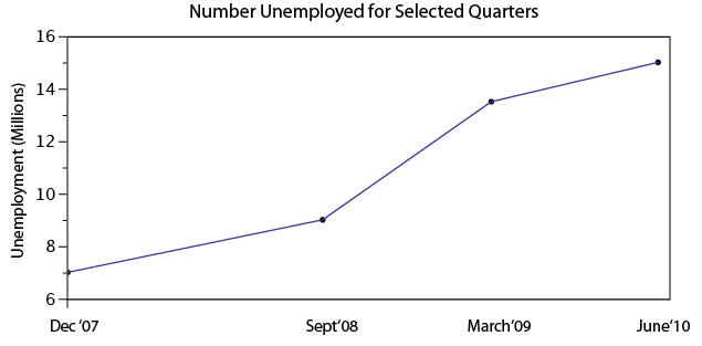
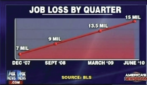
Not to pick on Fox News, but below is a graph that is severely misleading in both the title and the scale of the X-axis. The title leads you to believe the data is by consecutive quarter, and the inaccurate spacing on the X-axis leads to to believe the data is linear.

If you title and plot this data accurately, below is what you would get:

There are many types of errors or tricks that results in the display of data in an inaccurate way. Below are several categories and things to watch out for the next time somebody slaps a fancy looking report down on your desk:

USE OF THE 3D CHART:

Simple use of 3D charts distort the ratio of pies and the height of bars. Notice how Item A and C look more similar in the 3D chart, but flattened, C is less than half of A

ChartMisleading Pie Chart.pngSample Pie Chart.png

 IMPROPER SCALING:

Notice how the intent is to increase the value 3X (Y-Axis), while the perception is that it increased 9X

Improperly scaled picture graph.svg

Comparison of properly and improperly scaled picture graph.svg

The appropriate way to display the increase from 1 to 3 is shown below.

Picture Graph.svg

MISLEADING TRUNCATION:

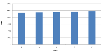
The truncation on the following graph leads the viewer to believe that group E is nearly twice the size of group A. While sometimes truncation is a great tool in certain situations, it is often misused.

Truncated Bar Graph.svg

Looking at the scale from 0 to 12,000 puts in perspective how slight of a difference there is between groups.

Bar graph.svg

IMPROPER AXIS RANGES:

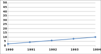
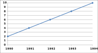
The graph immediately below makes you feel as though the growth over time has been slow and gradual, but a quick change of the axis values gives a completely different perception. Don’t always believe the slopes of lines as they are a function of the Axis values.

Line graph2.svg

Line graph3.svg

OMISSION OF SCALE:

When Scales are left off, the range of the axis is unknown and differences are easily exaggerated or minimized.

Bar graph missing zero1.svg    Example truncated bar graph.svg


Let the data speak for itself

I’ve been interested in developing models and using data to drive business decisions, and so I was recently reading “Doing Data Science”, which is available at http://www.amazon.com/Doing-Data-Science-Straight-Frontline/dp/1449358659/.  The book contains a fair bit of math, which might make it seem a bit daunting, but I believe it’s worth the read since the authors offer some interesting insights into how to incorporate data analysis and modelling into solving business problems.   There are two sections in particular that I found useful.  The first is on exploratory data analysis, which is the process by which you start to construct a solution to your problem.  As the author states, “Exploratory data analysis (EDA) is often relegated to chapter 1 (by which we mean the ‘easiest’ and lowest level) of standard introductory statistics textbooks and then forgotten about for the rest of the book… But EDA is a critical part of the data science process…”  One of the challenges for me, especially when facing a (messy) business problem, is figuring out what is relevant to the issue, and so I think the framework laid out in this book for doing EDA gives me a good structure for how to approach this step.  This involves both asking what information might be available to help me develop correlations between with the desired business result as well as strategies for teasing out those correlations.  Related to this is the chapter on extracting meaning from data, where the author effectively makes the point that just asking more questions and getting more information doesn’t necessarily lead to a better outcome/model if the data you are gathering is not relevant to the problem at hand.

The book also includes a number of useful vignettes about the real-life application (and misapplication) of data-driven business decisions.  For instance, here is an example from IBM where they wanted to find potential customers for their online business service:

At IBM, the target was to predict companies that would be willing to buy “websphere” solutions.  The data was transaction data and crawled potential company websites.  The winning model showed that if the term “websphere” appeared on the company’s website, then it was a great candidate for the product.  What happened?  Remember, when considering a potential customer, by definition that company wouldn’t have bought websphere yet (otherwise IBM wouldn’t be trying to sell to it); therefore no potential customer would have websphere on its site, so it’s not a predictor at all…  Doing simple sanity checking to make sure things are what you think they are can sometimes get you much further in the end…

The ‘Right’ Strategy For Business Intelligence?

Companies often look for templates or real world examples when it is time to bring a business intelligence system online. While they try to mimic a company similar to theirs, each organization is faced with their own respective needs and challenges. One commonality does exist in most roll outs as the strategy standard; involving end users and thinking big but starting small. This article discusses the best implementation strategy that is shared among companies.

Involving the users allows there to be early buy in from many members of the organization and it promotes the benefits immediately.  With many ideas flowing about, the implementation team is well prepared to deliver the best system. Additionally, pilot programs to test this system in are critical. Mass roll outs without the proper testing can lead to various issues and each department usually has its own pace to adopt these technologies.

Timelines allow for organized planning but its really the end user acclimating to the new system and providing feedback which will determine how long this implementation can take.  Does anyone have any other advice that may complement this over arching advice?

Data Visualization – Tableau

For starters, check out this video

I sometimes struggle with conveying my analysis (say, in Excel) into a presentation (say, in PowerPoint). The best way to capture the attention of your audience and to deliver an effective presentation is through data visualization. No matter how sound and detailed your analysis, if it is not communicated well to your audience then all of your hard work in performing that analysis was wasted.

Presenting data in a visual format can often be the quickest and most effective ways to convey results of your analysis and capture the attention of your audience. This can communicate a message that may have taken hours to develop in a matter of seconds if done correctly.

One of my favorite new data visualization resources that I am learning to use is called Tableau. Tableau is a software company that was founded in 2003 and does nothing other than data visualization. The company had sales of $34.2 Million in 2010 which grew to an astonishing $232.44 Million in 2013 and the company went public. It is now traded on the NYSE (ticker: DATA). It is extremely intuitive and the product looks amazing. Here is a great video that gives you an overview of the capabilities of Tableau (also linked above).

There are some really revolutionary and interesting methods to communicate data visually that are becoming more and more accepted in business and is thought by many as a way for companies to distinguish themselves among their peers. Often times my company might be similarly positioned to perform work for a given client, and I have seen that a lot of the work we have “won” has come from an effective pitch that highlights the strengths of our organization in a visually compelling manner that engages the client and shows that we can “give meaning to numbers” which is a skill that is hard to quantify.

I would be curious to get any thoughts on your experience with data visualization software and any recommendations you might have.


Other helpful data visualization links:

http://www.scientificamerican.com/article/the-data-visualization-revolution/

http://blogs.hbr.org/2014/04/the-quick-and-dirty-on-data-visualization/

http://fortune.com/2011/11/15/how-tableau-software-makes-business-data-beautiful/

Excel-ing in Real Estate

I learned early in my first semester that my skills with Microsoft Excel were in need of serious improvement.  By the second semester, I realized that I might be the least proficient Excel user in the entire program.  This is sort of embarrassing considering that I was a finance major and work in the commercial real estate business.  That being said, I am determined to improve.

This MP project is very timely for me.  It coincides with the need for me to analyze several prospective investments for my company.  Recently I have taken the time to review Professor Noonan’s slides and from that decided on some of the skills that I plan to acquire.  I have since learned how to use pivot tables as well as the sensitivity analysis feature.  I found some youtube videos that really helped me fine tune these skills:

Pivot Table

Sensitivity Analysis

I recently used sensitivity analysis as part of my analysis in evaluating an apartment complex.  See below:

$                     264,976.47 37,000 38,000 39,000 40,000 41,000 42,000 43,000
15,000    258,823.53    270,588.24    282,352.94    294,117.65    305,882.35    317,647.06    329,411.76
16,000    247,058.82    258,823.53    270,588.24    282,352.94    294,117.65    305,882.35    317,647.06
17,000    235,294.12    247,058.82    258,823.53    270,588.24    282,352.94    294,117.65    305,882.35
18,000    223,529.41    235,294.12    247,058.82    258,823.53    270,588.24    282,352.94    294,117.65
19,000    211,764.71    223,529.41    235,294.12    247,058.82    258,823.53    270,588.24    282,352.94
20,000    200,000.00    211,764.71    223,529.41    235,294.12    247,058.82    258,823.53    270,588.24
21,000    188,235.29    200,000.00    211,764.71    223,529.41    235,294.12    247,058.82    258,823.53


The left-hand column (starting with 15,000) refers the Operating Expenses and upper row (beginning with 37,000) refers to Revenue.   The info in the middle shows the resulting value (based on an 8.5 Cap rate).  If you’re not in the Real Estate business, a cap rate is NOI/VALUE, essentially a measure of the rate of return.  This proved fairly helpful as I went over it with our current apartment manager to confirm our offer.

I also did analyses for revenue sensitivity to price and vacancy and the Operating Expense sensitivity to some of the specific expenses.  The Revenue sensitivity illustrates how much vacancy we could bear under certain price levels.  The Operating Expense analysis displays the critical expenses.

I am well aware that, for most of you, this is very basic.  I am just glad to address this weakness.

What we can learn from the Declaration of Independence

What we can learn from The Declaration of Independence about the art and craft of structured problem solving.

This past weekend, as our nation celebrated the 4th of July, I took time to reread the Declaration of Independence. The document contains the most famous and precious words in American history, and arguably the finest articulation of the idea of natural rights ever written: “We hold these truths to be self-evident, that all men are created equal, that they are endowed by their Creator with certain inalienable Rights, that among these are Life, Liberty, and the pursuit of Happiness.”

I have long marveled at the beauty and power of the Declaration, and been fascinated by Thomas Jefferson, its principal author. This document provides a good example of 3 key management practice learning objectives: 1. Persuasive communication 2. Successful, real-world, problem solving and 3. An incitement to action.

1.  Making the Case Through Persuasive Communication

In the spring of 1776 Jefferson devoted much effort surveying the opinions of his countrymen to get their thoughts on American independence. He told one correspondent that he, “took great pains to enquire into the sentiments of the people on that head. In the upper counties I think I may safely say that nine out of ten are for it.” In terms of American political history, Jefferson was among the first to generate data from a survey of public opinion.

The ideas of freedom and liberty, which define the central themes of the emerging American republic, were commonplace in conversations, sermons, letters, and printed essays of the times. In drafting the declaration Thomas Jefferson said that his purpose was, “not aiming at originality of principle or sentiment.” Rather his intent was to, “place before mankind the common sense of the subject,” and to offer, “an expression of the American mind, and to give to that expression the proper tone and spirit called for by the occasion.”

Drawing upon the philosophers of the Scottish Enlightenment, Jefferson built his case on a contract between government and the governed that was founded on the consent of the people. Both poetic and practical, his arguments are grounded in the context of a story. The effect is a compelling narrative, even a romantic version of reality, which helped create an American identity.

Perhaps the most striking aspect of the document is the logical force and rational power of the arguments it presents, the most notable of which is the notion of self-evident Truths − Truths that are self evident by reason and definition and based upon assertions of reality. (The angles of a triangle equal 180 degrees)

Great writing commands respect. The Declaration is an excellent example of persuasive, evidenced based logic that shaped the course of history. Thomas Jefferson took the current American political ideas and put them into a form that the Colonists could read, appreciate, and understand. With the power of the pen, he articulated a new principle for the government of humanity: all men are created equal. He also ensured that from the beginning, the United States of America would be a nation based on the principles of rational thought.

2.  Creating Value through Real World Problem Solving

While Jefferson’s skill and abilities as a thinker and a writer were remarkable, he also possessed another important quality: the power to analyze a historical situation in depth, to propose a course of action, and shape the minds of the decision makers and legislative assemblies. The bulk of the declaration contains a list of charges condemning the actions of King George III, while creating sympathy for the American cause.

The main problems were subjecting the colonies to laws without representation and the increasing tyrannical abuses from the English system of monarchy. Jefferson provided a solution by focusing his structure on two important themes. The first was the concept of individual rights: ‘The God who gave us life, gave us liberty at the same time: the hand of force may destroy, but cannot enjoin them.’ Second, and equally important, was placing these rights within the context of popularly sovereignty, or the right of a nation to govern itself.

It was Jefferson’s ability to link the right to self government with liberty, both rooted in a Divine plan, and further legitimized by ancient practice and English tradition, which gave the colonists such a strong , clear, and compelling case for action. All of this led to a momentous decision. The struggle they faced was a daunting one.

3.  The Call to Effective Action

With forceful logic, evidence, and a sense of urgency, the declaration details the reasons the American colonists had to declare themselves independent, given their mistreatment at the hands of the British. Implementing these ideals would prove to be enormously challenging.  And, of course, England did not recognize or grant authority to the Declaration of Independence, and it would take a war of seven years to give validity and meaning to our founding document, but Jefferson’s efforts were essential for defining and legitimizing the new nation. With persuasive written communication, a logical framework for understanding the problem, and by proposing a  justifiable course of action, he won the hearts and the minds of the American people.

Great events in history are determined from all kinds of varied and complex factors, but the single most important one is always the quality of the people in charge. It all comes down to leadership. Two hundred and thirty-eight years ago our founding fathers made the sacrifices necessary to create the freedoms that we enjoy today. With the English language they gave voice to the unspoken hopes and aspirations of people everywhere. In the words of Benjamin Franklin, it was “the miracle of human affairs,” one that would result in “the greatest revolution the world ever saw.”

Full text of the document: http://avalon.law.yale.edu/18th_century/declare.asp


Sources that were used in the composition of this post:

Thomas Jefferson: The Art of Power by Jon Meacham 2012. Random House. New York

The Road To Monticello: The Life and Mind of Thomas Jefferson by Kevin J. Hayes. 2008. Oxford University Press.

American Sphinx: The Character of Thomas Jefferson by Joseph J. Ellis 1996. Random House. New York

A History of the American People by Paul Johnson 1997. Harper Perennial. New York

Benjamin Franklin: An American Life by Walter Issacson. Simon & Schuster. 2003. New York
Attention, Cleanup on Slide 6.

Engineers like numbers. Engineers like problems that can be solved with numerical analysis. Engineers like when others agree that their numbers are correct. However, all too often Engineers fail to clearly communicate their ideas, analysis, and solutions in a manner that quickly informs, educates, and persuades their audiences. I would know; I am an Engineer.

Presenters commonly overlook good information design in their presentations. Instead, they focus on providing the maximum amount of information and data in a manner that allows the audience to fully appreciate not only the solution but also the process of the analysis. In their attempt to wow the audience with slides dominated by tables, charts, graphs, best-fit lines, major and minor grid lines and the like, they instead produce confusion and lack of interest. I will be the first to admit that I am guilty of such techniques.

In Edward Tufte’s work on information design, “Visual Display of Quantitative Information” – yes it is indeed as interesting as it sounds – Tufte discusses Data-Ink and Graphical Redesign. In order to achieve maximum impact, Tufte outlines five principles for data graphics that can lead to significant improvements in graphical design: 1) Above all else show the data, 2) Maximize the data-ink ratio, 3) Erase non-data-ink, 4) Erase redundant data-ink, and 5) Revise and edit. To help clarify, Tufte describes data-ink as “the share of the ink on a graphic that presents the data-information”; it is “the non-erasable core of the graphic.” The key and the challenge of this topic is finding simplicity.

Tufte provides a great example of how to erase redundant data-ink within reason. Consider a simple bar chart with a single bar that is shaded and displays the value of the data point at the top of the bar. The height or value of the bar chart in this simple example is identified in six separate ways. Five of those ways can be considered redundant and removed, and the important data will still be present. The six ways include, 1) the height of the left vertical of the bar chart, 2) the height of the right vertical of the bar chart, 3) the height of the shaded region of the bar chart, 4) the vertical position of the horizontal top of the bar chart, 5) the vertical position of the value on top of the bar chart, and 6) the numeric value itself. Removing redundant information creates clearer presentation and more effective communication of a presenter’s ideas.

For most, this is likely not the most exciting of topics. However, for someone who works heavily in numerical analysis and who must convey outcomes to audiences of varying backgrounds, these suggestions on good information design are priceless. Does anyone else struggle in the area of good information design? Have you ever been complimented on your information design? Any other suggestions of how someone can improve their ability to display quantitative information?


Tufte, Edward R. “Data-Ink and Graphical Redesign.” The Visual Display of Quantitative Information. Second ed. Cheshire, CT: Graphics LLC, 2006. N. pag. Print.

Data’s Credibility Problem for Business Intelligence Users

Data driven decisions are the basis of finding solutions that will solve any problem. Utilizing the BI tools are an everyday affair for me, which can often have repercussions should the information be inaccurate. Before we can apply BI to decision making, there is a need to analyze and ensure the integrity of the data.

HBR had a good article regarding the time lost due to looking, identifying and correcting errors in data sets. Time is of essence when it comes to project deadlines and there is nothing I rather not do, than waste time. Companies need to meet deadlines and they give there full trust in data sets. If an error comes up at the last minute when conducting analysis, we often look to quickly fix the data set without fully addressing the root causes.

Previously working in the retail clothing environment, many issues would come up regarding data integrity of our systems. Much of the blame would come back to the IT team and they would try to fix it themselves without going to the respective department who owned the data set. Not only is this inefficient but does not encourage collaboration and communication.

The solutions to this issue is better communication between the data creators and users. Too often do we put a band aid on a mistake and never go to the source. The focus should be shifting the responsibility from the IT team to the managers of data sets. This article gives examples at Chevron and the processes we should be implementing to ensure the right decisions are made with the right information.

I invite others to see if they have utilized these techniques in their companies through their management. What works best for your teams when these issues arise?