Tag Archives: Slide Craft

Presentation Tips From One Of The Masters: Steve Jobs

I used to love watching Steve Jobs unveil the new Apple products every year. I usually volunteered to cover the story at work, just so I could watch the announcement! He was always so passionate about what he did — and it certainly showed. I hope I can develop my presenting skills enough to convey the same excitement and conviction he did. I thought this article from Forbes was a great summary of his techniques he used: http://www.forbes.com/sites/carminegallo/2012/10/04/11-presentation-lessons-you-can-still-learn-from-steve-jobs/

One thing he always did so well was tell stories. He didn’t just explain why the iPod or iPhone was great; he wove a tale to make you understand why it was so great and want to buy it! You really felt like he was inspired by the product, and that you should be too.

He was also a master at keeping it simple. Jobs always managed to describe these complicated devices with simple, beautiful language that didn’t talk down to the audience. His slides were simple too: never cluttered with too many words or graphics. He let the images speak for themselves.

I also liked the way he stayed focused on his message. He never highlighted more than 3 things at a time. The human brain is only trained to process so much at once, so this enabled viewers to comprehend what he was saying in small, easily remembered parts.

If you have time, watch the video on the website of Jobs’ 2007 Apple talk. It’s worth it!

Alternatives to PowerPoint

PowerPoint Alternatives: Will PowerPoint Ever be Obsolete?

Will PowerPoint ever be replaced?  It has become commonly accepted in the business world that ‘PowerPoint’ is synonymous with ‘Presentation’. However, when is the last time that you (or me, or anyone for that matter) questioned the validity of that accepted standard, or even gave fleeting consideration to using a different presentation platform or software program?

So, that leads to the question of whether or not PowerPoint will ever become obsolete, outdated, or replaced by something newer and shinier. In researching thoughts on this topic by folks smarter than myself (such as Jeff Bezos, CEO of Amazon, in this article), I discovered a few things.

First of all, there are already many of alternatives to PowerPoint, and while they might not be household names, they can arguably match the functionality of PowerPoint, and perhaps even be more targeted towards your audience depending on the nature of the presentation. Some of the more popular alternatives to PowerPoint include Apple’s Keynote (which Steve Jobs popularized by using when rolling out new products), Google docs (free, ‘quick and dirty”), SlideRocket (great for folks in a sales environment), and perhaps most notably, Prezi (Intuitive, sophisticated, puts ‘slides in motion’, great for storytelling).

I am personally considering giving Prezi a try based on the positive reviews and feedback that I have read and would love to hear from anyone in our class who has tried the software first-hand. It does seem that one day PowerPoint might be replaced as the gold standard for delivering presentations, but that day is likely not going to come anytime soon, and we are likely better off improving our delivery method rather than changing the platform all-together.

So, what are your thoughts??


Articles for Reference:

http://www.forbes.com/sites/carminegallo/2012/09/07/jeff-bezos-and-the-end-of-powerpoint-as-we-know-it/

http://lifehacker.com/5888189/five-best-powerpoint-alternatives

http://www.customshow.com/best-powerpoint-alternatives-presentation-programs/

http://www.powtoon.com/blog/10-best-powerpoint-alternatives/


Using PowerPoint Differently!

When I first started using PowerPoint, it was full of ClipArt stick figures and tons of text. Slowly, the art of presentation evolved (thankfully!), and ClipArt was no longer an acceptable way to add images to your slides. But, the evolution didn’t necessarily refine our presentation skills that much. The horrendous ClipArt images were only to be replaced by ‘slideuments’ and chart junk. Now, our slides were full of bar graphs and pie charts that didn’t explain anything and a text overload that bored the pants off of the audience. For this semster’s assignment, I turned to Garr Reynolds, author of Presentation Zen, to help with my information design skills. His book is available on Amazon and I highly recommend it to anyone who wants to work on their slide making skills. As a teaser, I am sharing a few of his tips here, some that I found particularly valuable.

Don’t be afraid to use Multimedia

I have seen multimedia being used effectively by many great presenters. Using video clips or even music can impact how the audience reacts to your presentation and how they retain it. A purely narrative style combined with a text heavy presentation can lose the audience’s interest quickly.

Simplify your visuals

If your visuals can’t be understood in 3 seconds, then redesign them to communicate your idea better. Some images or graphics looks great, but if they are too complicated, then it’s time to ditch them for a simpler design.

Less is More

This is something we have heard a lot in any talk/ article about effective presentation but it is an advbice worth repeating. Reduce the text on your slides. The slides should complement the narrator, not make you redundant. Another aspect of less is more is limiting the ideas to just one main idea per slide. It effectively takes the same amount of time to communicate 3 ideas on 3 slides that it takes to go through 3 ideas on one slide. But it will help your audience process each idea better when they are presented separately.

Back off on the Animation

Animation seems to be the shiny new toy everyone is playing with, but be careful not to overdo it. Animation on every slide can distract the audience from your narration.

Buy the book at : http://www.amazon.com/Presentation-Zen-Design-Principles-Presentations-ebook/dp/B00GXADSUU/ref=sr_1_2?ie=UTF8&qid=1407770573&sr=8-2&keywords=presentation+zen

Animations – don’t let them suck the life out of your audience!

My main goal for the summer MP session has been to improve the overall appearance of my PowerPoint slides. I learned that slide design was a weakness of mine during the first semester when I saw some of the Carlos Museum presentations that you all put together.  I was very impressed (and jealous!). I have since spent some time searching for articles on how to improve in this area, and it has been difficult to find tangible recommendations that are easy to apply. Thus, I turned to Amazon and purchased a book called slide:ology.

While I have not read the whole book yet, it has a lot of useful content, and reading it will be part of my personal action plan. I wanted to share one of many useful takeaways in this book with you, which is on animations. Human beings are innately programmed to look at things when they move (fight-or-flight instinct), but PowerPoint animations were not designed with this taken into consideration.

Every time we include animations in our presentations, our audience will turn toward the movement. Even if your animation is subtle, it will momentarily distract our audience. It is important to note that animation, while it may distract, is not always a bad thing. If we use them to help our audience process information more effectively, they can be a huge asset. This requires selecting animations wisely.

Animation should breathe life into your audience, not suck it out. Always choose animation that looks natural and alive, and movement must feel familiar. English is read from left to right, and so our eyes are much more comfortable moving left to right. Keep this in mind if you choose to have words fly-in. A descending object is sensible since we recognize the law of gravity. Although, text dropping down and bouncing all around has no meaning and can be annoying. Objects ascending appear to resist gravity, which can be perceived as illogical. The book goes into more detail on animation recommendations, but the key takeaway is not to include animations for the sake of having animations. They must be selected wisely and help the audience process information.

WP_20140805_002

It is fine to animate points, but make sure you hide them until you start discussing them.

Duarte, Nancy. Slide:ology: The Art and Science of Creating Great Presentations. Beijing: O’Reilly Media, 2008. Print.


Design Tips for the Novice Graphic Designer

For those of you (like me) who are not designers or naturally gifted in graphic design, this post is for you. We are always being judged by the visual appearance of our presentations, so I think that it is worth improving our capabilities in slide design. I have gathered ten tips that are easy to implement. A link to the article can be found here, which includes a lot of useful illustrations to help get these points across.

#1 Avoid built-in themes

Custom built slides make for a more powerful statement. Templates should only be used for last minute presentations.

#2 Use quality photos

A good photo is one of the easiest ways to make your presentation look better. However, no photo is better than a bad photo. Photos should be unique, attractive, and cliché-free. Where to get free photos? Try Stock XCHING or Flickr. On Flickr, search for “creative commons licensed content,” as those photos are free and usually only require attribution.

#3 Solid colors rock

Yes, it is possible to create an impactful slide with plain design and solid colors. Choose wisely though—too bright or colorful can be bothersome to the eyes. Remember your color wheel from elementary school and use contrast when picking your secondary color.

#4 Select fonts prudently

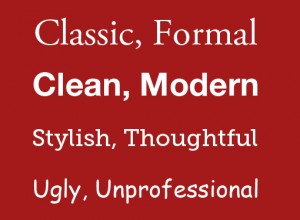
Make sure you understand the message you want to communicate before selecting a font. The classic, old-style serif fonts are formal while sans-serif are more modern.
ds-bp-10

Note: People often think the classics are too boring. They are wrong. These are safe choices.

#5 Make your slides readable

Do not use that amazing photograph as a background if you cannot make your font readable over it. You can get around this by using a simple color bar (example below).

ds-bp-16

#6 Simpler is better

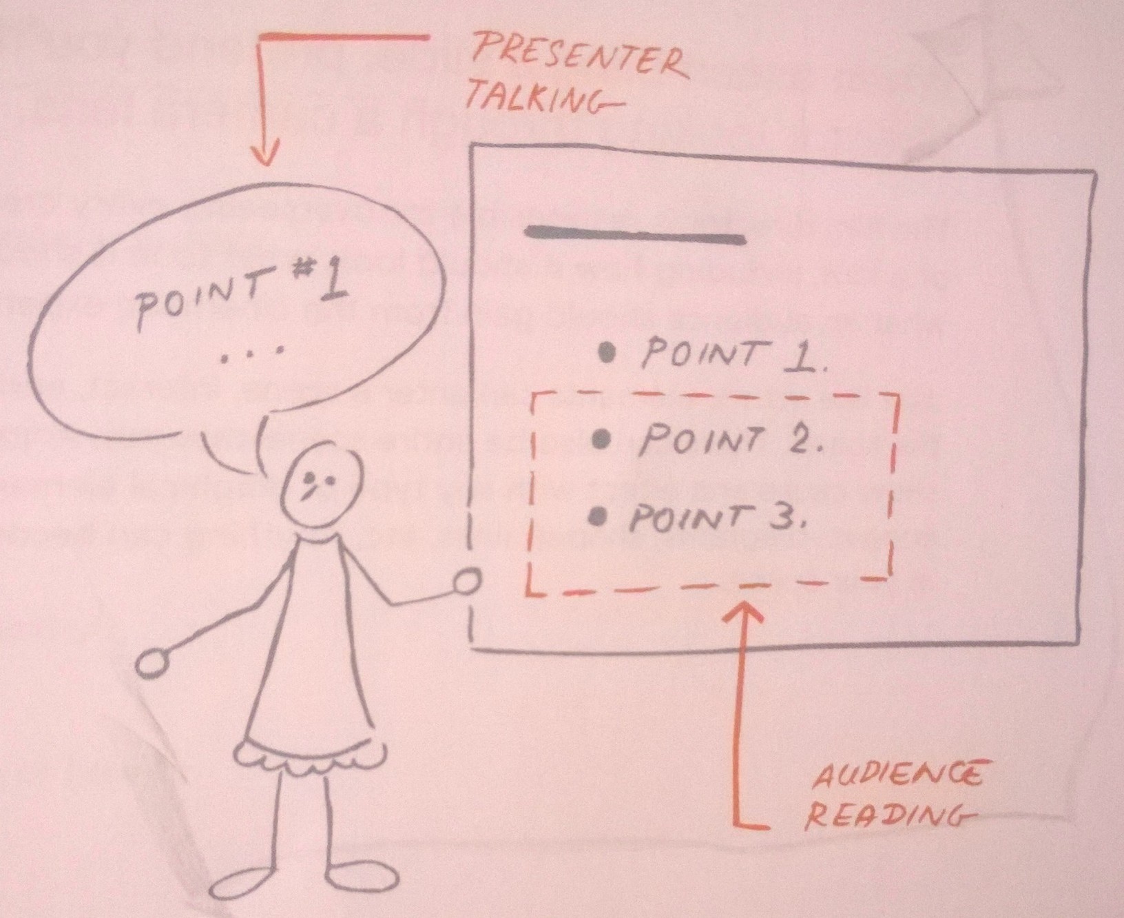
The main content comes from you when presenting, so the slides need to serve as a simplified visual aid. Think of your slides as an outline for your presentation. Additionally, simple slides prevent you from reading them.

#7 Go easy on the bullets

Keep them few in number and simple. Also, they do not need to be self-explanatory because that is what you are there for!

#8 Create clear focal points

Tip #8 may be harder to implement for those with limited design abilities (like me), but the idea is to know where and how to direct your audience’s attention You can do this with color, fonts, text size, and photographs. Without clear focal points, you risk losing your audience.

#9 Design a captivating slide cover

This slide sets the tone for your presentation, so do not ignore it even though it may only be seen for a few seconds. Leaving it up during your introductions helps start the presentation on a positive note and introduces your visual theme.

#10 Add some humor

Your goal is not necessarily to hear laughter. Consider inserting a simple comic or picture that will make your audience smile, as this will help ease any tension in the room. Remember, do not try too hard.

I know that we have some really good slide designers in the program because I have seen some beautiful slides. Anyone have other graphic design tips that the average PowerPoint user can start implementing?