All posts by Matthew Cranford

Misleading Graphs & Statistical Lies

Graphs and Charts are everywhere, and are excellent tools to visually convey statistics, results, trends, data, etc. There are basically three groups of graphs out there that you’ll find on a regular basis:

1.) Graphs created by people who do know what they are doing

2.) Graphs created by people who don’t know what they are doing

3.) Graphs created by people who do know what they are doing and have manipulated it to intentionally deceive the viewer.

There’s a fine line between number 2 and 3 sometimes, and to be effective business leaders, one skill we must possess is the ability to call “BS”, whether intentional or unintentional. Below is a great book to help uncover a lot of deceptive tricks and a few some examples.

A great book that I highly recommend is: “How To Lie With Statistics“. It’s short, cheap, and uncovers numerous tricks people use with charts, graphs, numbers, and statistics to deceive the reader without breaking the rules.

Not to pick on Fox News, but below is a graph that is severely misleading in both the title and the scale of the X-axis. The title leads you to believe the data is by consecutive quarter, and the inaccurate spacing on the X-axis leads to to believe the data is linear.
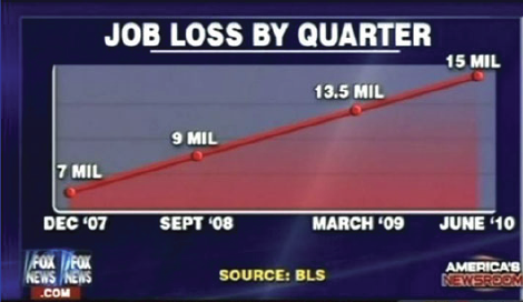
If you title and plot this data accurately, below is what you would get:
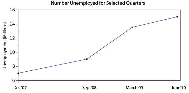
There are many types of errors or tricks that results in the display of data in an inaccurate way. Below are several categories and things to watch out for the next time somebody slaps a fancy looking report down on your desk:

USE OF THE 3D CHART:

Simple use of 3D charts distort the ratio of pies and the height of bars. Notice how Item A and C look more similar in the 3D chart, but flattened, C is less than half of A

ChartMisleading Pie Chart.pngSample Pie Chart.png

 IMPROPER SCALING:

Notice how the intent is to increase the value 3X (Y-Axis), while the perception is that it increased 9X

Improperly scaled picture graph.svg

Comparison of properly and improperly scaled picture graph.svg

The appropriate way to display the increase from 1 to 3 is shown below.
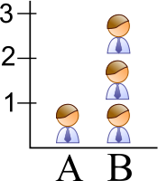
Picture Graph.svg

MISLEADING TRUNCATION:

The truncation on the following graph leads the viewer to believe that group E is nearly twice the size of group A. While sometimes truncation is a great tool in certain situations, it is often misused.

Truncated Bar Graph.svg

Looking at the scale from 0 to 12,000 puts in perspective how slight of a difference there is between groups.
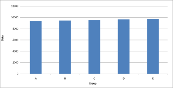
Bar graph.svg

IMPROPER AXIS RANGES:

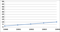
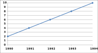
The graph immediately below makes you feel as though the growth over time has been slow and gradual, but a quick change of the axis values gives a completely different perception. Don’t always believe the slopes of lines as they are a function of the Axis values.
Line graph2.svg

Line graph3.svg

OMISSION OF SCALE:

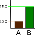
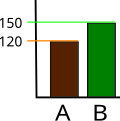
When Scales are left off, the range of the axis is unknown and differences are easily exaggerated or minimized.
Bar graph missing zero1.svg    Example truncated bar graph.svg


Tiny Data: Not An Excuse

When I got my first job as a Process Improvement Engineer for an industry leading company in their flagship facility, my first question to their production manager was: “Where’s the historical data on the process we need to improve?”. His answer was: “Well I know how many pounds of potatoes we usually put in, and I know about how many bags of potato chips come out the other end.”

How could such a sophisticated, industry leading company have so little knowledge about their own processes? Four years later, reflecting back on all the companies I have worked for and had exposure to, few have had the ‘big data’ that is such a popular topic of today’s data analysis discussions.

How do those us us who have only, ‘Tiny Data’ or incomplete data use it to make better decisions and improve out businesses? The first article posted below cites an Army Colonel’s experience:

“Look,” said the colonel, “if I’m on a battlefield trying to defend a hill and I get a piece of intelligence, even if I’m not 100 percent sure that it’s accurate, I will make decisions based on that intelligence.” He strongly believed that it’s better to have some information than none—and that you’d be a fool to disregard it just because it falls short of being definitive.

There are many ways to utilize small amounts of data, incomplete data, and varying quality data. You must find ways to fill in the gaps, determine the variance of the quality, and find ways to draw meaningful conclusions and areas to investigate more fully with small amounts of data.

Branch out and be creative, because a little bit of information is better than no information and is no excuse for simply accepting the status quo.

When Big Data Isn’t An Option

Small Data Analysis

How to Analyze Data With Low Quality or Small Samples 

Not So Linear Improvement

Most of us are taking a hard look at areas that we perceive as weaknesses or need some additional improvement to round ourselves out. As we use various methodologies of pin pointing those areas for improvement we set in action a plan to learn, progress, and improve over time.

Given the 13 week semester, will we all progress the same amount if we all put in equal amounts of effort? David Brooks points out in his article, ‘Learning Is No Easy Task‘, that progress is rarely linear. Tasks yield results in different proportions, and being aware of this phenomenon is the first step to mastering the learning process.

Some learning progressions are logarithmic in shape yielding great advancements on the front end of the learning process; you make a lot of progress when you first begin the activity, but as you get better, it gets harder and harder to improve.

Conversely, some learning progressions are exponential in shape, yielding little progress on the extensive efforts put forth on the front end, but your progress multiplies quickly on the back end of the process.

Learning progress curves come in all shapes and sizes. Some are step functions and some are valleys where you have to go down before going back up to higher highs. Whatever the curve shape, the importance is to be aware of the shape so you can effectively change your mental and strategic approaches to successfully master the learning task.