Category Archives: Uncategorized

Personal reflections on MP: Thoughts from the other side of the table

Last night I had the opportunity to join the one year MBAs, as they delivered their final presentations of the Delta project. After three (long…in a good way) semesters working with professors Noonan and Smith It was fascinating to sit on the other side of the table, and put a critical eye on the work of others. Let me start by saying that all five of the teams that I had the opportunity to watch did a great job, and clearly put time and energy into this project.

While I watched these presentations, what fascinated me most, was how far I feel that we, 2016 EvMBA’s have come since our first semester of MP. I went back and looked at slides from our Carlos Museum project and compared them to slides I saw in both our Delta and our personal reflection projects. I think it is fair to say that we all have come a long way in our story craft, our slide building capabilities, and our delivery techniques.

As I sat in room 234 writing notes and thinking of tough questions that could poke holes in the teams logic, I had to remind myself that they have not had the same opportunity to practice and refine these skills with previous semesters. This highlighted to me that practice really does help to improve these skills, and that I am a far better problem solver today than I was a year ago. I took this thinking one step further and wanted to equate this to my biggest take away from MP.

My key take away from the past three semesters was actually summed up best by Fawad in his final presentation last Thursday evening. As most of you recall, Fawad told a story about his home renovation; a project that revolved heavily around knocking down walls. His key theme, however, was not about the actual act of demolition, or the renovation project itself, but rather around a problem solving technique. As his exact quote escapes me, I will paraphrase a point that Fawad was able to articulate so well. “If you break down large complex problems into identifiable and manageable tasks, you can begin to see how a seemingly daunting task is actually rather simple if approached it the correct way.”

Since last Thursday, I can already recount three instances where I used this piece of advice not only in daily thinking, but also in a presentation to my company. I now view problems and structure solutions in a way that I had never thought about one short year ago.
Steve Jobs and the Value of Deadlines: Real Artists Ship!

jobs-real-artists-ship

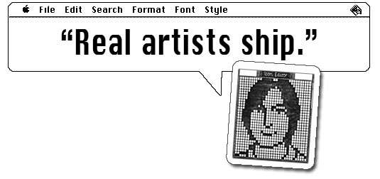
I recently listened to Walter Isaacson’s book Steve Jobs, in which the reader (or in my case the listener) is treated to a behind the scenes view of the rise of Apple, Inc. and the role played by its founder.  One of the most memorable moments in the book comes when only a week before the scheduled launch of the Macintosh a  small team of engineers and designers approaches Jobs to let him know they won’t be able to make the deadline.  In an effort to rally and cajole his team to meet the deadline, he exclaims, “Real Artists Ship!”

The concept was that it doesn’t matter if you’re the most creative person in the world if you can’t deliver on that creativity.  There are no shortages of accounts in Isaacon’s book that suggest Jobs was a lover of creative thinking and artistic design –some might say he held that in higher regard than anything else –but this particular instance indicates his clear understanding on the value of delivering the goods –on setting a deadline and sticking to it, no matter what.

All too often in life (with the exception of legal filing deadlines during my years as a litigator) I have been soft on deadlines.  Whether it’s with myself or with people who are reporting to me.  I adopt an “okay, we can push it back one more week,” mentality, believing, like Jobs’s engineers that one more read through of a contract or one more week spent practicing tennis before a big match is going to make a substantive difference.  Jobs’s point, however, was that it does not matter if you have written the perfect contract or crafted the perfect forehand volley if you can’t get out there and share it with the world.  The reason “real artists ship,” is that you only know about the artists that actually sat down and delivered their work –the others, well, they weren’t artists, they were just dreamers.   So set your deadlines for yourself and your team and stick to them!  Real Artists Ship!

If you’d like to read a firsthand account of what it was like trying to meet the Mac software deadline, you can do so here, where Andy Hertzfeld shares his perspective on running under the gun of Steve Jobs.


Finding your dream job

Over the course of this semester, I have been reflecting on what I want my next adventure to be. I have enjoyed my time with The Carter Center, had many amazing opportunities (including traveling to China, Ethiopia and Ghana) and honed a lot of skills (developing a strategy in a new field for a 20-year old program, designing and executing events, coordinating travel logistics around the globe, researching and writing…a lot, et cetera, et cetera). But I think my time to move on is nigh. In terms of functional skill set, I think I have learned everything that I will learn here. More time at TCC will mean further honing these skills, and continuing to learn more about China. But, those are both things that I can do elsewhere, too.

I have looked through a couple resources for job-seekers that want a clearer way to evaluate multiple paths one can take. Thus far, I have found Forbes’ ‘ideal job algorithm’ to be the best balance of being comprehensive, and straight forward. http://www.forbes.com/sites/brettnelson/2013/02/28/how-to-find-your-dream-job/

The algorithm uses the following parameters to guide you in your evaluation of your next step:

1. Compensation

2. Satisfaction

3. Opportunity

4. Commitment

5. Culture

6. Health

7. Location

8. Teamwork

9. Number of hats

10. Business or retail

And the beauty of this algorithm is that you can adjust the weights depending on what is more valuable to you. Naturally, you can also remove some variables if they are of no importance to you at all, and you can add variables that the author has left out. For example, are you in a phase of your life where location is really important (you just had child, and want to be around your support network)? Do you have some debt (….student loans, perhaps?).

When I shared this with others, they commented that there is no such thing as a “dream job”. Or maybe there is, but searching for jobs is so reliant on timing (mutual availability) and other factors that it is unlikely that we will ever meet up with our dream job. What do you think? I guess this is the same thinking that people can apply to the chances of finding “the one.”

Others have said that we cannot hope for/aim for dream jobs, but should think in terms of “dream careers.” This approach would offer greater feasibility and flexibility. While it may be difficult for each job you have to be “a dreamy job,” certainly there are some valuable take-aways from it that you can use to create a larger dream.

I very well may be too idealistic–do you think it is unreasonable for your job to bring you some sort of higher satisfaction? I have heard that critique of our generation–that we expect our jobs to provide us with some sort of higher purpose, and we are often disappointed when it does not live up to that. Instead, it provides a place for us to go and be busy every day, and a way to pay the bills.

This is a very broad question, perhaps the broadest question you can ask about work life/careers in general–what is the ultimate goal? I’d be happy to hear your two cents.

Art of Persuasion: Tell a story

Persuasion: /pər-ˈswā-zhən/ The act of causing people to do or believe something.

Persuasion is the centerpiece of any  business activity. Customers must be convinced to buy your company’s products or services, employees and colleagues to go along with a new strategic plan or reorganization, investors to buy (or not to sell) your stock, and partners to sign the next deal.  Persuasion, despite being so critically important, history has shown that  many leaders, business executives  struggle to communicate , too often, the message  gets lost in the accoutrements of companyspeak: PowerPoint slides, dry memos, and hyperbolic missives from the corporate communications department.

Robert McKee , leading screenwriting instructor in his recent article on Harvard business review  suggests that   speakers can engage listeners on a whole new level if they toss their PowerPoint slides and learn to tell good stories instead. According to Mckee, there are two ways to persuade people. First, Using conventional Rhetoric  and second, through Uniting an Idea with emotion.Out of two the latter being the most powerful, and is best accomplished by telling a story.

Storytelling That Moves People


Powerpoint: Its not just what you say….

Read an interesting article the other day when putting together my MP presentation: Check it out.

It brings up some very interesting points about what makes a good power point presentation – specifically good slide craft.   By focusing on several key cognitive principles (having to do with mental processes and how we intake and process information), the article  reduces concept to execution by outlining several ways to obey the principles when creating slides.

My personal favorites have to do with using visual queues to trigger the brain to ingest information in specific ways.  When discussing ranked information, by maintaining color schemes and orderings across slides, it is possible to increase memory retention in the audience.  Or by making important information visible different from the other contents of the slide, it signals the brain that the visually different information is potentially more important that the rest on the slide.

I highly recommend that you run through the first 6 pages at least and compare the cognitive corollaries listed with slides you’ve done or seen in the past.

Takeaways from being an MP judge

Last night, I volunteered to judge the Delta presentations of the 2015 one-year MBA students. It felt good not being the presenter and  really good being the judge 🙂 Below are some key takeaways of mine.

Need for Visuals : I’m completely convinced of the need for more visuals and less text. It was very difficult to take in anything when the presentations are loaded with text. Some of the one’s were really really text heavy and it wasn’t easy to concentrate.  So you may ask, how much text is appropriate ? I felt one to two sentences per slide mixed with visuals to be more appealing.  Anything beyond that, I had difficulty moving back and forth between the screen and the presenter.

Need for Simplicity : Teams with simplicity in their slide-crafting kept me more engaged and more interested. Slides with just one data image helped me absorb the content. Whenever there was too much data on one slide, I checked out of the presentation for few minutes.  The problem with that is, even if the listener wants to check-in again it won’t be easy for him to follow. This is my take on the need for simplicity. This is an essential ingredient if you want your audience engaged totally.

Need for laughter : It’s very easy to get bored when you are just watching presentation after presentation.  If you know you will be in situations like that, it helps to have a slide that can make the audience laugh so that they can get back into the presentation

Need for honesty : When someone asks you a question at the end, it’s ok to say “yeah, we didn’t consider that issue”  instead of saying something to cover up. This helps building trust which, I believe, is the foundation for any business relationship

It was a great learning experience to be on the other side. My long trip from John Creek was well worth it. Thank You, Prof. Noonan for giving us this opportunity


Bad Presentation? Maybe not…

Ever feel like you totally bombed a presentation? Here are a few things to consider because odds are it didn’t go as bad as you think.


And the most important piece of advice I can offer: don’t get distracted during a presentation because you think it isn’t going the way you hoped. “Reading” your audience is important, but don’t “over-read” a situation. Stick to the basic game plan and you will execute just fine.

Olivia Mitchell shares a few words of wisdom:

1. You can’t tell how a presentation went just by looking at people

Emma didn’t get much positive nonverbal feedback from her audience. She felt like they were just starting at her blankly and she was like a deer caught in the headlights. And she made the worst possible assumptions about what the audience were thinking. Like:

“…maybe people hated the presentation.”

“…she was boring.”

Here’s the thing: you can’t tell what an audience member is thinking by the way that they look. A person can look totally blank and yet be intensely interested in what you’re saying. If you went to the front of a movie theater and looked back at the audience you’d probably be looking out on a sea of slack-jawed blank faces.

I’ve been constantly surprised by people in my audience who looked totally bored and disinterested or even cynical and then I’ve talked to them later and found that they enjoyed it and found it interesting and valuable.

When I see a person who looks bored I still have a little voice in my head that pipes up  “Oh you’re bombing, they’re bored.” I fight back against that voice by saying “No, that’s not true. You don’t know that they’re bored. Plenty of times people look bored but are in fact getting lots of value.”  The voice shuts up. That allows me to just get on with delivering my presentation and engaging with people.

2. All audiences are different

Emma is assuming that because her audience looked blank they didn’t like the presentation. But the way an audience reacts to a presentation is often more about the audience than about the presentation. Audiences can react to the same presentation in many different ways. Because I deliver roughly the same material all the time I’m reminded of this constantly. I’ll deliver the same material and get different reactions. Some of the factors that influence their reaction are:

Confidence: an audience full of confident people will generally give you lots of nonverbal feedback – nodding, smiling etc. If they’re not confident they may not even make eye contact with you. For example, in our Introduction to Presenting course which is tailored for nervous beginners I know that some participants are unlikely to make eye contact with me during the first hour. I’m now prepared for this.

How well they know each other: an audience of friends will be very different to an audience of strangers. An audience of friends who trust each other are likely to laugh more, banter with you etc. I experience this when we run an inhouse course for a tightly-knit team compared to a public course where no-one knows each other to begin with.

My partner, Tony, does some amateur acting. The cast deliver exactly the same play night after night. But the audience reaction can be different every night.

What’s the point of this? When you’re in front of people speaking you feel vulnerable and you’re primed to take it personally. But, the audience reaction (or lack of it) is not necessarily about you.

3. Your perceptions can be very faulty

Emma felt flustered and felt that she was bombing. Just because she felt that way doesn’t mean it was true.

I have a good friend who presents regularly all over the world. One particular presentation, things went wrong for her at the start, she got rattled and she thought the whole presentation was an absolute unmitigated disaster. Luckily, on that trip she’d taken her 23 year old daughter with her. Her daughter was able to set her straight and tell her that the presentation was fine. Maybe not her best performance ever – but fine.

The story behind your presentation

Just a quick one…

The beginning of this HBR article, How to give a killer presentation, is intriguing to the relationship of what many of us just experienced in our final presentations of MP.  Even though this article is shortened to non-subscribers, the intriguing part to me is the basis of the article – a story about a boy who had a story to tell.  The 90+ of us just finished our presentations, and it was amazing to see what some of my peers had to say.  Learning from each other is one of the biggest facets of this program, yet at the same time this isn’t just to learn about each others’ business knowledge, but to learn about the more personal part of each others’ lives.

Many of us gave great presentations, and as this article began, you have to begin with a good background to your story.  I think the key to this article is not just another subset of bulletpoints of how to do a process (although that’s probably where the article heads), but to make you think about what the baseline of any presentation needs to be – a good story.  A lot of times we can get caught up in the details – get caught up in the data.  Presenting the data is so critical, that we forget what the baseline is, and how to bring the story completely together, full circle.  Without a clearly stated statement at the beginning of your presentation, there’s a good chance you’ve already lost a large part of the story you’re trying to tell.

http://hbr.org/2013/06/how-to-give-a-killer-presentation/ar/1

Misleading Graphs & Statistical Lies

Graphs and Charts are everywhere, and are excellent tools to visually convey statistics, results, trends, data, etc. There are basically three groups of graphs out there that you’ll find on a regular basis:

1.) Graphs created by people who do know what they are doing

2.) Graphs created by people who don’t know what they are doing

3.) Graphs created by people who do know what they are doing and have manipulated it to intentionally deceive the viewer.

There’s a fine line between number 2 and 3 sometimes, and to be effective business leaders, one skill we must possess is the ability to call “BS”, whether intentional or unintentional. Below is a great book to help uncover a lot of deceptive tricks and a few some examples.

A great book that I highly recommend is: “How To Lie With Statistics“. It’s short, cheap, and uncovers numerous tricks people use with charts, graphs, numbers, and statistics to deceive the reader without breaking the rules.

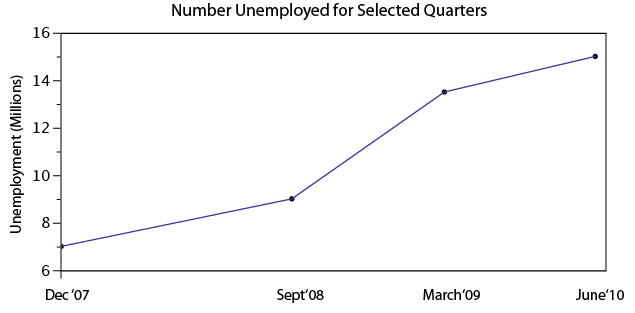
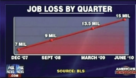
Not to pick on Fox News, but below is a graph that is severely misleading in both the title and the scale of the X-axis. The title leads you to believe the data is by consecutive quarter, and the inaccurate spacing on the X-axis leads to to believe the data is linear.

If you title and plot this data accurately, below is what you would get:

There are many types of errors or tricks that results in the display of data in an inaccurate way. Below are several categories and things to watch out for the next time somebody slaps a fancy looking report down on your desk:

USE OF THE 3D CHART:

Simple use of 3D charts distort the ratio of pies and the height of bars. Notice how Item A and C look more similar in the 3D chart, but flattened, C is less than half of A

ChartMisleading Pie Chart.pngSample Pie Chart.png

 IMPROPER SCALING:

Notice how the intent is to increase the value 3X (Y-Axis), while the perception is that it increased 9X

Improperly scaled picture graph.svg

Comparison of properly and improperly scaled picture graph.svg

The appropriate way to display the increase from 1 to 3 is shown below.

Picture Graph.svg

MISLEADING TRUNCATION:

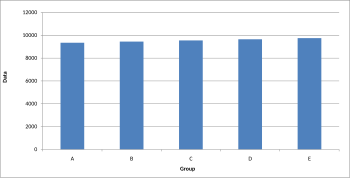
The truncation on the following graph leads the viewer to believe that group E is nearly twice the size of group A. While sometimes truncation is a great tool in certain situations, it is often misused.

Truncated Bar Graph.svg

Looking at the scale from 0 to 12,000 puts in perspective how slight of a difference there is between groups.

Bar graph.svg

IMPROPER AXIS RANGES:

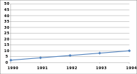
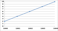
The graph immediately below makes you feel as though the growth over time has been slow and gradual, but a quick change of the axis values gives a completely different perception. Don’t always believe the slopes of lines as they are a function of the Axis values.

Line graph2.svg

Line graph3.svg

OMISSION OF SCALE:

When Scales are left off, the range of the axis is unknown and differences are easily exaggerated or minimized.

Bar graph missing zero1.svg    Example truncated bar graph.svg


The Lion King: What we can learn from Simba’s story

In a recent article over at copyblogger.com by Sean D’Souza he takes us through the three critical components of great stories by telling drawing a parallel to a Disney classic.  In my rendition I’ll convert his story of Cinderalla to the Lion King…because that is my favorite, and this is my post.

1.  The Sequence:

We’ve got Simba who’s the heir of to the throne at Pride Rock that runs into trouble when he faces his Uncle Scar’s quest to make the throne his own.  Simba is manipulated by Scar into thinking he is responsible for the tragic death of his Father and King, Mufasa.

There’s a sequence of events that are critical to building the drama needed in a good story.

2. The Suspense:

Simba runs away to avoid facing his Father’s untimely death.  He learns a new way of life and makes some entertaining friends along the way.  Meanwhile things take a turn for the worse when Scar unleashes his accomplices – the hyena’s on the fertile grounds surrounding Pride Rock.

Will Simba ever head back to face his past?  Who is this Nala character and why do I like her so much?  Does Simba get the girl?  All suspense.

3.  The roller coaster:

Highs and lows allow you to show the contrast and let the audience dig into the fact that this story really is worthwhile.  It keeps them on the edge of their seats waiting for the resolution.

So why is this kind of story telling critical?  Two reasons:

1. Most writers are unable to capture the elements of the story.

According to D’Souza, “Even if they get the sequence right, they rarely build in the suspense or the roller coaster.  That’s because they aren’t aware of these elements, or just don’t know how to go about it.”

2.  Most articles are almost always how-to or reporter like.

Stories are just more interesting and will naturally pique the reader’s interest more than reports.

The classic stories, Disney or otherwise, constantly bring people back time and time again when they already know the ending.  Now you know why.  With a little bit of practice you can implement this three step approach.  Or at a minimum give some thought to why you love your favorite Disney cartoon so much.