Category Archives: charts & graphs

Being Intentional with your Data and Giving your Graphics a Voice!

I have a particular interest in evaluation in the workplace– the evaluation of employees, work output, employers, etc. In the types of programs I’ve been in, I have found in very useful. However, I’m sure that most companies don’t have the time to thoroughly evaluate their work in a systematic and organized way. I have always worked in the research/higher education end of business, and so I don’t personally have experience with how evaluation works in the corporate setting.  How does evaluation look like in your industry or company?

A few years ago, I came across this site and I have been a fan ever since. The group is called Evergreen Data and they focus on intentional reporting and data visualization. I work in public health/higher education, and the public health industry is very data-heavy. Data in public health is used for analysis, program planning, grant opportunities, research, etc. and so I have seen the benefits of its use in my industry. What does your company do with its evaluation data?

This particular site had a checklist on how you should layout your evaluation reports which I’ve found super helpful! The purpose of the checklist is to help identify what parts of an evaluation report can be enhanced through the use of graphics.

Here are some of the items they had in their checklist:

  • Text font and size (sans serif and size 9-11)
  • Text uniformity
  • Line spacing (between 11-13 points)
  • Headers/callouts
  • The number of different types of fonts that you should use (no more than three!)
  • Don’t make too “strong” or “bold” of bullet points
  • Alignment (be consistent!)
  • Make sure that items in page that are grouped together are related
  • Utilize white/empty space!
  • Use of pictures/graphics – individuals learn differently from one another
  • Use color changes for a purpose (are you being intentional by choosing to change the color of a font or header?)

Evergreen also has an additional checklist that’s used for data visualization. It’s specific to making your graphs speak for themselves! This is a great resource as well.

What are some of the tips you have when creating reports (not exclusive to evaluation reports)? What steps do you take to have your data share a “story” or a “point”? Are you intentional in your decisions in terms of report layouts, font, graphics, etc.? Do you find that you have to pay more attention to this? 
Beer and Infographics DO mix

I’ve been tinkering with Adobe InDesign and Illustrator. These programs are very powerful but can be equally as frustrating to manipulate – much more manageable after a couple beers.

I put together this standalone document to illustrate the rise of the craft and microbrewery industry. The content is engaging but I’m most interested in your thoughts on the formatting and design. Don’t worry about holding any punches – this is an early shot at the tool and feedback is helpful.

Thanks and here is the PDF:
Beer and Infographics

Alternatives to PowerPoint

PowerPoint Alternatives: Will PowerPoint Ever be Obsolete?

Will PowerPoint ever be replaced?  It has become commonly accepted in the business world that ‘PowerPoint’ is synonymous with ‘Presentation’. However, when is the last time that you (or me, or anyone for that matter) questioned the validity of that accepted standard, or even gave fleeting consideration to using a different presentation platform or software program?

So, that leads to the question of whether or not PowerPoint will ever become obsolete, outdated, or replaced by something newer and shinier. In researching thoughts on this topic by folks smarter than myself (such as Jeff Bezos, CEO of Amazon, in this article), I discovered a few things.

First of all, there are already many of alternatives to PowerPoint, and while they might not be household names, they can arguably match the functionality of PowerPoint, and perhaps even be more targeted towards your audience depending on the nature of the presentation. Some of the more popular alternatives to PowerPoint include Apple’s Keynote (which Steve Jobs popularized by using when rolling out new products), Google docs (free, ‘quick and dirty”), SlideRocket (great for folks in a sales environment), and perhaps most notably, Prezi (Intuitive, sophisticated, puts ‘slides in motion’, great for storytelling).

I am personally considering giving Prezi a try based on the positive reviews and feedback that I have read and would love to hear from anyone in our class who has tried the software first-hand. It does seem that one day PowerPoint might be replaced as the gold standard for delivering presentations, but that day is likely not going to come anytime soon, and we are likely better off improving our delivery method rather than changing the platform all-together.

So, what are your thoughts??


Articles for Reference:

http://www.forbes.com/sites/carminegallo/2012/09/07/jeff-bezos-and-the-end-of-powerpoint-as-we-know-it/

http://lifehacker.com/5888189/five-best-powerpoint-alternatives

http://www.customshow.com/best-powerpoint-alternatives-presentation-programs/

http://www.powtoon.com/blog/10-best-powerpoint-alternatives/


Infographics on the Job

In my earlier post on this subject, I discussed the history of information design and some best practices associated with its use today.  It’s great to consider the past and present of this art, but what about the real context for most of us on a day-to-day basis?

In my career thus far, I haven’t to do much of this type of work.  In fact, between undergrad and business school, I don’t think I touched PowerPoint more than a few times.  Well, those days are over!  I’ve been serving in my new role at Arby’s for almost a month now, and I’ve already been asked to create what we call “one pagers.”  These summaries are a brief overview of a topic, usually presented via a PowerPoint slide.  It’s important that they present only the most critical information, and are used during the numerous meetings that happen on a daily basis.

So what role do infographics play?  Let’s just say that they’re a team player and not the star.  Our one-pagers are generally mostly text, organized in a way that is very clear and easy to read.  The graphs, data, etc. typically plays a support role or is left out altogether, only to be presented in more thorough presentations.  The key here is to extract the data into bullet points or going beyond that, make your point or recommendation based on the data.  I found a good example of the general form we use on, of all places, the Citizens for Public Justice website.  I agree with their format, and it can be seen here: http://www.cpj.ca/content/how-write-one-page-brief

I still believe that I will have to create a good bit of graphs and charts, however I think the true, modern form of infographics are typically left up to the design types and corporate communications department.  Luckily, the organization is fairly flat and meeting with those people, collaboration, and learning from them is eminent.

Although I may not be presenting as much of this type of work as I had expected, I believe I will certainly know how to create meaningful visualizations of data to support my future recommendations.  I look forward to the challenge and continued learning!

Misleading Graphs & Statistical Lies

Graphs and Charts are everywhere, and are excellent tools to visually convey statistics, results, trends, data, etc. There are basically three groups of graphs out there that you’ll find on a regular basis:

1.) Graphs created by people who do know what they are doing

2.) Graphs created by people who don’t know what they are doing

3.) Graphs created by people who do know what they are doing and have manipulated it to intentionally deceive the viewer.

There’s a fine line between number 2 and 3 sometimes, and to be effective business leaders, one skill we must possess is the ability to call “BS”, whether intentional or unintentional. Below is a great book to help uncover a lot of deceptive tricks and a few some examples.

A great book that I highly recommend is: “How To Lie With Statistics“. It’s short, cheap, and uncovers numerous tricks people use with charts, graphs, numbers, and statistics to deceive the reader without breaking the rules.

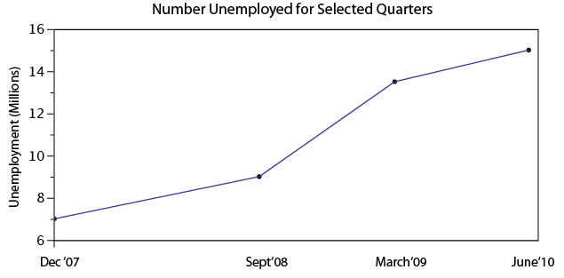
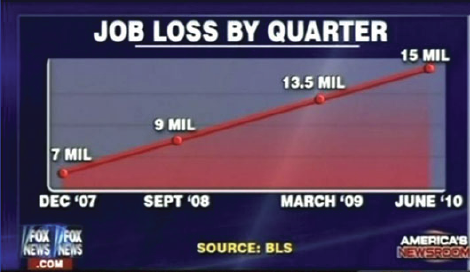
Not to pick on Fox News, but below is a graph that is severely misleading in both the title and the scale of the X-axis. The title leads you to believe the data is by consecutive quarter, and the inaccurate spacing on the X-axis leads to to believe the data is linear.

If you title and plot this data accurately, below is what you would get:

There are many types of errors or tricks that results in the display of data in an inaccurate way. Below are several categories and things to watch out for the next time somebody slaps a fancy looking report down on your desk:

USE OF THE 3D CHART:

Simple use of 3D charts distort the ratio of pies and the height of bars. Notice how Item A and C look more similar in the 3D chart, but flattened, C is less than half of A

ChartMisleading Pie Chart.pngSample Pie Chart.png

 IMPROPER SCALING:

Notice how the intent is to increase the value 3X (Y-Axis), while the perception is that it increased 9X

Improperly scaled picture graph.svg

Comparison of properly and improperly scaled picture graph.svg

The appropriate way to display the increase from 1 to 3 is shown below.

Picture Graph.svg

MISLEADING TRUNCATION:

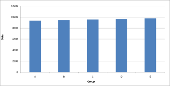
The truncation on the following graph leads the viewer to believe that group E is nearly twice the size of group A. While sometimes truncation is a great tool in certain situations, it is often misused.

Truncated Bar Graph.svg

Looking at the scale from 0 to 12,000 puts in perspective how slight of a difference there is between groups.

Bar graph.svg

IMPROPER AXIS RANGES:

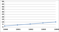
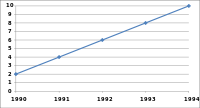
The graph immediately below makes you feel as though the growth over time has been slow and gradual, but a quick change of the axis values gives a completely different perception. Don’t always believe the slopes of lines as they are a function of the Axis values.

Line graph2.svg

Line graph3.svg

OMISSION OF SCALE:

When Scales are left off, the range of the axis is unknown and differences are easily exaggerated or minimized.

Bar graph missing zero1.svg    Example truncated bar graph.svg


My Challenges with Excel

C.S. Lewis (1898-1963), Fellow and Tutor in English Literature at Oxford University, and Chair of Medieval and Renaissance English at Cambridge, was an intellectual giant of the 20th century. In later life, reflecting on challenges he faced in his younger days, Lewis remarked:

I could never have gone very far in any science, because in the path of every science the lion mathematics lies in wait for you. Even in mathematics whatever could be done by mere reasoning as in simple geometry I did with delight. But the moment calculation came in I was helpless. I grasped the principles but my answers were always wrong. Yet though I never could have been a scientist, I had scientific as well as imaginative impulses and I loved ratiocination*.”

To be candid, I have some apprehension when it comes to Excel . . . made all the more pressing because of how central excel skills are to the practice of finance. So when I consider my excel challenges I draw much encouragement from these thoughts of C.S. Lewis.

Although I have a deep passion for finance, and have worked in investment management for 10 years, my position at work has been more about interpreting and leveraging excel generated data, rather than performing the actual work of creating spreadsheet models myself.

The result is that up till now, my excel skills have languished.  Thus I’m grateful that our MBA program has forced me to improve. In this spirit, (and acting on the advice of professor Noonan) I’ve set out to build my own personal top 10 excel skillset, that will be useful to my financial career.  Some of these may seem rather obvious, but excel is my self-selected focus area and I figured that I could subject my list to public opinion and scrutiny, in the hope that collaborative discussion might occur. I also thought that some of this material might be useful for those considering a financial career.

Rough draft of “Top 10” excel skills for investment management and financial planning for high net worth individuals, families, trusts, and charitable foundations:

  1. Precision tree
  2. Sensitivity analysis, useful for evaluating insurance policies
  3. Goal Seek
  4. Historical market and financial instrument analysis
  5. Excel integration with Word and PowerPoint
  6. Configuring excel for pleasant appearance and functionality
  7. Mortgage / Bond / Annuity amortization schedules
  8. Learning to manipulate and efficiently sort data – this is hugely important for many areas within our business such as ranking client positions, asset allocation decisions, analysis of individual positions, and assessing performance in order to prioritize investment decisions
  9. Graphing portfolio performance vs. relevant market benchmarks
  10. Leveraging excel with proprietary finance software used by major financial enterprises. (our firm uses Advent)

When I reflect on the challenges of the first year of MBA school, I am glad that I have improved in several of theses areas and incorporated them into different assignments and projects. Our cohort has aided much of my improvement.

For example, during first semester, I was fortunate to be on a team with Shehzad Shabuddin, who was quite generous with his time and patient with helping me make progress on excel. Shehzad’s blog post, The Excel trap, reminds us of the dangers of reducing life to data and mathematics. Excel-ing in Real Estate by Bob Caperton and the article by Barry Slaymaker on MBA level excel skills were both particularly helpful. I’m also hopeful that I can persuade Joe Song to give me some Excel lessons between now and graduation.

One of the most powerful lessons I have learned in life (and a “key content” area of MP) is the importance of surrounding yourself with others whose complementary strengths have the capacity to offset your personal areas of weakness.  My next blog post will examine a leader who intimately understood just how powerful this principal is, and became a great, and most unexpected, actor in history.

*Ratiocination, noun. – the process of logical reasoning. [1520-30]

10 tips on how to make slides that communicate your idea, from TED’s in-house expert

One of the skills that I chose to work on this semester was improving my presentation skills and slide design. In the past, I have been guilty of using the standard slide template, including too much text and underutilizing images. Over the course of the semester, I have been tasked with giving two presentations at work and have found ways to visually enhance my slides that have resulted in more effective presentations.

I recently came across an article on the TEDBlog that was written by Aaron Weyenberg, a UX Lead at Ted, and internally referred to as the master of slide decks. Below are 10 tips on how to make effective slides that he identified, however I have highlighted 2 tips that I found the most insightful and provided excerpts from the article.

  1. Think about your slides last. 
  2. Create a consistent look and feel. 
  3. Think about topic transitions. 
  4. With text, less is almost always more. 
  5. Use photos that enhance meaning.
  • I love using simple, punchy photos in presentations, because they help what you’re saying resonate in your audience’s mind without pulling their attention from your spoken words. Look for photos that (1) speak strongly to the concept you’re talking about and (2) aren’t compositionally complex. Your photo could be a metaphor or something more literal, but it should be clear why the audience is looking at it, and why it’s paired with what you’re saying. Below is an example of a photo I used in a deck to talk about the launch of the new TED.com. The point I was making was that a launch isn’t the end of a project—it’s the beginning of something new.

newbeginning-1

  • I found this tip to be eye-opening for me because I tend to be more literal in my presentations, so it was interesting to see how Aaron Weyenberg uses images to represent more tactical elements. For example, I am currently working on a deck outlining the new features of the upcoming relaunch of CNN.com, and instead of opening the presentation with an image from the new site, I’m planning on using a photo that represents the essence of the redesign and the impact it will have on the user.

6. Go easy on the effects and transitions.

7.  Use masking to direct attention in images.

If you want to point something out in a photo, you could use a big arrow. Or you could do what I call a dupe-and-mask. I do this a lot when showing new page designs, particularly when I don’t want the audience to see the whole design until I’m finished talking about individual components of it. Here’s the original image:

mask-11

Here’s the process for masking it. (1) Set the image transparency to something less than 100. (2) Duplicate that image so there is one directly over the top of the other. (3) Set the dup’d image transparency back to 100. and (4) Follow the technique here to mask the dup’d image. You’ll end up with something that looks like this:

mask-31

  • I am often faced with this problem since my work is primarily focused on CNN.com, so many of my presentations include screenshots of our website. The tip above is a really great way to still show the site, but hone in on an area in a very interesting way.

8. Try panning large images.
9. For video, don’t use autoplay.
10. Reproduce simple charts and graphs.

Here’s the link to the full article where you can get the details on each tip.


Effective Data Visualization

One of the most critical items in crafting in effective presentation is the proper visualization of supporting data.  A good picture will both engage the audience and highlight the salient features embedded within the data.  As a scientist, I have sat through numerous talks with poorly executed visualizations—tables overcrowded with numbers (most of which are irrelevant), plots containing too many overlapping and indistinguishable lines, indecipherable figures, etc…  The result of these was, almost uniformly, audiences who were uninterested and unwilling to believe the conclusions because they couldn’t understand any of the data being presented.  Even though there are plenty of examples of what not to do, sometimes it can be hard to find positive examples, especially for presenting the complex data or results that come out of business analysis.  While looking for ways to develop my visualization skills, I recently encountered this blog post: http://www.targetprocess.com/articles/visual-encoding.html, which has a few good rules-of-thumb for creating presentations:

  • Humans do better comparing relative areas, so if you want to map data to a shape, you should map it to its area.
  • Use no more than a dozen colors to encode categories effectively.  If there’s more, it becomes difficult to differentiate them.
  • A diverging color scale should have different colors for positive and negative values.
  • A planar chart is best for representing simple two variable data sets.

As an example of how good data visualization can help build a story and highlight underlying trends and relationships, here are, what I think, are two effective uses of a particular visualization type called a heat map.  In a heat map, data are plotted on a plane (usually projected onto an image of some particular area) and colored according to frequency or some other variable.  This representation helps quickly highlight where important areas (geographic or other) are on the map.

From The New York Times, a good visualization of basketball players shooting and scoring patterns: http://www.nytimes.com/interactive/2012/06/11/sports/basketball/nba-shot-analysis.html

And finally, a visualization of where all the action is on a typical World of Tanks game on the Abbey map: http://www.vbaddict.net/heatmaps/abbey/12


Crap Circles

It’s Time to Retire ‘Crap Circles’” by Gardiner Morse, may be my favorite HBR article that I have read this semester. Morse makes the point that people often add graphics to PowerPoint presentations without considering if the graphic actually supports their model or idea. Obviously, graphics can be an effective tool for connecting to an audience, more so than a slide deck packed full of text, however, before including a “crap circle” make sure the idea that you are attempting to portray is circular in nature and not linear.

Here are a two bad examples from Morse’s article:

An accounting firm graphic for company services (in a circular graphic): 1) Conception/Start-up Phase, 2) Survival Phase, 3) Growth Phase, 4) Take-off Phase, and 5) Maturity Phase. There is an arrow between each phase pointing to the next. So the question is, how does the fifth phase of Maturity Phase progress into the first phase of Conception/Start-up? It doesn’t.

A solar energy advocacy group use a circular graphic in an attempt to display the relationship between supply and demand for solar power. “Supply Goes Up” as economies of scale are improved, feeds into “Demand Goes Up” as more people and cities begin producing their own power. As “Demand Goes Up” this feeds back into “Supply Goes Up”. Their graphic creates an endless loop of awesomeness for their product and company.

Bottom line, don’t just add random graphics to presentations because they are better than text, be sure to ask yourself if the graphic accurately and effectively portrays the model or idea.

Data Visualization – Tableau

For starters, check out this video

I sometimes struggle with conveying my analysis (say, in Excel) into a presentation (say, in PowerPoint). The best way to capture the attention of your audience and to deliver an effective presentation is through data visualization. No matter how sound and detailed your analysis, if it is not communicated well to your audience then all of your hard work in performing that analysis was wasted.

Presenting data in a visual format can often be the quickest and most effective ways to convey results of your analysis and capture the attention of your audience. This can communicate a message that may have taken hours to develop in a matter of seconds if done correctly.

One of my favorite new data visualization resources that I am learning to use is called Tableau. Tableau is a software company that was founded in 2003 and does nothing other than data visualization. The company had sales of $34.2 Million in 2010 which grew to an astonishing $232.44 Million in 2013 and the company went public. It is now traded on the NYSE (ticker: DATA). It is extremely intuitive and the product looks amazing. Here is a great video that gives you an overview of the capabilities of Tableau (also linked above).

There are some really revolutionary and interesting methods to communicate data visually that are becoming more and more accepted in business and is thought by many as a way for companies to distinguish themselves among their peers. Often times my company might be similarly positioned to perform work for a given client, and I have seen that a lot of the work we have “won” has come from an effective pitch that highlights the strengths of our organization in a visually compelling manner that engages the client and shows that we can “give meaning to numbers” which is a skill that is hard to quantify.

I would be curious to get any thoughts on your experience with data visualization software and any recommendations you might have.


Other helpful data visualization links:

http://www.scientificamerican.com/article/the-data-visualization-revolution/

http://blogs.hbr.org/2014/04/the-quick-and-dirty-on-data-visualization/

http://fortune.com/2011/11/15/how-tableau-software-makes-business-data-beautiful/