Graphs and Charts are everywhere, and are excellent tools to visually convey statistics, results, trends, data, etc. There are basically three groups of graphs out there that you’ll find on a regular basis:
1.) Graphs created by people who do know what they are doing
2.) Graphs created by people who don’t know what they are doing
3.) Graphs created by people who do know what they are doing and have manipulated it to intentionally deceive the viewer.
There’s a fine line between number 2 and 3 sometimes, and to be effective business leaders, one skill we must possess is the ability to call “BS”, whether intentional or unintentional. Below is a great book to help uncover a lot of deceptive tricks and a few some examples.
A great book that I highly recommend is: “How To Lie With Statistics“. It’s short, cheap, and uncovers numerous tricks people use with charts, graphs, numbers, and statistics to deceive the reader without breaking the rules.
Not to pick on Fox News, but below is a graph that is severely misleading in both the title and the scale of the X-axis. The title leads you to believe the data is by consecutive quarter, and the inaccurate spacing on the X-axis leads to to believe the data is linear.
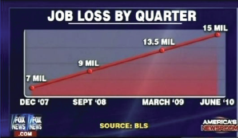
If you title and plot this data accurately, below is what you would get:
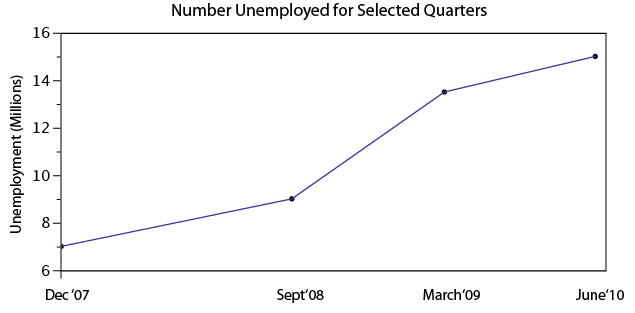
There are many types of errors or tricks that results in the display of data in an inaccurate way. Below are several categories and things to watch out for the next time somebody slaps a fancy looking report down on your desk:
USE OF THE 3D CHART:
Simple use of 3D charts distort the ratio of pies and the height of bars. Notice how Item A and C look more similar in the 3D chart, but flattened, C is less than half of A
Chart

IMPROPER SCALING:
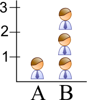
Notice how the intent is to increase the value 3X (Y-Axis), while the perception is that it increased 9X
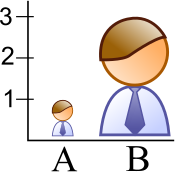

The appropriate way to display the increase from 1 to 3 is shown below.
MISLEADING TRUNCATION:
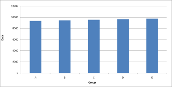
The truncation on the following graph leads the viewer to believe that group E is nearly twice the size of group A. While sometimes truncation is a great tool in certain situations, it is often misused.

Looking at the scale from 0 to 12,000 puts in perspective how slight of a difference there is between groups.
IMPROPER AXIS RANGES:
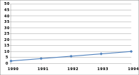
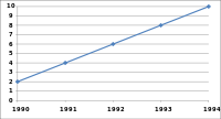
The graph immediately below makes you feel as though the growth over time has been slow and gradual, but a quick change of the axis values gives a completely different perception. Don’t always believe the slopes of lines as they are a function of the Axis values.
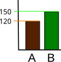
OMISSION OF SCALE:
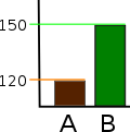
When Scales are left off, the range of the axis is unknown and differences are easily exaggerated or minimized.
Great article! Related to this is the misinterpretation of the real world onto maps. Because my job deals with real estate, it is important to understand the difference between what the map says and what is really there. This was even more important before the proliferation of Google Maps, Google Earth, and other GIS mapping products.
Some of my favorite examples of misleading maps include the London tube map and the map of California as an island in the Pacific Ocean, not to mention the whole Apple Maps fiasco.
London: http://www.creativedataprojects.com/2011/06/what-does-londons-tube-map-really-look-like/
California: http://www.wanderlust.co.uk/magazine/blogs/weird@wanderlust/the-worlds-most-misleading-maps
That article about the London Tube was pretty awesome. I’ve always thought about what the Tube and other subways really looked like underground. I guess with all the mapping technology that exists, we just assume distances and relationships are correctly portrayed on maps.
It is also important to point out that you could have the right data and the proper graph, but if you don’t label your graphs and make it clear to the audience, the credibility could easily be thrown out the door.
Thanks for posting this, Matt. It’s a great reminder of how important it is to be clear and transparent about where you are getting your data, but how you are presenting it. Graphs, statistics and the like can be SO easily manipulated to fit a certain scenario. It’s crucial as a presenter to make sure you know where your materials are coming from and if they are reliable.
But on the flip side, you as a viewer need to be able to recognize flawed data when you see it. This can be difficult, but if the facts presented seem a little too “convenient”, they probably are. That’s why it’s always important to double check facts and graphics yourself before you accidentally spread any misinformation.