Category Archives: PowerPoint resources

Being Intentional with your Data and Giving your Graphics a Voice!

I have a particular interest in evaluation in the workplace– the evaluation of employees, work output, employers, etc. In the types of programs I’ve been in, I have found in very useful. However, I’m sure that most companies don’t have the time to thoroughly evaluate their work in a systematic and organized way. I have always worked in the research/higher education end of business, and so I don’t personally have experience with how evaluation works in the corporate setting.  How does evaluation look like in your industry or company?

A few years ago, I came across this site and I have been a fan ever since. The group is called Evergreen Data and they focus on intentional reporting and data visualization. I work in public health/higher education, and the public health industry is very data-heavy. Data in public health is used for analysis, program planning, grant opportunities, research, etc. and so I have seen the benefits of its use in my industry. What does your company do with its evaluation data?

This particular site had a checklist on how you should layout your evaluation reports which I’ve found super helpful! The purpose of the checklist is to help identify what parts of an evaluation report can be enhanced through the use of graphics.

Here are some of the items they had in their checklist:

  • Text font and size (sans serif and size 9-11)
  • Text uniformity
  • Line spacing (between 11-13 points)
  • Headers/callouts
  • The number of different types of fonts that you should use (no more than three!)
  • Don’t make too “strong” or “bold” of bullet points
  • Alignment (be consistent!)
  • Make sure that items in page that are grouped together are related
  • Utilize white/empty space!
  • Use of pictures/graphics – individuals learn differently from one another
  • Use color changes for a purpose (are you being intentional by choosing to change the color of a font or header?)

Evergreen also has an additional checklist that’s used for data visualization. It’s specific to making your graphs speak for themselves! This is a great resource as well.

What are some of the tips you have when creating reports (not exclusive to evaluation reports)? What steps do you take to have your data share a “story” or a “point”? Are you intentional in your decisions in terms of report layouts, font, graphics, etc.? Do you find that you have to pay more attention to this? 

Alternatives to PowerPoint

PowerPoint Alternatives: Will PowerPoint Ever be Obsolete?

Will PowerPoint ever be replaced?  It has become commonly accepted in the business world that ‘PowerPoint’ is synonymous with ‘Presentation’. However, when is the last time that you (or me, or anyone for that matter) questioned the validity of that accepted standard, or even gave fleeting consideration to using a different presentation platform or software program?

So, that leads to the question of whether or not PowerPoint will ever become obsolete, outdated, or replaced by something newer and shinier. In researching thoughts on this topic by folks smarter than myself (such as Jeff Bezos, CEO of Amazon, in this article), I discovered a few things.

First of all, there are already many of alternatives to PowerPoint, and while they might not be household names, they can arguably match the functionality of PowerPoint, and perhaps even be more targeted towards your audience depending on the nature of the presentation. Some of the more popular alternatives to PowerPoint include Apple’s Keynote (which Steve Jobs popularized by using when rolling out new products), Google docs (free, ‘quick and dirty”), SlideRocket (great for folks in a sales environment), and perhaps most notably, Prezi (Intuitive, sophisticated, puts ‘slides in motion’, great for storytelling).

I am personally considering giving Prezi a try based on the positive reviews and feedback that I have read and would love to hear from anyone in our class who has tried the software first-hand. It does seem that one day PowerPoint might be replaced as the gold standard for delivering presentations, but that day is likely not going to come anytime soon, and we are likely better off improving our delivery method rather than changing the platform all-together.

So, what are your thoughts??


Articles for Reference:

http://www.forbes.com/sites/carminegallo/2012/09/07/jeff-bezos-and-the-end-of-powerpoint-as-we-know-it/

http://lifehacker.com/5888189/five-best-powerpoint-alternatives

http://www.customshow.com/best-powerpoint-alternatives-presentation-programs/

http://www.powtoon.com/blog/10-best-powerpoint-alternatives/


10 tips on how to make slides that communicate your idea, from TED’s in-house expert

One of the skills that I chose to work on this semester was improving my presentation skills and slide design. In the past, I have been guilty of using the standard slide template, including too much text and underutilizing images. Over the course of the semester, I have been tasked with giving two presentations at work and have found ways to visually enhance my slides that have resulted in more effective presentations.

I recently came across an article on the TEDBlog that was written by Aaron Weyenberg, a UX Lead at Ted, and internally referred to as the master of slide decks. Below are 10 tips on how to make effective slides that he identified, however I have highlighted 2 tips that I found the most insightful and provided excerpts from the article.

  1. Think about your slides last. 
  2. Create a consistent look and feel. 
  3. Think about topic transitions. 
  4. With text, less is almost always more. 
  5. Use photos that enhance meaning.
  • I love using simple, punchy photos in presentations, because they help what you’re saying resonate in your audience’s mind without pulling their attention from your spoken words. Look for photos that (1) speak strongly to the concept you’re talking about and (2) aren’t compositionally complex. Your photo could be a metaphor or something more literal, but it should be clear why the audience is looking at it, and why it’s paired with what you’re saying. Below is an example of a photo I used in a deck to talk about the launch of the new TED.com. The point I was making was that a launch isn’t the end of a project—it’s the beginning of something new.

newbeginning-1

  • I found this tip to be eye-opening for me because I tend to be more literal in my presentations, so it was interesting to see how Aaron Weyenberg uses images to represent more tactical elements. For example, I am currently working on a deck outlining the new features of the upcoming relaunch of CNN.com, and instead of opening the presentation with an image from the new site, I’m planning on using a photo that represents the essence of the redesign and the impact it will have on the user.

6. Go easy on the effects and transitions.

7.  Use masking to direct attention in images.

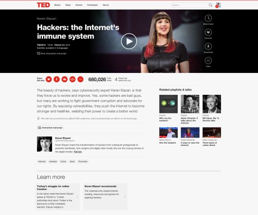
If you want to point something out in a photo, you could use a big arrow. Or you could do what I call a dupe-and-mask. I do this a lot when showing new page designs, particularly when I don’t want the audience to see the whole design until I’m finished talking about individual components of it. Here’s the original image:

mask-11

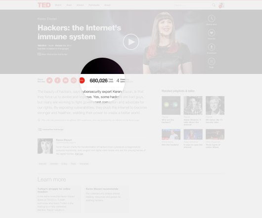
Here’s the process for masking it. (1) Set the image transparency to something less than 100. (2) Duplicate that image so there is one directly over the top of the other. (3) Set the dup’d image transparency back to 100. and (4) Follow the technique here to mask the dup’d image. You’ll end up with something that looks like this:

mask-31

  • I am often faced with this problem since my work is primarily focused on CNN.com, so many of my presentations include screenshots of our website. The tip above is a really great way to still show the site, but hone in on an area in a very interesting way.

8. Try panning large images.
9. For video, don’t use autoplay.
10. Reproduce simple charts and graphs.

Here’s the link to the full article where you can get the details on each tip.


What Not To Do

What Not To Do (When Giving a Presentation):

While most of us know what we “should” be doing when it comes to giving presentations, we oftentimes forget what we should NOT be doing. I have realized over time that what we should vs. should not do are not inherently mutually exclusive. You can be doing everything that you are “supposed to” (i.e. following best practices), but simultaneously be making common errors that can limit the effectiveness of your delivery.

I’m as guilty as anyone when it comes to checking the boxes for everything that a strong presentation should have, but I’ve started to realize that by diagnosing errors that I am more inclined to make, many of the recommended strategies subsequently fall in line naturally.

To frame this as a metaphor, I’m talking about targeting the disease, not making the anecdote stronger. I’ve found that this starts with getting back to the basics and building from there. So, what are some of the more common pitfalls in presentation delivery? After vetting several resources I’ve consolidated a list of quick anecdotes that I have found to be helpful to keep in mind:

  • Avoid reliance on slides. Slides are there to compliment your presentation and provide a framework, not the other way around.
  • Overload: Less is more. Too much talking and/or too much text will easily disinterest any audience, no matter how rich the content.
  • Avoid Apologies: If something goes wrong, there is a typo, you say something incorrectly, etc… JUST GO WITH IT. Odds are that no one else noticed and by drawing attention to it you are just calling out yourself (and your credibility).
  • Avoid filler words: This is public speaking 101, it sounds easy and we’ve heard it thousands of times, but it is absolutely critical. Unfilled airtime between sentences and ideas is okay. Specifically avoid “um”, “so”, “right”, and “you know” are very common and very distracting!
  • Going over your allotted time: Once you start to go long you begin to lose your audience. And once you even begin to lose your audience, it’s too late. This can cause the audience to miss your “big finish” and really tear down everything you’ve worked so hard to build.

While there are many more, these are just some of the most common problems that can hold you back from delivering the most effective presentation possible. We never get to a point where we are too advanced to worry about the basics. While one of these points are anything that you haven’t heard before, hopefully you will find some of these to be helpful reminders.


Helpful Resources:
http://www.inc.com/eric-v-holtzclaw/big-presentation-5-rookie-mistakes-to-avoid.html
https://www.youtube.com/watch?v=gNG0etmnwuk
http://blogs.hbr.org/2012/12/avoid-these-five-mistakes-in-y/


Punt PowerPoint

Like most people, I have always used Microsoft PowerPoint to create presentations. It’s quick, simple, and accessible by most users. However, it’s also these characteristics that have led to so many horrible presentations. Everyone can make a PowerPoint presentation, but it seems that only a few can make good PowerPoint presentations.

Obviously, the content, arrangement, and delivery of a PowerPoint presentation will ultimately determine whether the presentation is a dud or not. However, with the extremely high use rates of PowerPoint, maybe there are other software applications available that will help make a presentation standout against the crowd.

Here is a list of five alternative presentation applications that I came across in an article by Stu Robarts.

1. Prezi (prezi.com) – Instead of the linear progression of PowerPoint slides, Prezi presentations are designed on a large space (similar to a whiteboard) where the user can decide the path that the material should be presented in. Ultimately, the design is intended to help audiences understand how the ideas in the presentation are related to each other.

2. Keynote (https://www.apple.com/mac/keynote/) – Apple’s version of PowerPoint. In typical Apple style, it’s only compatible with Apple products.

3.  Google Slides (google.com) – A stripped-down version of PowerPoint; only the essential tools for creating a slide deck are available. However, the perk is that Slides are integrated into Google Docs. Changes to the presentations are auto-saved and multiple users can simultaneously edit a Slides presentation. The output can be downloaded into PowerPoint format.

4. ClearSlide (clearslide.com) – Designed for sales teams. The primary purpose is web-based presentations. It can be integrated with CRM systems for ease of data integration.

5. SlideDog (slidedog.com) – Every professor should be forced to use SlideDog. It’s not so much a presentation development software, as it is a presentation organizational software. It allows users to drag-and-drop all of their files that will be a part of their presentation (PowerPoint slides, Prezi presentation, web pages, PDFs, videos, etc.) into the SlideDog application and then arrange them into the desired order. When one file is completed, the subsequent file is launched. No more watching the presenter frantically search their desktop for the shortcut to the next element of their presentation.

Data Visualization – Tableau

For starters, check out this video

I sometimes struggle with conveying my analysis (say, in Excel) into a presentation (say, in PowerPoint). The best way to capture the attention of your audience and to deliver an effective presentation is through data visualization. No matter how sound and detailed your analysis, if it is not communicated well to your audience then all of your hard work in performing that analysis was wasted.

Presenting data in a visual format can often be the quickest and most effective ways to convey results of your analysis and capture the attention of your audience. This can communicate a message that may have taken hours to develop in a matter of seconds if done correctly.

One of my favorite new data visualization resources that I am learning to use is called Tableau. Tableau is a software company that was founded in 2003 and does nothing other than data visualization. The company had sales of $34.2 Million in 2010 which grew to an astonishing $232.44 Million in 2013 and the company went public. It is now traded on the NYSE (ticker: DATA). It is extremely intuitive and the product looks amazing. Here is a great video that gives you an overview of the capabilities of Tableau (also linked above).

There are some really revolutionary and interesting methods to communicate data visually that are becoming more and more accepted in business and is thought by many as a way for companies to distinguish themselves among their peers. Often times my company might be similarly positioned to perform work for a given client, and I have seen that a lot of the work we have “won” has come from an effective pitch that highlights the strengths of our organization in a visually compelling manner that engages the client and shows that we can “give meaning to numbers” which is a skill that is hard to quantify.

I would be curious to get any thoughts on your experience with data visualization software and any recommendations you might have.


Other helpful data visualization links:

http://www.scientificamerican.com/article/the-data-visualization-revolution/

http://blogs.hbr.org/2014/04/the-quick-and-dirty-on-data-visualization/

http://fortune.com/2011/11/15/how-tableau-software-makes-business-data-beautiful/

Edward Tufte on PowerPoint

This is an interesting read on the pitfalls associated with PowerPoint presentations. One of the things that I am focusing on improving this semester is my presentation skills, and I found this article, The Cognitive Style of PowerPoint by Edward Tufte, to be helpful with regards of how to present data in a meaningful way. While you may find some of his opinions to be extreme, I believe that he still has many valid points and that his arguments are logical.

Even if you do not read this entire article, at least see his demonstration of Abraham Lincoln’s Gettysburg Address via PowerPoint presentation on page 12 along with the section on improving our Presentations on page 22. I’ve included some highlights of the article below:

The Cognitive Style of PowerPoint

PP convenience for the speaker can be costly to both content and
audience. These costs result from the cognitive style characteristic of the standard default PP presentation: foreshortening of evidence and thought, low spatial resolution, a deeply hierarchical single-path structure as the model for organizing every type of content, breaking up narrative and data into slides and minimal fragments, rapid temporal sequencing of thin information rather than focused spatial analysis, conspicuous decoration and Phruff, a preoccupation with format not content, an attitude of commercialism that turns everything into a sales pitch.

Extremely Low Resolution of PowerPoint 

Visual reasoning usually works more effectively when the relevant information is shown adjacent in space within our eyespan. This is especially the case for statistical data, where the fundamental analytical act is to make comparisons.

Bullet Outlines Dilute Thought

By leaving out the narrative between the points, the bullet outline ignores and conceals the causal assumptions and analytic structure of the reasoning.

Bullet outlines might be useful in presentations now and then, but sentences with subjects and verbs are usually better. Instead of this type of soft, generic point found in many business plans.

Improving Our Presentations

Designer formats will not salvage weak content. If your numbers are boring, then you’ve got the wrong numbers. If your words or images are not on point, making them dance in color won’t make them relevant. Audience boredom is usually a content failure, not a decoration failure.

Never use PP templates for arraying words or numbers. Avoid elaborate hierarchies of bullet lists. Never read aloud from slides. Never use PP templates to format paper reports or web screens.

Paper handouts at a talk can effectively show text, numbers, data graphics, images. Printed materials, which should largely replace PP, bring information transfer rates in presentations up to that of everyday material in newspapers, magazines, books, and internet screens.


Sharing a Helpful Resource

If your job is anything like mine, you use Microsoft Excel and/or PowerPoint on a regular (if not daily) basis. If you use either of these applications in conjunction with each other (which I know all of us have in our prior MP presentations), I have a very helpful resource to share with you.

One of the biggest challenges that I have faced is effectively incorporating data (particularly from Excel) into a concise PowerPoint presentation. Given that Excel and PowerPoint are both made by Microsoft, you would think that using these two applications in conjunction with one another would be fairly seamless and potentially even synergistic (1 + 1 = 3, right?).  However, integrating Excel and PowerPoint is not always straight forward, and conveying key takeaways rather than “data dumping” an entire financial model into your presentation can be a challenge. Additionally, I think that most of us are typically better at one than the other which doesn’t make things any easier.  I certainly have found this to be the case for myself, and while I have a strong background in using Excel, I have a lot of “room to grow” in terms of incorporating financial data from huge bulky models into a clean and concise presentation that conveys the underlying data effectively.

As I have searched for tools, resources, and articles giving guidance on this very topic, I have come across a particularly helpful website that I wanted to share with our class and hope that you will find it to be as useful as I have. This website is called ‘Think Outside the Slide’ and is as close to a “one stop shop” as I have found for guidance on just about everything relating to creating powerful presentations, with literally thousands of articles neatly organized by topic, as well as video tutorials if you’re more of a visual person. If you use Excel or PowerPoint at all, there is likely a specific article with tips and guidance on how to more effectively use the applications in a context relevant to you.

These are just a few that I have begun to frequently reference to give you a snapshot:

  • Using Excel Data in Powerpoint Presentations
  • Slide Design, Creation, and Editing
  • Linking Excel Data (and other content) to PowerPoint so that data in slides automatically updates
  • Tips on effectively cleaning up and animating graphs
  • Creating powerful visuals using Excel Data (waterfall graphs, diverging stacked bar charts, treemap diagrams, proportional shape comparisons, etc…)

For many business professionals, myself included, Excel and PowerPoint are critical tools, and learning to use data effectively in PowerPoint presentations can take time but is versatile skill with application to countless professions that can help to distinguish yourself from your peers/co-workers, and add value to your clients. I hope you find this to be a helpful resource, please feel free to share any other resources that you frequently use and have found helpful in your career. Thanks!

Helpful links referenced in this post:

http://www.thinkoutsidetheslide.com/free-resources/

http://www.thinkoutsidetheslide.com/using-excel-data-in-a-powerpoint-presentation/

http://www.thinkoutsidetheslide.com/articles/