I have a particular interest in evaluation in the workplace– the evaluation of employees, work output, employers, etc. In the types of programs I’ve been in, I have found in very useful. However, I’m sure that most companies don’t have the time to thoroughly evaluate their work in a systematic and organized way. I have always worked in the research/higher education end of business, and so I don’t personally have experience with how evaluation works in the corporate setting. How does evaluation look like in your industry or company?
A few years ago, I came across this site and I have been a fan ever since. The group is called Evergreen Data and they focus on intentional reporting and data visualization. I work in public health/higher education, and the public health industry is very data-heavy. Data in public health is used for analysis, program planning, grant opportunities, research, etc. and so I have seen the benefits of its use in my industry. What does your company do with its evaluation data?
This particular site had a checklist on how you should layout your evaluation reports which I’ve found super helpful! The purpose of the checklist is to help identify what parts of an evaluation report can be enhanced through the use of graphics.
Here are some of the items they had in their checklist:
- Text font and size (sans serif and size 9-11)
- Text uniformity
- Line spacing (between 11-13 points)
- Headers/callouts
- The number of different types of fonts that you should use (no more than three!)
- Don’t make too “strong” or “bold” of bullet points
- Alignment (be consistent!)
- Make sure that items in page that are grouped together are related
- Utilize white/empty space!
- Use of pictures/graphics – individuals learn differently from one another
- Use color changes for a purpose (are you being intentional by choosing to change the color of a font or header?)
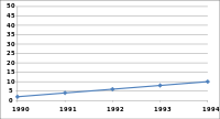
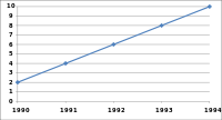
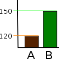
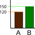
Evergreen also has an additional checklist that’s used for data visualization. It’s specific to making your graphs speak for themselves! This is a great resource as well.
What are some of the tips you have when creating reports (not exclusive to evaluation reports)? What steps do you take to have your data share a “story” or a “point”? Are you intentional in your decisions in terms of report layouts, font, graphics, etc.? Do you find that you have to pay more attention to this?