Tag Archives: Charts

Being Intentional with your Data and Giving your Graphics a Voice!

I have a particular interest in evaluation in the workplace– the evaluation of employees, work output, employers, etc. In the types of programs I’ve been in, I have found in very useful. However, I’m sure that most companies don’t have the time to thoroughly evaluate their work in a systematic and organized way. I have always worked in the research/higher education end of business, and so I don’t personally have experience with how evaluation works in the corporate setting.  How does evaluation look like in your industry or company?

A few years ago, I came across this site and I have been a fan ever since. The group is called Evergreen Data and they focus on intentional reporting and data visualization. I work in public health/higher education, and the public health industry is very data-heavy. Data in public health is used for analysis, program planning, grant opportunities, research, etc. and so I have seen the benefits of its use in my industry. What does your company do with its evaluation data?

This particular site had a checklist on how you should layout your evaluation reports which I’ve found super helpful! The purpose of the checklist is to help identify what parts of an evaluation report can be enhanced through the use of graphics.

Here are some of the items they had in their checklist:

  • Text font and size (sans serif and size 9-11)
  • Text uniformity
  • Line spacing (between 11-13 points)
  • Headers/callouts
  • The number of different types of fonts that you should use (no more than three!)
  • Don’t make too “strong” or “bold” of bullet points
  • Alignment (be consistent!)
  • Make sure that items in page that are grouped together are related
  • Utilize white/empty space!
  • Use of pictures/graphics – individuals learn differently from one another
  • Use color changes for a purpose (are you being intentional by choosing to change the color of a font or header?)

Evergreen also has an additional checklist that’s used for data visualization. It’s specific to making your graphs speak for themselves! This is a great resource as well.

What are some of the tips you have when creating reports (not exclusive to evaluation reports)? What steps do you take to have your data share a “story” or a “point”? Are you intentional in your decisions in terms of report layouts, font, graphics, etc.? Do you find that you have to pay more attention to this? 
Misleading Graphs & Statistical Lies

Graphs and Charts are everywhere, and are excellent tools to visually convey statistics, results, trends, data, etc. There are basically three groups of graphs out there that you’ll find on a regular basis:

1.) Graphs created by people who do know what they are doing

2.) Graphs created by people who don’t know what they are doing

3.) Graphs created by people who do know what they are doing and have manipulated it to intentionally deceive the viewer.

There’s a fine line between number 2 and 3 sometimes, and to be effective business leaders, one skill we must possess is the ability to call “BS”, whether intentional or unintentional. Below is a great book to help uncover a lot of deceptive tricks and a few some examples.

A great book that I highly recommend is: “How To Lie With Statistics“. It’s short, cheap, and uncovers numerous tricks people use with charts, graphs, numbers, and statistics to deceive the reader without breaking the rules.

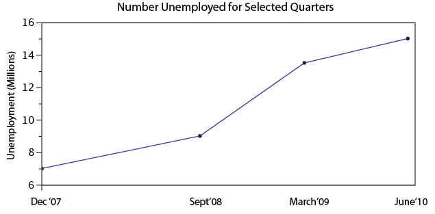
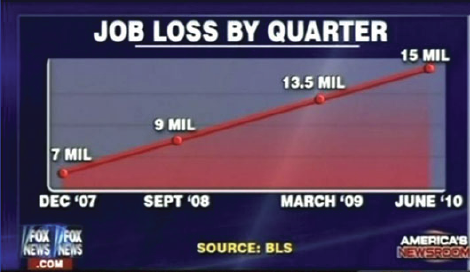
Not to pick on Fox News, but below is a graph that is severely misleading in both the title and the scale of the X-axis. The title leads you to believe the data is by consecutive quarter, and the inaccurate spacing on the X-axis leads to to believe the data is linear.

If you title and plot this data accurately, below is what you would get:

There are many types of errors or tricks that results in the display of data in an inaccurate way. Below are several categories and things to watch out for the next time somebody slaps a fancy looking report down on your desk:

USE OF THE 3D CHART:

Simple use of 3D charts distort the ratio of pies and the height of bars. Notice how Item A and C look more similar in the 3D chart, but flattened, C is less than half of A

ChartMisleading Pie Chart.pngSample Pie Chart.png

 IMPROPER SCALING:

Notice how the intent is to increase the value 3X (Y-Axis), while the perception is that it increased 9X

Improperly scaled picture graph.svg

Comparison of properly and improperly scaled picture graph.svg

The appropriate way to display the increase from 1 to 3 is shown below.

Picture Graph.svg

MISLEADING TRUNCATION:

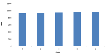
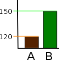
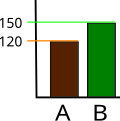
The truncation on the following graph leads the viewer to believe that group E is nearly twice the size of group A. While sometimes truncation is a great tool in certain situations, it is often misused.

Truncated Bar Graph.svg

Looking at the scale from 0 to 12,000 puts in perspective how slight of a difference there is between groups.

Bar graph.svg

IMPROPER AXIS RANGES:

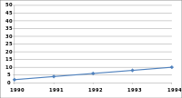
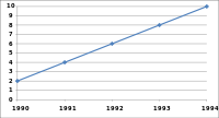
The graph immediately below makes you feel as though the growth over time has been slow and gradual, but a quick change of the axis values gives a completely different perception. Don’t always believe the slopes of lines as they are a function of the Axis values.

Line graph2.svg

Line graph3.svg

OMISSION OF SCALE:

When Scales are left off, the range of the axis is unknown and differences are easily exaggerated or minimized.

Bar graph missing zero1.svg    Example truncated bar graph.svg


My Challenges with Excel

C.S. Lewis (1898-1963), Fellow and Tutor in English Literature at Oxford University, and Chair of Medieval and Renaissance English at Cambridge, was an intellectual giant of the 20th century. In later life, reflecting on challenges he faced in his younger days, Lewis remarked:

I could never have gone very far in any science, because in the path of every science the lion mathematics lies in wait for you. Even in mathematics whatever could be done by mere reasoning as in simple geometry I did with delight. But the moment calculation came in I was helpless. I grasped the principles but my answers were always wrong. Yet though I never could have been a scientist, I had scientific as well as imaginative impulses and I loved ratiocination*.”

To be candid, I have some apprehension when it comes to Excel . . . made all the more pressing because of how central excel skills are to the practice of finance. So when I consider my excel challenges I draw much encouragement from these thoughts of C.S. Lewis.

Although I have a deep passion for finance, and have worked in investment management for 10 years, my position at work has been more about interpreting and leveraging excel generated data, rather than performing the actual work of creating spreadsheet models myself.

The result is that up till now, my excel skills have languished.  Thus I’m grateful that our MBA program has forced me to improve. In this spirit, (and acting on the advice of professor Noonan) I’ve set out to build my own personal top 10 excel skillset, that will be useful to my financial career.  Some of these may seem rather obvious, but excel is my self-selected focus area and I figured that I could subject my list to public opinion and scrutiny, in the hope that collaborative discussion might occur. I also thought that some of this material might be useful for those considering a financial career.

Rough draft of “Top 10” excel skills for investment management and financial planning for high net worth individuals, families, trusts, and charitable foundations:

  1. Precision tree
  2. Sensitivity analysis, useful for evaluating insurance policies
  3. Goal Seek
  4. Historical market and financial instrument analysis
  5. Excel integration with Word and PowerPoint
  6. Configuring excel for pleasant appearance and functionality
  7. Mortgage / Bond / Annuity amortization schedules
  8. Learning to manipulate and efficiently sort data – this is hugely important for many areas within our business such as ranking client positions, asset allocation decisions, analysis of individual positions, and assessing performance in order to prioritize investment decisions
  9. Graphing portfolio performance vs. relevant market benchmarks
  10. Leveraging excel with proprietary finance software used by major financial enterprises. (our firm uses Advent)

When I reflect on the challenges of the first year of MBA school, I am glad that I have improved in several of theses areas and incorporated them into different assignments and projects. Our cohort has aided much of my improvement.

For example, during first semester, I was fortunate to be on a team with Shehzad Shabuddin, who was quite generous with his time and patient with helping me make progress on excel. Shehzad’s blog post, The Excel trap, reminds us of the dangers of reducing life to data and mathematics. Excel-ing in Real Estate by Bob Caperton and the article by Barry Slaymaker on MBA level excel skills were both particularly helpful. I’m also hopeful that I can persuade Joe Song to give me some Excel lessons between now and graduation.

One of the most powerful lessons I have learned in life (and a “key content” area of MP) is the importance of surrounding yourself with others whose complementary strengths have the capacity to offset your personal areas of weakness.  My next blog post will examine a leader who intimately understood just how powerful this principal is, and became a great, and most unexpected, actor in history.

*Ratiocination, noun. – the process of logical reasoning. [1520-30]

Data Visualization – Tableau

For starters, check out this video

I sometimes struggle with conveying my analysis (say, in Excel) into a presentation (say, in PowerPoint). The best way to capture the attention of your audience and to deliver an effective presentation is through data visualization. No matter how sound and detailed your analysis, if it is not communicated well to your audience then all of your hard work in performing that analysis was wasted.

Presenting data in a visual format can often be the quickest and most effective ways to convey results of your analysis and capture the attention of your audience. This can communicate a message that may have taken hours to develop in a matter of seconds if done correctly.

One of my favorite new data visualization resources that I am learning to use is called Tableau. Tableau is a software company that was founded in 2003 and does nothing other than data visualization. The company had sales of $34.2 Million in 2010 which grew to an astonishing $232.44 Million in 2013 and the company went public. It is now traded on the NYSE (ticker: DATA). It is extremely intuitive and the product looks amazing. Here is a great video that gives you an overview of the capabilities of Tableau (also linked above).

There are some really revolutionary and interesting methods to communicate data visually that are becoming more and more accepted in business and is thought by many as a way for companies to distinguish themselves among their peers. Often times my company might be similarly positioned to perform work for a given client, and I have seen that a lot of the work we have “won” has come from an effective pitch that highlights the strengths of our organization in a visually compelling manner that engages the client and shows that we can “give meaning to numbers” which is a skill that is hard to quantify.

I would be curious to get any thoughts on your experience with data visualization software and any recommendations you might have.


Other helpful data visualization links:

http://www.scientificamerican.com/article/the-data-visualization-revolution/

http://blogs.hbr.org/2014/04/the-quick-and-dirty-on-data-visualization/

http://fortune.com/2011/11/15/how-tableau-software-makes-business-data-beautiful/

Excel-ing in Real Estate

I learned early in my first semester that my skills with Microsoft Excel were in need of serious improvement.  By the second semester, I realized that I might be the least proficient Excel user in the entire program.  This is sort of embarrassing considering that I was a finance major and work in the commercial real estate business.  That being said, I am determined to improve.

This MP project is very timely for me.  It coincides with the need for me to analyze several prospective investments for my company.  Recently I have taken the time to review Professor Noonan’s slides and from that decided on some of the skills that I plan to acquire.  I have since learned how to use pivot tables as well as the sensitivity analysis feature.  I found some youtube videos that really helped me fine tune these skills:

Pivot Table

Sensitivity Analysis

I recently used sensitivity analysis as part of my analysis in evaluating an apartment complex.  See below:

$                     264,976.47 37,000 38,000 39,000 40,000 41,000 42,000 43,000
15,000    258,823.53    270,588.24    282,352.94    294,117.65    305,882.35    317,647.06    329,411.76
16,000    247,058.82    258,823.53    270,588.24    282,352.94    294,117.65    305,882.35    317,647.06
17,000    235,294.12    247,058.82    258,823.53    270,588.24    282,352.94    294,117.65    305,882.35
18,000    223,529.41    235,294.12    247,058.82    258,823.53    270,588.24    282,352.94    294,117.65
19,000    211,764.71    223,529.41    235,294.12    247,058.82    258,823.53    270,588.24    282,352.94
20,000    200,000.00    211,764.71    223,529.41    235,294.12    247,058.82    258,823.53    270,588.24
21,000    188,235.29    200,000.00    211,764.71    223,529.41    235,294.12    247,058.82    258,823.53


The left-hand column (starting with 15,000) refers the Operating Expenses and upper row (beginning with 37,000) refers to Revenue.   The info in the middle shows the resulting value (based on an 8.5 Cap rate).  If you’re not in the Real Estate business, a cap rate is NOI/VALUE, essentially a measure of the rate of return.  This proved fairly helpful as I went over it with our current apartment manager to confirm our offer.

I also did analyses for revenue sensitivity to price and vacancy and the Operating Expense sensitivity to some of the specific expenses.  The Revenue sensitivity illustrates how much vacancy we could bear under certain price levels.  The Operating Expense analysis displays the critical expenses.

I am well aware that, for most of you, this is very basic.  I am just glad to address this weakness.

Information Design For Dummies

This title is clearly tongue-in-cheek, but for me, “For Dummies” can be applied to several areas of mine that need improvement. I suppose those of us who aren’t fortunate enough to practice every viable business skillset regularly may feel the same. But hey, isn’t that why we’re in school? Isn’t that the nature of this project? I digress….

Presentations haven’t been a focus of career thus far, so even the term Information Design is something relatively new. In trying to gain expertise and understanding quickly, I always like to start at the beginning. Where did Information Design originate? What’s its purpose? How is it best used today? To quote professor Makadok, “I’m energized! I’m ready to learn!”

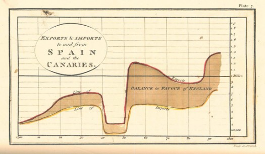
The term “information design” originated in the early 1990’s, however humans have been using visual aids to tell stories for a very long time (think cave paintings, hieroglyphics, etc.). Formal Information Design really hit its stride in the 18th century, with innovators like William Playfair creating some groundbreaking representations of data (http://www.humantific.com/making-sense-of-the-early-sensemakers). Playfair, a Scottish engineer and political economist, invented pie charts, line graphs, and bar charts. And you thought Scotch whisky was Scotland’s greatest invention! All kidding aside, Playfair’s charts were beautiful representations of imports and exports, giving life to previously abstract statistics.Playfair13-525x306

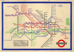
The evolution continued, and fast forward to 20th century: Harry Beck, an English technical draftsman creates the famous London Underground tube map in 1931 (http://britton.disted.camosun.bc.ca/beck_map.jpg).

beck_map

As a map lover, this is truly an iconic work, and set the standard of urban transit maps that we all know today. To me, Beck’s work truly achieves one of the key goals of information design: clearly visualizing something that is difficult to understand. Can you imagine the complexity of an actual map of the London Underground in its correct scale? It would likely look like an angry cluster of snakes. Beck’s map breaks down the complexity into something that even a novice traveller can visually digest over a cup of tea and a scone.

So with a little history under our belt, what are some tips for taking a modern approach to Information Design? Amy Balliett of Smashing Magazine wrote a fantastic article that gives some great examples of do’s and don’ts, that we can all use to approach our next presentation (http://www.smashingmagazine.com/2011/10/14/the-dos-and-donts-of-infographic-design/):

1) Show, don’t tell: Don’t miss an opportunity to visualize data. In other words, avoid putting into text what can better be conveyed with an image, chart, or graph.
2) If the client wanted an excel chart, they wouldn’t need you: This is clearly aimed at professional info designers, but you get the idea. Step your game up, and get creative! If possible, learning some design platform could really differentiate your skills from the rest of the pack.
3) Typography should not be a crutch: avoid leaning too heavily on fancy fonts that distract from the visualized data. I think this is great advice, and reflects back to “show, don’t tell.”

She goes on to make several other good points, but I’ll get right to the good stuff…

4) Tell a story: Funny how it always comes back to a good story. Great info graphics introduce a problem, back it up with data, and finish with a conclusion.

I highly recommend reading Ballet’s entire article, and hopefully it will provide some inspiration next time you attempt to convey a message visually. Now where did I put that Scotch?

Sharing a Helpful Resource

If your job is anything like mine, you use Microsoft Excel and/or PowerPoint on a regular (if not daily) basis. If you use either of these applications in conjunction with each other (which I know all of us have in our prior MP presentations), I have a very helpful resource to share with you.

One of the biggest challenges that I have faced is effectively incorporating data (particularly from Excel) into a concise PowerPoint presentation. Given that Excel and PowerPoint are both made by Microsoft, you would think that using these two applications in conjunction with one another would be fairly seamless and potentially even synergistic (1 + 1 = 3, right?).  However, integrating Excel and PowerPoint is not always straight forward, and conveying key takeaways rather than “data dumping” an entire financial model into your presentation can be a challenge. Additionally, I think that most of us are typically better at one than the other which doesn’t make things any easier.  I certainly have found this to be the case for myself, and while I have a strong background in using Excel, I have a lot of “room to grow” in terms of incorporating financial data from huge bulky models into a clean and concise presentation that conveys the underlying data effectively.

As I have searched for tools, resources, and articles giving guidance on this very topic, I have come across a particularly helpful website that I wanted to share with our class and hope that you will find it to be as useful as I have. This website is called ‘Think Outside the Slide’ and is as close to a “one stop shop” as I have found for guidance on just about everything relating to creating powerful presentations, with literally thousands of articles neatly organized by topic, as well as video tutorials if you’re more of a visual person. If you use Excel or PowerPoint at all, there is likely a specific article with tips and guidance on how to more effectively use the applications in a context relevant to you.

These are just a few that I have begun to frequently reference to give you a snapshot:

  • Using Excel Data in Powerpoint Presentations
  • Slide Design, Creation, and Editing
  • Linking Excel Data (and other content) to PowerPoint so that data in slides automatically updates
  • Tips on effectively cleaning up and animating graphs
  • Creating powerful visuals using Excel Data (waterfall graphs, diverging stacked bar charts, treemap diagrams, proportional shape comparisons, etc…)

For many business professionals, myself included, Excel and PowerPoint are critical tools, and learning to use data effectively in PowerPoint presentations can take time but is versatile skill with application to countless professions that can help to distinguish yourself from your peers/co-workers, and add value to your clients. I hope you find this to be a helpful resource, please feel free to share any other resources that you frequently use and have found helpful in your career. Thanks!

Helpful links referenced in this post:

http://www.thinkoutsidetheslide.com/free-resources/

http://www.thinkoutsidetheslide.com/using-excel-data-in-a-powerpoint-presentation/

http://www.thinkoutsidetheslide.com/articles/

Attention, Cleanup on Slide 6.

Engineers like numbers. Engineers like problems that can be solved with numerical analysis. Engineers like when others agree that their numbers are correct. However, all too often Engineers fail to clearly communicate their ideas, analysis, and solutions in a manner that quickly informs, educates, and persuades their audiences. I would know; I am an Engineer.

Presenters commonly overlook good information design in their presentations. Instead, they focus on providing the maximum amount of information and data in a manner that allows the audience to fully appreciate not only the solution but also the process of the analysis. In their attempt to wow the audience with slides dominated by tables, charts, graphs, best-fit lines, major and minor grid lines and the like, they instead produce confusion and lack of interest. I will be the first to admit that I am guilty of such techniques.

In Edward Tufte’s work on information design, “Visual Display of Quantitative Information” – yes it is indeed as interesting as it sounds – Tufte discusses Data-Ink and Graphical Redesign. In order to achieve maximum impact, Tufte outlines five principles for data graphics that can lead to significant improvements in graphical design: 1) Above all else show the data, 2) Maximize the data-ink ratio, 3) Erase non-data-ink, 4) Erase redundant data-ink, and 5) Revise and edit. To help clarify, Tufte describes data-ink as “the share of the ink on a graphic that presents the data-information”; it is “the non-erasable core of the graphic.” The key and the challenge of this topic is finding simplicity.

Tufte provides a great example of how to erase redundant data-ink within reason. Consider a simple bar chart with a single bar that is shaded and displays the value of the data point at the top of the bar. The height or value of the bar chart in this simple example is identified in six separate ways. Five of those ways can be considered redundant and removed, and the important data will still be present. The six ways include, 1) the height of the left vertical of the bar chart, 2) the height of the right vertical of the bar chart, 3) the height of the shaded region of the bar chart, 4) the vertical position of the horizontal top of the bar chart, 5) the vertical position of the value on top of the bar chart, and 6) the numeric value itself. Removing redundant information creates clearer presentation and more effective communication of a presenter’s ideas.

For most, this is likely not the most exciting of topics. However, for someone who works heavily in numerical analysis and who must convey outcomes to audiences of varying backgrounds, these suggestions on good information design are priceless. Does anyone else struggle in the area of good information design? Have you ever been complimented on your information design? Any other suggestions of how someone can improve their ability to display quantitative information?


Tufte, Edward R. “Data-Ink and Graphical Redesign.” The Visual Display of Quantitative Information. Second ed. Cheshire, CT: Graphics LLC, 2006. N. pag. Print.