This title is clearly tongue-in-cheek, but for me, “For Dummies” can be applied to several areas of mine that need improvement. I suppose those of us who aren’t fortunate enough to practice every viable business skillset regularly may feel the same. But hey, isn’t that why we’re in school? Isn’t that the nature of this project? I digress….
Presentations haven’t been a focus of career thus far, so even the term Information Design is something relatively new. In trying to gain expertise and understanding quickly, I always like to start at the beginning. Where did Information Design originate? What’s its purpose? How is it best used today? To quote professor Makadok, “I’m energized! I’m ready to learn!”
The term “information design” originated in the early 1990’s, however humans have been using visual aids to tell stories for a very long time (think cave paintings, hieroglyphics, etc.). Formal Information Design really hit its stride in the 18th century, with innovators like William Playfair creating some groundbreaking representations of data (http://www.humantific.com/making-sense-of-the-early-sensemakers). Playfair, a Scottish engineer and political economist, invented pie charts, line graphs, and bar charts. And you thought Scotch whisky was Scotland’s greatest invention! All kidding aside, Playfair’s charts were beautiful representations of imports and exports, giving life to previously abstract statistics.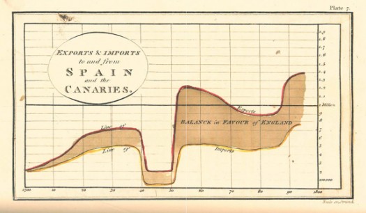
The evolution continued, and fast forward to 20th century: Harry Beck, an English technical draftsman creates the famous London Underground tube map in 1931 (http://britton.disted.camosun.bc.ca/beck_map.jpg).
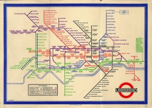
As a map lover, this is truly an iconic work, and set the standard of urban transit maps that we all know today. To me, Beck’s work truly achieves one of the key goals of information design: clearly visualizing something that is difficult to understand. Can you imagine the complexity of an actual map of the London Underground in its correct scale? It would likely look like an angry cluster of snakes. Beck’s map breaks down the complexity into something that even a novice traveller can visually digest over a cup of tea and a scone.
So with a little history under our belt, what are some tips for taking a modern approach to Information Design? Amy Balliett of Smashing Magazine wrote a fantastic article that gives some great examples of do’s and don’ts, that we can all use to approach our next presentation (http://www.smashingmagazine.com/2011/10/14/the-dos-and-donts-of-infographic-design/):
1) Show, don’t tell: Don’t miss an opportunity to visualize data. In other words, avoid putting into text what can better be conveyed with an image, chart, or graph.
2) If the client wanted an excel chart, they wouldn’t need you: This is clearly aimed at professional info designers, but you get the idea. Step your game up, and get creative! If possible, learning some design platform could really differentiate your skills from the rest of the pack.
3) Typography should not be a crutch: avoid leaning too heavily on fancy fonts that distract from the visualized data. I think this is great advice, and reflects back to “show, don’t tell.”
She goes on to make several other good points, but I’ll get right to the good stuff…
4) Tell a story: Funny how it always comes back to a good story. Great info graphics introduce a problem, back it up with data, and finish with a conclusion.
I highly recommend reading Ballet’s entire article, and hopefully it will provide some inspiration next time you attempt to convey a message visually. Now where did I put that Scotch?