All posts by Matt Barnett

Infographics on the Job

In my earlier post on this subject, I discussed the history of information design and some best practices associated with its use today.  It’s great to consider the past and present of this art, but what about the real context for most of us on a day-to-day basis?

In my career thus far, I haven’t to do much of this type of work.  In fact, between undergrad and business school, I don’t think I touched PowerPoint more than a few times.  Well, those days are over!  I’ve been serving in my new role at Arby’s for almost a month now, and I’ve already been asked to create what we call “one pagers.”  These summaries are a brief overview of a topic, usually presented via a PowerPoint slide.  It’s important that they present only the most critical information, and are used during the numerous meetings that happen on a daily basis.

So what role do infographics play?  Let’s just say that they’re a team player and not the star.  Our one-pagers are generally mostly text, organized in a way that is very clear and easy to read.  The graphs, data, etc. typically plays a support role or is left out altogether, only to be presented in more thorough presentations.  The key here is to extract the data into bullet points or going beyond that, make your point or recommendation based on the data.  I found a good example of the general form we use on, of all places, the Citizens for Public Justice website.  I agree with their format, and it can be seen here: http://www.cpj.ca/content/how-write-one-page-brief

I still believe that I will have to create a good bit of graphs and charts, however I think the true, modern form of infographics are typically left up to the design types and corporate communications department.  Luckily, the organization is fairly flat and meeting with those people, collaboration, and learning from them is eminent.

Although I may not be presenting as much of this type of work as I had expected, I believe I will certainly know how to create meaningful visualizations of data to support my future recommendations.  I look forward to the challenge and continued learning!
The Future of Business Intelligence…Literally!

Hopefully by now we’re all well versed in the forms of business intelligence that I discussed in my first article (peers, industry publications, and databases).  Now the question remains, what do we do with the information?  I recently read an article by Tom Groenfeldt, written for Forbes.  Here’s a quick link: http://www.forbes.com/sites/tomgroenfeldt/2014/07/30/business-intelligence-bi-isnt-very-intelligent-yet

Tom cleverly points out that “in a SunGard survey of executives in the two industries, only 20 percent use proactive and investigative techniques or showed an interest in scorecards, dashboards and analytics techniques.”  In short, this means that many executives and business analysts are using previously recorded data to formulate strategies and make decisions.  He goes on to say that “only 13% of respondents utilize advanced BI techniques such as predictive analytics and alerts.”  

While this may not be a surprise in for some of us, I would have expected a higher percentage of executives to use some form of predictive analytics, especially in high tech industries.  With this said, I feel like this is a good opportunity to be a part of what could be a movement in this direction.  Clearly there will be growth in this field, and it’s likely that more companies, in a wider set of industries, could employ these tools to develop strategies.  If we can acquire these skills (or at least be able to speak the language), we certainly put ourselves on the front end of a trend that will likely have staying power.

I had a meeting with a business intelligence officer at my company today, and I was very impressed with the tools we have at hand.  However, it does seem that our company is mostly focused on managing and interpreting the bulk data that we collect regularly.  Do any of you have experience with predictive analytics and alerts?  What has your experience been?

Traditional and Crowd Sourced Business Intelligence

Going into grad school, one of my main goals was to change jobs and change industries.  Needless to say, I knew that I had a lot to learn, both in and out of the classroom.  In retrospect, I took a three-pronged approach to acquire the business intelligence that helped move me from me from point A to point B:

1) Talk to anyone and everyone who worked in the space.  I mean everyone. Through networking opportunities, I was able to land some informational interviews with industry leaders that were happy to share their experiences.  There is no substitute for the value of their insights that both informed me and reinforced my desire to be a part of the industry.  Even more valuable – and directly responsible for my eventual success – was the help of classmates that had significant experience working for food and beverage companies (you know who you are!).  Their willingness to help was undoubtedly the turning point for me, and the shared knowledge of industry dynamics and lingo was instrumental.  I truly believe gaining direct knowledge from peers and mentors is the best way to gain business intelligence.

2) Industry publications: Being familiar with the current landscape of an industry is critical in making a big transition.  So many resources are available to help deepen understanding and industry knowledge, and not just the usual suspects.  I was able to stay on top of emerging food and beverage trends by following leaders on Twitter and other social media platforms.  This awareness was integral during the interview process.  However, as Ann Cullen, on of our business librarians, was quick to point out: consider the source.  Industry publications can be motivated by all sorts of outside forces, so this must be considered.

3) The old fashioned way: research.  In my meeting with Ann, we walked through so many examples of deep resources available to us.  It’s truly amazing how much data there is out there, and it’s up to us to refine our skills on how to find it.  Luckily, our business librarians are there every step of the way to support.  In addition, she showed me several great methods to make the search easier.  My favorite trick is to narrow a google search by using “inurl,” which can search for any keyword within a specific website.  Another great tip is using the tilday symbol (~), which searches for any synonym of a key word.  Using tips like these have helped me become more efficient in my research, and the mountain of information out there seems a little less daunting.

What research tips can you share?  Do you agree with my three-pronged approach mentioned above?  Have I forgotten any good source?

Information Design For Dummies

This title is clearly tongue-in-cheek, but for me, “For Dummies” can be applied to several areas of mine that need improvement. I suppose those of us who aren’t fortunate enough to practice every viable business skillset regularly may feel the same. But hey, isn’t that why we’re in school? Isn’t that the nature of this project? I digress….

Presentations haven’t been a focus of career thus far, so even the term Information Design is something relatively new. In trying to gain expertise and understanding quickly, I always like to start at the beginning. Where did Information Design originate? What’s its purpose? How is it best used today? To quote professor Makadok, “I’m energized! I’m ready to learn!”

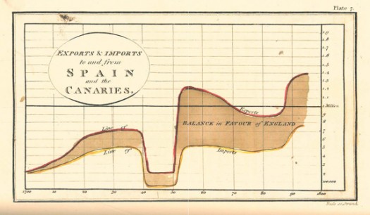
The term “information design” originated in the early 1990’s, however humans have been using visual aids to tell stories for a very long time (think cave paintings, hieroglyphics, etc.). Formal Information Design really hit its stride in the 18th century, with innovators like William Playfair creating some groundbreaking representations of data (http://www.humantific.com/making-sense-of-the-early-sensemakers). Playfair, a Scottish engineer and political economist, invented pie charts, line graphs, and bar charts. And you thought Scotch whisky was Scotland’s greatest invention! All kidding aside, Playfair’s charts were beautiful representations of imports and exports, giving life to previously abstract statistics.Playfair13-525x306

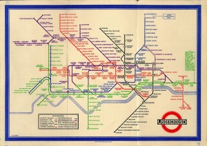
The evolution continued, and fast forward to 20th century: Harry Beck, an English technical draftsman creates the famous London Underground tube map in 1931 (http://britton.disted.camosun.bc.ca/beck_map.jpg).

beck_map

As a map lover, this is truly an iconic work, and set the standard of urban transit maps that we all know today. To me, Beck’s work truly achieves one of the key goals of information design: clearly visualizing something that is difficult to understand. Can you imagine the complexity of an actual map of the London Underground in its correct scale? It would likely look like an angry cluster of snakes. Beck’s map breaks down the complexity into something that even a novice traveller can visually digest over a cup of tea and a scone.

So with a little history under our belt, what are some tips for taking a modern approach to Information Design? Amy Balliett of Smashing Magazine wrote a fantastic article that gives some great examples of do’s and don’ts, that we can all use to approach our next presentation (http://www.smashingmagazine.com/2011/10/14/the-dos-and-donts-of-infographic-design/):

1) Show, don’t tell: Don’t miss an opportunity to visualize data. In other words, avoid putting into text what can better be conveyed with an image, chart, or graph.
2) If the client wanted an excel chart, they wouldn’t need you: This is clearly aimed at professional info designers, but you get the idea. Step your game up, and get creative! If possible, learning some design platform could really differentiate your skills from the rest of the pack.
3) Typography should not be a crutch: avoid leaning too heavily on fancy fonts that distract from the visualized data. I think this is great advice, and reflects back to “show, don’t tell.”

She goes on to make several other good points, but I’ll get right to the good stuff…

4) Tell a story: Funny how it always comes back to a good story. Great info graphics introduce a problem, back it up with data, and finish with a conclusion.

I highly recommend reading Ballet’s entire article, and hopefully it will provide some inspiration next time you attempt to convey a message visually. Now where did I put that Scotch?