Tag Archives: Presentations

Information Design For Dummies

This title is clearly tongue-in-cheek, but for me, “For Dummies” can be applied to several areas of mine that need improvement. I suppose those of us who aren’t fortunate enough to practice every viable business skillset regularly may feel the same. But hey, isn’t that why we’re in school? Isn’t that the nature of this project? I digress….

Presentations haven’t been a focus of career thus far, so even the term Information Design is something relatively new. In trying to gain expertise and understanding quickly, I always like to start at the beginning. Where did Information Design originate? What’s its purpose? How is it best used today? To quote professor Makadok, “I’m energized! I’m ready to learn!”

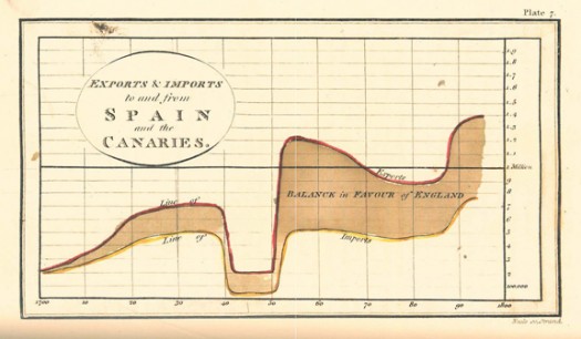
The term “information design” originated in the early 1990’s, however humans have been using visual aids to tell stories for a very long time (think cave paintings, hieroglyphics, etc.). Formal Information Design really hit its stride in the 18th century, with innovators like William Playfair creating some groundbreaking representations of data (http://www.humantific.com/making-sense-of-the-early-sensemakers). Playfair, a Scottish engineer and political economist, invented pie charts, line graphs, and bar charts. And you thought Scotch whisky was Scotland’s greatest invention! All kidding aside, Playfair’s charts were beautiful representations of imports and exports, giving life to previously abstract statistics.Playfair13-525x306
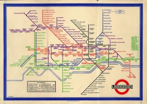
The evolution continued, and fast forward to 20th century: Harry Beck, an English technical draftsman creates the famous London Underground tube map in 1931 (http://britton.disted.camosun.bc.ca/beck_map.jpg).
beck_map

As a map lover, this is truly an iconic work, and set the standard of urban transit maps that we all know today. To me, Beck’s work truly achieves one of the key goals of information design: clearly visualizing something that is difficult to understand. Can you imagine the complexity of an actual map of the London Underground in its correct scale? It would likely look like an angry cluster of snakes. Beck’s map breaks down the complexity into something that even a novice traveller can visually digest over a cup of tea and a scone.

So with a little history under our belt, what are some tips for taking a modern approach to Information Design? Amy Balliett of Smashing Magazine wrote a fantastic article that gives some great examples of do’s and don’ts, that we can all use to approach our next presentation (http://www.smashingmagazine.com/2011/10/14/the-dos-and-donts-of-infographic-design/):

1) Show, don’t tell: Don’t miss an opportunity to visualize data. In other words, avoid putting into text what can better be conveyed with an image, chart, or graph.
2) If the client wanted an excel chart, they wouldn’t need you: This is clearly aimed at professional info designers, but you get the idea. Step your game up, and get creative! If possible, learning some design platform could really differentiate your skills from the rest of the pack.
3) Typography should not be a crutch: avoid leaning too heavily on fancy fonts that distract from the visualized data. I think this is great advice, and reflects back to “show, don’t tell.”

She goes on to make several other good points, but I’ll get right to the good stuff…

4) Tell a story: Funny how it always comes back to a good story. Great info graphics introduce a problem, back it up with data, and finish with a conclusion.

I highly recommend reading Ballet’s entire article, and hopefully it will provide some inspiration next time you attempt to convey a message visually. Now where did I put that Scotch?

Sharing a Helpful Resource

If your job is anything like mine, you use Microsoft Excel and/or PowerPoint on a regular (if not daily) basis. If you use either of these applications in conjunction with each other (which I know all of us have in our prior MP presentations), I have a very helpful resource to share with you.

One of the biggest challenges that I have faced is effectively incorporating data (particularly from Excel) into a concise PowerPoint presentation. Given that Excel and PowerPoint are both made by Microsoft, you would think that using these two applications in conjunction with one another would be fairly seamless and potentially even synergistic (1 + 1 = 3, right?).  However, integrating Excel and PowerPoint is not always straight forward, and conveying key takeaways rather than “data dumping” an entire financial model into your presentation can be a challenge. Additionally, I think that most of us are typically better at one than the other which doesn’t make things any easier.  I certainly have found this to be the case for myself, and while I have a strong background in using Excel, I have a lot of “room to grow” in terms of incorporating financial data from huge bulky models into a clean and concise presentation that conveys the underlying data effectively.

As I have searched for tools, resources, and articles giving guidance on this very topic, I have come across a particularly helpful website that I wanted to share with our class and hope that you will find it to be as useful as I have. This website is called ‘Think Outside the Slide’ and is as close to a “one stop shop” as I have found for guidance on just about everything relating to creating powerful presentations, with literally thousands of articles neatly organized by topic, as well as video tutorials if you’re more of a visual person. If you use Excel or PowerPoint at all, there is likely a specific article with tips and guidance on how to more effectively use the applications in a context relevant to you.

These are just a few that I have begun to frequently reference to give you a snapshot:

  • Using Excel Data in Powerpoint Presentations
  • Slide Design, Creation, and Editing
  • Linking Excel Data (and other content) to PowerPoint so that data in slides automatically updates
  • Tips on effectively cleaning up and animating graphs
  • Creating powerful visuals using Excel Data (waterfall graphs, diverging stacked bar charts, treemap diagrams, proportional shape comparisons, etc…)

For many business professionals, myself included, Excel and PowerPoint are critical tools, and learning to use data effectively in PowerPoint presentations can take time but is versatile skill with application to countless professions that can help to distinguish yourself from your peers/co-workers, and add value to your clients. I hope you find this to be a helpful resource, please feel free to share any other resources that you frequently use and have found helpful in your career. Thanks!

Helpful links referenced in this post:

http://www.thinkoutsidetheslide.com/free-resources/

http://www.thinkoutsidetheslide.com/using-excel-data-in-a-powerpoint-presentation/

http://www.thinkoutsidetheslide.com/articles/

Easy on the Slides, Heavy on the Story

I currently work for a large energy management company, specifically on a team that develops new software applications that promote internal efficiencies of business processes. Every few months I find myself in front of groups of engineers, project managers, and business managers presenting information regarding the latest set of features released in our software applications. The presentation material is always technical, the demonstrations are always technical, and the questions and answers exchanged with the audience are always technical. My purpose is to equip the audience with the technical knowledge to enable them to turn-around and use the software applications to their fullest.

Needless to say, I don’t often weave storytelling into my technical presentations. I’m not particularly looking to close a sale or win over a new investor with my presentations. However, with aspirations to venture into entrepreneurship post-MBA, I have been considering the art of storytelling as a skill that may be extremely beneficial in my near future. An Inc.com article by Riley Gibson highlights three reasons why mastering the art of storytelling can help entrepreneurs and start-ups succeed (Article Link).

1. Stories are Memorable.

No matter how great your idea is or how much data you have to prove its greatness, if your audience isn’t connected to what you are saying, they won’t care or remember after you finish. Gibson points out Dollar Shave Club and their over-the-top hilarious commercials. No PowerPoint slides or bar charts, just a witty and entertaining delivery that won’t quickly be forgotten by viewers, or more importantly investors.

2. Stories Travel Further.

Gibson suggests that memorable stories are much easier to recall in the future than detailed specifications or statistics. The accuracy to which your business idea or venture is retold by others after your initial presentation is very important. In essence, a memorable story will travel more accurately and further than other techniques.

3. Stories Inspire Action.

Finally, Gibson points out that entrepreneurs often need to inspire action, which may be among investors, employees, or even customers. Spilling out data or specifications isn’t likely to motivate the majority of audiences. Rather, a compelling story can reveal the what, why, and how that is behind the action and in-turn can help to inspire the action that is desired.

With a technical background, it will be a challenge for me to punt the PowerPoint slides filled with technical jargon and transition to the development of a story that is 1) memorable, 2) can be accurately recounted, and 3) inspire action. However, I fully agree with Gibson, with a high level of competition in the marketplace for investors and customers, it is of the upmost importance to be able to set your company or idea apart from the rest.


Article Link: http://www.inc.com/riley-gibson/3-reasons-every-start-up-should-tell-more-stories.html

11 Techniques Steve Jobs’s used to Present Apple’s

Steve Jobs was known for a slick product presentation with a seemingly casual delivery. His visionary products he pitched through his keynote presentations created hype and buzz in the industry that will be timeless. He was a fantastic presenter however not a natural, which gives hope to all of us that need improvement!

He used many different techniques to perfect his art of presenting and many articles can be found that explain his effective use of these techniques.

I have attached an article which describes 11 different techniques that Steve Jobs practiced. Teaser alert; my favorite recommendation is Practice & Have Fun.


1) Express your passion

2) Create a Twitter-friendly headline

3) Stick to the rule of three

4) Introduce a villain

5) Sell the benefit

6) Build simple, visual slides

7) Tell stories

8) Prepare and practice excessively

9) Avoid reading from notes

10) Have fun

11) Inspire your audience

If you have any good tips on presenting you utilize, please share!

Attached below is the original article:

http://www.forbes.com/sites/carminegallo/2012/10/04/11-presentation-lessons-you-can-still-learn-from-steve-jobs/

Continue reading 11 Techniques Steve Jobs’s used to Present Apple’s

Attention, Cleanup on Slide 6.

Engineers like numbers. Engineers like problems that can be solved with numerical analysis. Engineers like when others agree that their numbers are correct. However, all too often Engineers fail to clearly communicate their ideas, analysis, and solutions in a manner that quickly informs, educates, and persuades their audiences. I would know; I am an Engineer.

Presenters commonly overlook good information design in their presentations. Instead, they focus on providing the maximum amount of information and data in a manner that allows the audience to fully appreciate not only the solution but also the process of the analysis. In their attempt to wow the audience with slides dominated by tables, charts, graphs, best-fit lines, major and minor grid lines and the like, they instead produce confusion and lack of interest. I will be the first to admit that I am guilty of such techniques.

In Edward Tufte’s work on information design, “Visual Display of Quantitative Information” – yes it is indeed as interesting as it sounds – Tufte discusses Data-Ink and Graphical Redesign. In order to achieve maximum impact, Tufte outlines five principles for data graphics that can lead to significant improvements in graphical design: 1) Above all else show the data, 2) Maximize the data-ink ratio, 3) Erase non-data-ink, 4) Erase redundant data-ink, and 5) Revise and edit. To help clarify, Tufte describes data-ink as “the share of the ink on a graphic that presents the data-information”; it is “the non-erasable core of the graphic.” The key and the challenge of this topic is finding simplicity.

Tufte provides a great example of how to erase redundant data-ink within reason. Consider a simple bar chart with a single bar that is shaded and displays the value of the data point at the top of the bar. The height or value of the bar chart in this simple example is identified in six separate ways. Five of those ways can be considered redundant and removed, and the important data will still be present. The six ways include, 1) the height of the left vertical of the bar chart, 2) the height of the right vertical of the bar chart, 3) the height of the shaded region of the bar chart, 4) the vertical position of the horizontal top of the bar chart, 5) the vertical position of the value on top of the bar chart, and 6) the numeric value itself. Removing redundant information creates clearer presentation and more effective communication of a presenter’s ideas.

For most, this is likely not the most exciting of topics. However, for someone who works heavily in numerical analysis and who must convey outcomes to audiences of varying backgrounds, these suggestions on good information design are priceless. Does anyone else struggle in the area of good information design? Have you ever been complimented on your information design? Any other suggestions of how someone can improve their ability to display quantitative information?


Tufte, Edward R. “Data-Ink and Graphical Redesign.” The Visual Display of Quantitative Information. Second ed. Cheshire, CT: Graphics LLC, 2006. N. pag. Print.