All posts by Betsy Cossette

How the Nixon-Kennedy Debate Changed the World

“It is not simply what we say, but how we say it, and how we look while saying it.”
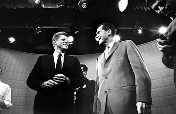
360_presidential_debate_0924

Jack Kennedy, left, and Dick Nixon before their 1st TV debate.

Today, I attended a training course on communicating assertively. It was filled with a lot of great takeaways, and the focus was around adapting your approach towards others for optimum results. The instructor brought up the three “V’s” when communicating with others: verbal, vocal, and visual. It is primarily the vocal (tone) and visual (appearance, facial expressions, body language) that impact communication. Together, these two V’s count for 93% of the impact. Of course, this is context dependent, but the statement led one of my colleagues to mention the famous Kennedy vs. Nixon debate.

In case you are unaware, this was the first presidential debate ever broadcasted on TV. The debate of course was also broadcasted on the radio, and for those listeners who were polled, more said that Nixon was the winner than Kennedy. For those who were lucky enough to watch the debate on TV, more said that Kennedy was the winner. The conclusion—Kennedy’s visual appearance and presence was superior to Nixon’s, and this made him the clear winner, at least to those who watched it on TV.

I was not around for this debate and have not had a chance to watch it yet, but from what I have read, some words used to describe Kennedy after the debate were handsome, dapper, calm, confident, and poised, while Nixon was described as sickly, clammy-faced, awkward, and sweaty. We all know that Kennedy went on to win the presidency, and many believe that this televised debate was what took him from a young, relatively unknown senator to a star in one night.

After hearing this story, I searched for some articles about this debate to investigate. Some argue that the polls used were not statistically significant, and I will leave that up to you to decide. In the end, I do believe that when it comes to communicating and presenting, tone and body language influence the verbal message. It is not simply what we say, but how we say it, and how we look while saying it. We all need to take this into consideration when presenting for impact.

Interesting Time Article on the debate and its impact on the world.

SCHUTZER, PAUL. Democratic and Republican presidential candidates Jack Kennedy, left, and Dick Nixon stand underneath glaring lights prior to beginning their 1st TV debate. Digital image. How the Nixon-Kennedy Debate Changed the World. Time, 23 Sept. 2010. Web. 14 Aug. 2014.
Animations – don’t let them suck the life out of your audience!

My main goal for the summer MP session has been to improve the overall appearance of my PowerPoint slides. I learned that slide design was a weakness of mine during the first semester when I saw some of the Carlos Museum presentations that you all put together.  I was very impressed (and jealous!). I have since spent some time searching for articles on how to improve in this area, and it has been difficult to find tangible recommendations that are easy to apply. Thus, I turned to Amazon and purchased a book called slide:ology.

While I have not read the whole book yet, it has a lot of useful content, and reading it will be part of my personal action plan. I wanted to share one of many useful takeaways in this book with you, which is on animations. Human beings are innately programmed to look at things when they move (fight-or-flight instinct), but PowerPoint animations were not designed with this taken into consideration.

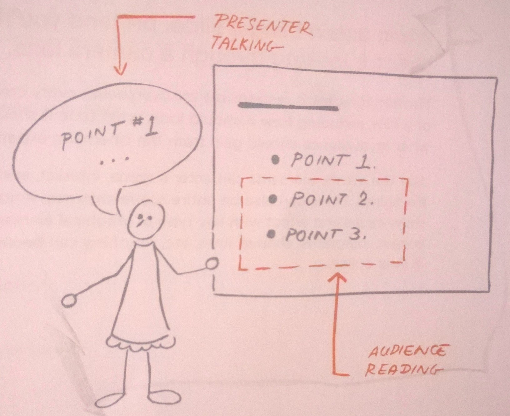
Every time we include animations in our presentations, our audience will turn toward the movement. Even if your animation is subtle, it will momentarily distract our audience. It is important to note that animation, while it may distract, is not always a bad thing. If we use them to help our audience process information more effectively, they can be a huge asset. This requires selecting animations wisely.

Animation should breathe life into your audience, not suck it out. Always choose animation that looks natural and alive, and movement must feel familiar. English is read from left to right, and so our eyes are much more comfortable moving left to right. Keep this in mind if you choose to have words fly-in. A descending object is sensible since we recognize the law of gravity. Although, text dropping down and bouncing all around has no meaning and can be annoying. Objects ascending appear to resist gravity, which can be perceived as illogical. The book goes into more detail on animation recommendations, but the key takeaway is not to include animations for the sake of having animations. They must be selected wisely and help the audience process information.

WP_20140805_002

It is fine to animate points, but make sure you hide them until you start discussing them.

Duarte, Nancy. Slide:ology: The Art and Science of Creating Great Presentations. Beijing: O’Reilly Media, 2008. Print.


Design Tips for the Novice Graphic Designer

For those of you (like me) who are not designers or naturally gifted in graphic design, this post is for you. We are always being judged by the visual appearance of our presentations, so I think that it is worth improving our capabilities in slide design. I have gathered ten tips that are easy to implement. A link to the article can be found here, which includes a lot of useful illustrations to help get these points across.

#1 Avoid built-in themes

Custom built slides make for a more powerful statement. Templates should only be used for last minute presentations.

#2 Use quality photos

A good photo is one of the easiest ways to make your presentation look better. However, no photo is better than a bad photo. Photos should be unique, attractive, and cliché-free. Where to get free photos? Try Stock XCHING or Flickr. On Flickr, search for “creative commons licensed content,” as those photos are free and usually only require attribution.

#3 Solid colors rock

Yes, it is possible to create an impactful slide with plain design and solid colors. Choose wisely though—too bright or colorful can be bothersome to the eyes. Remember your color wheel from elementary school and use contrast when picking your secondary color.

#4 Select fonts prudently

Make sure you understand the message you want to communicate before selecting a font. The classic, old-style serif fonts are formal while sans-serif are more modern.

ds-bp-10

Note: People often think the classics are too boring. They are wrong. These are safe choices.

#5 Make your slides readable

Do not use that amazing photograph as a background if you cannot make your font readable over it. You can get around this by using a simple color bar (example below).

ds-bp-16

#6 Simpler is better

The main content comes from you when presenting, so the slides need to serve as a simplified visual aid. Think of your slides as an outline for your presentation. Additionally, simple slides prevent you from reading them.

#7 Go easy on the bullets

Keep them few in number and simple. Also, they do not need to be self-explanatory because that is what you are there for!

#8 Create clear focal points

Tip #8 may be harder to implement for those with limited design abilities (like me), but the idea is to know where and how to direct your audience’s attention You can do this with color, fonts, text size, and photographs. Without clear focal points, you risk losing your audience.

#9 Design a captivating slide cover

This slide sets the tone for your presentation, so do not ignore it even though it may only be seen for a few seconds. Leaving it up during your introductions helps start the presentation on a positive note and introduces your visual theme.

#10 Add some humor

Your goal is not necessarily to hear laughter. Consider inserting a simple comic or picture that will make your audience smile, as this will help ease any tension in the room. Remember, do not try too hard.

I know that we have some really good slide designers in the program because I have seen some beautiful slides. Anyone have other graphic design tips that the average PowerPoint user can start implementing?


Deconstructing a Ted Talk

Happy early 4th of July! Before I head out to the pool to enjoy this long weekend, I thought I would leave everyone with a few tangible tips on how to make a presentation great.

Everyone is familiar with Ted Talks, and for good reason—they contain powerful ideas that often change people’s attitudes, lives, and the world. I happened to find an article that deconstructs one of the most viewed Ted Talks of all time: “How Great Leaders Inspire Action.” I do encourage watching it when you get a chance, as it contains some intriguing and useful ideas. Whether you get to watch it or not, here are some takeaways that can be applied to future presentations.  Click Here for the Ted Talk and full deconstruction of the speech.

1. Get your audience in the proper mindset right away. Simon did this by getting the listeners “to question,” but you can be creative here with stories or astonishing facts.

2. Have an inflection point, and be sure to emphasize it.

3. Make your speech tangible by bringing in examples or research to support your ideas (duh!), but do not spend too much time or get into the nitty-gritty details. Otherwise, you risk losing your listeners.

4. Build suspense into your story. More direct eye contact helps you achieve this effect.

5. Consider using parallel structure. Think JFK’s famous line: “Ask not what your country can do for you. Ask what you can do for your country.” As for Simon, “We follow those who lead, not because we have to, but because we want to. We follow those who lead, not for them, but for ourselves.” Very impactful!

6. Pause for impact, but you need to be strategic with quantity and placement; keep them to a minimum and spaced out.

7. The most viewed Ted Talks do not use PowerPoint slides, so do you really need to?

8. This one is my favorite: fascination cannot be faked. Hopefully you have the privilege of being fascinated with what you present because this allows you to connect with your audience. And if you are not fascinated…well, good luck?!

I would like to add “smile” to the list as my own. When I was an intern, that was one of the most important pieces of advice that I received regarding public speaking: “Don’t forget to smile while presenting.” I was a little surprised with this advice since I thought it could take away from the seriousness of a formal presentation, but the more top-notch presentations I see, the more I notice the smiles throughout the speeches. This goes together with tip #8, but I thought it needed to be called out specifically. Hopefully I smiled during the Delta presentation…

Lastly, I came across an article titled, “How to Give a Killer Presentation,” which appeared in the Harvard Business Review last summer (you can get the full article through the Emory library system; click here for a portion of the article). It was inspired by the Ted Talk given by Richard Turere, which this one YOU MUST WATCH (Richard Turere: My invention that made peace with lions)! Richard was an unlikely candidate to give a Ted Talk: terribly shy, spoke poor English, and had difficulty producing coherent sentences. But, his idea was so inspirational that the folks at Ted worked with him to frame his story and give a powerful speech. Boy, did he nail it!

The lesson here is that you do not need to be the best speaker to be engaging and inspiring. There are tools and tips you can follow to improve presentations (i.e. the list from above, this HBR article, all the other posts on this blog…), and if you let your pure passion and unique personality shine through honestly, people will hear you. And how about Richard’s smile? My heart melted.