I just read an article that discusses the issue of wanting to transition into a management role, but needing management experience in order to qualify. How do you gain experience if you need experience to get the position. This is a tricky situation that many people face as they try to climb the corporate ladder.
Effective Leadership & Knowing Your Team
I’ve been able to work in a small office over the past 5 years, and one of the things I’ve really come to appreciate is the flexibility provided to our employees in terms of their work roles and job descriptions. Oftentimes, we hire someone with the intent they’ll complete a specific job or task in our office but then find their skill-set or personality lends itself better to a completely different role. We’ve had the ability to frequently re-organize and assign people to new areas with their specific strengths in mind, oftentimes leading to an increase of quality work output.
This seems to support the phrase “you should hire for personality and train for skill,” which I’ve heard on occasion. Given my experience, and within reason, this seems to make sense. If your employee fits into the office culture and has the basic intelligence level needed to succeed after a period of training, how can you go wrong? To effectively do this, a manager undoubtedly needs to know their team well. Good leaders need to understand their employee’s strengths and weaknesses, their goals and professional aspirations, as well as how each member interacts with the others.
I’ve copied two excerpts below that highlight these points. You have to know your employees well and then help them assume the role that not only makes them most happy at work, but will ultimately benefit the organization as whole:
2. Know Their Stories – Take time to get to know the people you work with, especially your direct reports. Have coffee or a meal with them. Ask questions to learn about their lives and what’s important to them. Questions unrelated to work might include “so you were born and then what happened?”; “what are your interests outside of work?”; and “where did you grow up?” These questions typically open the door for you to ask follow-up questions. This will give you insights into how the people you work with are wired, including what they value at work and in their lives outside of work.
3. Help People Get Into the “Right Role” – Help your direct reports get into the right role that fits their interests and strengths, and provides the right degree of challenge. If you are not able to get them a role that is a good fit, consider responsibilities or projects you can assign them that fit well with their wiring.
What I’m most curious about, is whether the flexibility and real-world practice of these two traits carry over into larger corporations or organizational structures. Do those of you who work in larger environments experience this type of management style and job responsibility flexibility?
See the full article here: http://www.foxbusiness.com/business-leaders/2014/07/10/7-best-practices-to-boost-employee-engagement/
Excel-ing in Real Estate
I learned early in my first semester that my skills with Microsoft Excel were in need of serious improvement. By the second semester, I realized that I might be the least proficient Excel user in the entire program. This is sort of embarrassing considering that I was a finance major and work in the commercial real estate business. That being said, I am determined to improve.
This MP project is very timely for me. It coincides with the need for me to analyze several prospective investments for my company. Recently I have taken the time to review Professor Noonan’s slides and from that decided on some of the skills that I plan to acquire. I have since learned how to use pivot tables as well as the sensitivity analysis feature. I found some youtube videos that really helped me fine tune these skills:
I recently used sensitivity analysis as part of my analysis in evaluating an apartment complex. See below:
| $ 264,976.47 | 37,000 | 38,000 | 39,000 | 40,000 | 41,000 | 42,000 | 43,000 |
| 15,000 | 258,823.53 | 270,588.24 | 282,352.94 | 294,117.65 | 305,882.35 | 317,647.06 | 329,411.76 |
| 16,000 | 247,058.82 | 258,823.53 | 270,588.24 | 282,352.94 | 294,117.65 | 305,882.35 | 317,647.06 |
| 17,000 | 235,294.12 | 247,058.82 | 258,823.53 | 270,588.24 | 282,352.94 | 294,117.65 | 305,882.35 |
| 18,000 | 223,529.41 | 235,294.12 | 247,058.82 | 258,823.53 | 270,588.24 | 282,352.94 | 294,117.65 |
| 19,000 | 211,764.71 | 223,529.41 | 235,294.12 | 247,058.82 | 258,823.53 | 270,588.24 | 282,352.94 |
| 20,000 | 200,000.00 | 211,764.71 | 223,529.41 | 235,294.12 | 247,058.82 | 258,823.53 | 270,588.24 |
| 21,000 | 188,235.29 | 200,000.00 | 211,764.71 | 223,529.41 | 235,294.12 | 247,058.82 | 258,823.53 |
The left-hand column (starting with 15,000) refers the Operating Expenses and upper row (beginning with 37,000) refers to Revenue. The info in the middle shows the resulting value (based on an 8.5 Cap rate). If you’re not in the Real Estate business, a cap rate is NOI/VALUE, essentially a measure of the rate of return. This proved fairly helpful as I went over it with our current apartment manager to confirm our offer.
I also did analyses for revenue sensitivity to price and vacancy and the Operating Expense sensitivity to some of the specific expenses. The Revenue sensitivity illustrates how much vacancy we could bear under certain price levels. The Operating Expense analysis displays the critical expenses.
I am well aware that, for most of you, this is very basic. I am just glad to address this weakness.
Edward Tufte on PowerPoint
This is an interesting read on the pitfalls associated with PowerPoint presentations. One of the things that I am focusing on improving this semester is my presentation skills, and I found this article, The Cognitive Style of PowerPoint by Edward Tufte, to be helpful with regards of how to present data in a meaningful way. While you may find some of his opinions to be extreme, I believe that he still has many valid points and that his arguments are logical.
Even if you do not read this entire article, at least see his demonstration of Abraham Lincoln’s Gettysburg Address via PowerPoint presentation on page 12 along with the section on improving our Presentations on page 22. I’ve included some highlights of the article below:
The Cognitive Style of PowerPoint
PP convenience for the speaker can be costly to both content and
audience. These costs result from the cognitive style characteristic of the standard default PP presentation: foreshortening of evidence and thought, low spatial resolution, a deeply hierarchical single-path structure as the model for organizing every type of content, breaking up narrative and data into slides and minimal fragments, rapid temporal sequencing of thin information rather than focused spatial analysis, conspicuous decoration and Phruff, a preoccupation with format not content, an attitude of commercialism that turns everything into a sales pitch.
Extremely Low Resolution of PowerPoint
Visual reasoning usually works more effectively when the relevant information is shown adjacent in space within our eyespan. This is especially the case for statistical data, where the fundamental analytical act is to make comparisons.
Bullet Outlines Dilute Thought
By leaving out the narrative between the points, the bullet outline ignores and conceals the causal assumptions and analytic structure of the reasoning.
Bullet outlines might be useful in presentations now and then, but sentences with subjects and verbs are usually better. Instead of this type of soft, generic point found in many business plans.
Improving Our Presentations
Designer formats will not salvage weak content. If your numbers are boring, then you’ve got the wrong numbers. If your words or images are not on point, making them dance in color won’t make them relevant. Audience boredom is usually a content failure, not a decoration failure.
Never use PP templates for arraying words or numbers. Avoid elaborate hierarchies of bullet lists. Never read aloud from slides. Never use PP templates to format paper reports or web screens.
Paper handouts at a talk can effectively show text, numbers, data graphics, images. Printed materials, which should largely replace PP, bring information transfer rates in presentations up to that of everyday material in newspapers, magazines, books, and internet screens.
Applying Business Intelligence: The Power of Business Resource Groups
Business Resource Groups, often also referred to as Affinity or Ethnic Resource groups, are an important component of organizations. For those of you who aren’t as familiar, business resource groups are typically composed of a group of employees who share a commonality (e.g. race, gender, sexual orientation, age etc….) Ten years ago, corporate diversity was seen more as a good thing to have, but not as a necessity for corporate growth. Leaders often categorized business diversity initiatives with corporate giving and office philanthropy.
Today, company executives now realize that in order to survive and succeed in today’s competitive business environment, they have to bring diversity to the forefront of the company. The top executives and the employees have come to the realization that the introduction of different voices, with different perspectives, backgrounds, priorities and orientations will help identify opportunities that will yield success in new markets. Here is an example of how one company applied this business intelligence, and saved $100 million in market research fees using its company’s business resource groups. Resource Groups & Marketing: DiversityInc Innovation Fest
Does your organization have business resource groups? If so, have they been used to help drive business results?
Source: Resource Groups 101: A Primer on Starting Them & Using Them for Business Goals
Transitioning from Management to Leadership
I read an article this morning on HBR by Vineet Nayar that briefly outlined three ways any manager can improve, and all of them are based on the concept that to “manage” is to do a disservice — you’re much better off leading.
Though my MP path of self-improvement is about how to better “manage a project team”, it’s safe to say that we’ve all entered Goizueta with a goal to become improved leaders rather than improved managers.
What are a few differences? Vineet Nayar provides a 3-step litmus test.
1) Do you count value or do you create value?
A manager counts value and holds rigid milestones while a leader might instead create a team dynamic that will hit those milestones on its own. One of the commenters likened this to someone who is sick taking some pills to resolve the issue, versus someone eating right, resting, and exercising, thus staying well.
2) Do you present a circle of influence or a circle of power?
This goes into the article I posted a few weeks back about the importance of trust in leadership. Wielding power is a negative trait, but being that person who others come to for advice or encouragement is an indicator of leadership. The author only mentions how one can recognize their leadership in this point, but doesn’t recommend how to position oneself. Any thoughts here?
3) Do you manage work or do you lead people?
This relates to oversight (managing) and influencing by working alongside those in the trenches.
All in all, it seems that both are necessary, but influence and leadership are more proactive approaches to problems. Management is more reactive. The three litmus questions are overlapping and somewhat redundant, but I like the underlying point. What Vineet never says is that both management and leadership are necessary, but I’m not sure if he agrees with that.
As a general rule, after reading an article, avoid the comments section. Except in HBR.
I broke this rule and read a different take on Leadership vs Management dichotomy by “John R. Shultz”:
Which point of view do you find speaks more to you?
Original article here: http://blogs.hbr.org/2013/08/tests-of-a-leadership-transiti/
Information Design For Dummies
This title is clearly tongue-in-cheek, but for me, “For Dummies” can be applied to several areas of mine that need improvement. I suppose those of us who aren’t fortunate enough to practice every viable business skillset regularly may feel the same. But hey, isn’t that why we’re in school? Isn’t that the nature of this project? I digress….
Presentations haven’t been a focus of career thus far, so even the term Information Design is something relatively new. In trying to gain expertise and understanding quickly, I always like to start at the beginning. Where did Information Design originate? What’s its purpose? How is it best used today? To quote professor Makadok, “I’m energized! I’m ready to learn!”
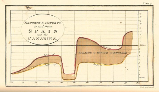
The term “information design” originated in the early 1990’s, however humans have been using visual aids to tell stories for a very long time (think cave paintings, hieroglyphics, etc.). Formal Information Design really hit its stride in the 18th century, with innovators like William Playfair creating some groundbreaking representations of data (http://www.humantific.com/making-sense-of-the-early-sensemakers). Playfair, a Scottish engineer and political economist, invented pie charts, line graphs, and bar charts. And you thought Scotch whisky was Scotland’s greatest invention! All kidding aside, Playfair’s charts were beautiful representations of imports and exports, giving life to previously abstract statistics.
The evolution continued, and fast forward to 20th century: Harry Beck, an English technical draftsman creates the famous London Underground tube map in 1931 (http://britton.disted.camosun.bc.ca/beck_map.jpg).

As a map lover, this is truly an iconic work, and set the standard of urban transit maps that we all know today. To me, Beck’s work truly achieves one of the key goals of information design: clearly visualizing something that is difficult to understand. Can you imagine the complexity of an actual map of the London Underground in its correct scale? It would likely look like an angry cluster of snakes. Beck’s map breaks down the complexity into something that even a novice traveller can visually digest over a cup of tea and a scone.
So with a little history under our belt, what are some tips for taking a modern approach to Information Design? Amy Balliett of Smashing Magazine wrote a fantastic article that gives some great examples of do’s and don’ts, that we can all use to approach our next presentation (http://www.smashingmagazine.com/2011/10/14/the-dos-and-donts-of-infographic-design/):
1) Show, don’t tell: Don’t miss an opportunity to visualize data. In other words, avoid putting into text what can better be conveyed with an image, chart, or graph.
2) If the client wanted an excel chart, they wouldn’t need you: This is clearly aimed at professional info designers, but you get the idea. Step your game up, and get creative! If possible, learning some design platform could really differentiate your skills from the rest of the pack.
3) Typography should not be a crutch: avoid leaning too heavily on fancy fonts that distract from the visualized data. I think this is great advice, and reflects back to “show, don’t tell.”
She goes on to make several other good points, but I’ll get right to the good stuff…
4) Tell a story: Funny how it always comes back to a good story. Great info graphics introduce a problem, back it up with data, and finish with a conclusion.
I highly recommend reading Ballet’s entire article, and hopefully it will provide some inspiration next time you attempt to convey a message visually. Now where did I put that Scotch?
Elements of a Story
Stories are the fiber of what holds everything together. Stories can be personal or they can be professional. The elements that make a story great remain consistent, but the emphasis on different elements of a story may shift. When you go home at Thanksgiving, your grandfather wants to hear all of the details of your new job, but when you face an executive review board at work, you need to keep your words to their most effective minimum. This is the difference of when emphasis shifts. Knowing the give and take of a good story is where the art exists. And that is where practice makes perfect.
1. The Audience: Knowing your audience is one of the biggest keys to a good story. By knowing the expectations and world view of your audience, everyone is on the same team. When your story resonates with the audience’s belief system, this is when stories are spread. (Remember, you are resonating with an existing world view, not trying to bully pulpit the audience to think the way that you do.)
2. Clarity: Details are important, but not at the expense of your main point. Make sure that the main point of what you are saying is not lost in all of your attention to the telling of the story. The reason you are telling the story is to evoke a response—inspire, motivate, create urgency, give warning. Make that happen by always returning to the main point.
3. Credibility: This goes back to the audience element. If you cannot evoke trust, you aren’t just telling a story, you are telling a lie (which ironically some people call a story). Be authentic and maintain the trust of the audience. Don’t contradict the belief system that your story appears to espouse. Be authentic and win friends.
4. Brevity: A simple story is more successful than a complicated one. Understatement carries a big impact. Maintain a cadence and progression in the story.
5. Add Context: Appeal to the senses, not to logic: descriptive language makes you feel like you are there and relates to the audience. A Forbes article published in 2013 states that 80% of what we hear is gone within 24 hours, and a story makes information sharing more memorable.
6. Create tension: Any time that you want to connect with an audience, you have to create some form of interaction. Ask a probing question to make them think (bonus: require that someone in the audience responds). Tension makes the audience wrestle. Make the audience feel invested.
7. It never hurts to add humor: As Mark Twain says, “The humorous story is strictly a work of art—high and delicate art—and only an artist can tell it; but no art is necessary in telling the comic and the witty story; anybody can do it. The art of telling a humorous story—understand, I mean by word of mouth, not print—was created in America, and has remained at home.”
The final element of a good story is practice. As much as we would like to think that storytelling off the cuff will come easy, the best story tellers will attest that practice makes perfect. Given the value of a story, mastering this art is worth it.
What Makes a Great Manager?
The article “What Great Managers Do” by Marcus Buckingham uses the old aphorism “he’s playing chess while the rest are playing checkers”, but in a different light.
Here the phrase doesn’t represent managers who are simply more strategic in their style, but likens a checkers approach to management as one that treats all employees as uniform pieces toward a success goal. Meanwhile, chess is a more apt comparison, since employees are never homogeneous.
Some employees excel in types of projects, but struggle endlessly in others. A great manager exploits the strengths of each employee and can work outside the framework of an original plan by recognizing who should be working on what.
How many have seen people fired for failing in one aspect of their job when you’ve seen them excel elsewhere? I’m thinking about the “A for effort gets generous severance” from our Netflix recruitment slide deck in particular. Would a great manager be able to save that human capital and repurpose the employee where their strengths lie? Or is that kind of effort a waste of time and resources?
Article: http://hbr.org/2005/03/what-great-managers-do/ar/1
Edit: Here’s more on the topic, including info behind the research and the book by Marcus Buckingham. http://www.businessinsider.com/how-to-be-a-great-manager-2013-8
The Art of an Executive Summary
In my job I give 3 or 4 client-facing presentations per week. These presentations are often very similar, and over the course of my career there are very few new issues in my specific field. It can be very simple to reuse an old presentation with a few adjustments. However, it is important to understand that this may be the first time your client has come across this particular issue or undertaking. An easy an effective was to frame an issue and have your audience moving in the same direction is an executive summary page.
Below is an article written by a CBS contributor outlining an effective executive summary. The key is to not approach the summary in chronological order… problem, solution, and outcome. If the goal of the presentation is a sale or a call to action, end with that. Structure the summary beginning with current problem, the desired outcome, and then the solution. This ending will provide a nice transition into the meat of the work you will present.
The goal is to establish your credibility by displaying your understanding of the customer needs, provide a compelling value proposition and why your solution is unique.
http://www.cbsnews.com/news/the-art-of-the-executive-summary/