Category Archives: Uncategorized

Delivering Presentations – A few quick tips

2. Don’t Memorize:

This is, after all, a presentation, not a recital. Every presentation needs two major components — life and energy. Recite from memory and your presentation will be sadly lacking both of these factors. Not only will you lose your audience, but you will be hard pressed to adapt to unexpected events that may throw you off your mental script.

12. Have a Backup Plan:

What if your projector dies? Or the computer crashes? Or the CD drive doesn’t work? Or your CD gets stepped on? For the first two, you may have no choice but to go with an AV free presentation, so have a printed copy of your notes with you. For the last two, carry a backup of your presentation on a USB flash drive or email yourself a copy, or better yet, do both.

5. Know the Room:

Be familiar with the place in which you will speak. Arrive ahead of time, walk around the speaking area, and sit in the seats. Seeing the setup from your audience’s perspective will help you decide where to stand, what direction to face, and how loudly you will need to speak.

6. Know the Equipment:

If you are using a microphone, make sure it works. The same goes for the projector. If it’s your projector, carry a spare bulb. Also, check to see if the projector is bright enough to overpower the room’s lighting. If not, find out how to dim the lights.
________________________________________
The  four tips above are excerpts from an article by Wendy Russell titled “12 Tips for Delivering a Knockout Business Presentation”. These four tips are among the most important in my opinion. #4 and #12 go together in the sense that you need to be prepared for the unexpected. If you memorize exactly what you are going to say, then you will be in trouble if anything unexpected occurs. Rather, if you prepare to share certain content (instead of memorizing specific sentences) you will be able to speak more confidently and clearly.
#5 and #6 pertain to each other as well and can be summarized as such: know your surroundings. Your presentation should be catered to your audience instead of a cookie cutter generic presentation. Additionally, knowing the equipment you will use allows you to be even more comfortable and adaptable incase anything unexpected happens.
Beyond Powerpoint: Innovative Presentation Tools

The most common presentation software, Microsoft Powerpoint, has remained largely unchanged for the past two decades, and has several well-known drawbacks that impede the ability of presenters to tell their story to the audience.  Fortunately, a new generation of presentation software has recently been developed.  Below I’ve highlighted a several innovative presentation tools designed to promote dialogue,  introduce real-time data into presentations, and foster collaboration between people creating presentations.

Presentation Structure

Powerpoint forces the presenter to present to the audience in a linear format.  The problem with a linear format is that many concepts require multiple dimensions  to display the interconnected nature of the subject matter.  Enter Prezi, a new presentation software to create a ‘spacial narrative’ that not only allows for a 2 or 3 dimensional presentation flow and visualization, but also allows the presenter to stop at any point, and ‘zoom’ to any portion of the overall presentation.  Prezi is especially great for more interactive, discussion based meetings, or for subject matter that does not have a distinctly linear format.   Links to some great ‘sample’ Prezi presentations are provided below.

Real Time Data

A blog article from the Harvard Business Review website called “Presentation Tools That Go Beyond ‘Next Slide Please'” by Nolan Browne notes that ‘presentation tools have largely been static, creating an artificial boundary between the presentation and the outside world.”  Power point slides are great for capturing the state of things at a particular moment in time, similar to how a balance sheet captures the financial situation of a company at the end of a quarter. For presentations that touch on subject matter that is constantly changing, this can cause a lot of extra work in changing the content, or require that the presenter present out of date information.  Several new tools are working to help bring real-time data into presentations.  Zoho Show, a component of Zoho Docs, an online suite of productivity tools similar to Microsoft Office, allows users to insert live media and data from a variety of online sources directly into a presentation.

Collaboration

Powerpoint impedes collaboration in several ways.  First, its difficult to collaborate with others when creating a new presentation.  Presenters either have to create slides separately, and then splice them together to create a whole presentation.  This method usually leads to a presentation with an uneven flow due to differences in writing, style, format etc. of the different presenters slides.  Alternatively, presenters either have to meet in real time to create the presentations, or email revisions back and forth, which can be difficult to manage.  Online collaboration tools like Dropbox and Google Drive help with this issue by creating a centralized document that the presenters can share.

Powerpoint also inhibits in-meeting collaboration between those in the meeting.  For example, if a presenter would like to collaborate with the meeting participants during the presentation to edit a graph, they either need to use the cumbersome and slow feature to imbed an excel plot within Powerpoint, or open up a separate excel file.  A new program called Plotly allows users to create interactive graphs that foster collaboration and discussion about the data.  Google Drive allows multiple users to use a single document at one time, and shows where each users cursor is on the document so that each participant can keep track of where the other users are concentrating.

Here are several sample Prezi presentations.  My goal for this MP course is to create at least one Prezi presentation for my job and gather the meeting participants feedback on the experience.

Source:

Browne, Nolan. “Presentation Tools That Go Beyond “Next Slide Please””Harvard Business Review. N.p., 24 Apr. 2014. Web. 12 July 2014.

Storytelling: Displaying the Struggle Between Expectation and Reality

Most of us in the evening MBA program are knowledge workers.  We don’t work with our hands, we don’t physically produce goods, we either create, analyze or transfer knowledge. Transferring knowledge from one person to another is the most challenging, because no two people think in the exact same way, but also the most important, because it is what drives change. Whether its giving a presentation, writing an important email, or having a tough conversation, my instinct is to fall back on my engineering background and rely on data and facts – and more often then not, doing this doesn’t inspire action.

The Harvard Business Review conducted an interview with screenwriting coach Robert McKee called “Storytelling That Moves People.”  In the interview, McKee talks about how storytelling is a crucial skill for business leaders to be able to motivate their coworkers, customers and partners to navigate through business challenges. McKee describes two types of storytelling that business leaders use.  The first uses conventional rhetoric and statistics, which, if successful, persuades people only on an intellectual level, which doesn’t inspire people to act. The second method of storytelling is to unite an idea with an emotion to persuade people on an emotional level and get them to act.

In the conversation, McKee describes the most difficult part of effective emotional persuasion through story-telling:  discussing the struggle. We all have a tendency, especially at work, to paint a rosy picture.  We want to be viewed as always succeeding, always in control, and always right.  McKee argues that story without a struggle doesn’t inspire because it doesn’t connect people on an emotional level about the challenges we all face.  To be a good storyteller,  according to McKee, “you want to display the struggle between expectation and reality in all its nastiness.”  McKee goes further to say that “the energy to live comes from the dark side…as we struggle against these negative powers, we’re forced to live more deeply, more fully.”

As an engineer working for a marketing company, the most difficult part of my job is persuading others to act while not falling back on data and statistics, and not painting a rosy picture.  Even though its challenging, telling stories that include a struggle has a tendency to unite people as they think about adversity in their own jobs, which usually causes them to rally around your goals.

As McKee says in the article, being a great storyteller alone won’t make you a great leader, but it is a skill that will help make you a better leader and help you to inspire action in others.  You can access the article through the Goizueta Business Library website, through the “Business Source Complete” database (search “Storytelling That Moves People”).

Source:

Fryer B. Storytelling That Moves People. Harvard Business Review [serial online]. June 2003;81(6):51-55. Available from: Business Source Complete, Ipswich, MA. Accessed July 12, 2014.

Information Design For Dummies

This title is clearly tongue-in-cheek, but for me, “For Dummies” can be applied to several areas of mine that need improvement. I suppose those of us who aren’t fortunate enough to practice every viable business skillset regularly may feel the same. But hey, isn’t that why we’re in school? Isn’t that the nature of this project? I digress….

Presentations haven’t been a focus of career thus far, so even the term Information Design is something relatively new. In trying to gain expertise and understanding quickly, I always like to start at the beginning. Where did Information Design originate? What’s its purpose? How is it best used today? To quote professor Makadok, “I’m energized! I’m ready to learn!”

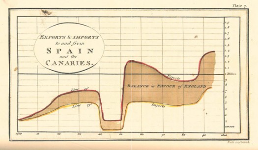
The term “information design” originated in the early 1990’s, however humans have been using visual aids to tell stories for a very long time (think cave paintings, hieroglyphics, etc.). Formal Information Design really hit its stride in the 18th century, with innovators like William Playfair creating some groundbreaking representations of data (http://www.humantific.com/making-sense-of-the-early-sensemakers). Playfair, a Scottish engineer and political economist, invented pie charts, line graphs, and bar charts. And you thought Scotch whisky was Scotland’s greatest invention! All kidding aside, Playfair’s charts were beautiful representations of imports and exports, giving life to previously abstract statistics.Playfair13-525x306

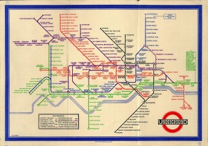
The evolution continued, and fast forward to 20th century: Harry Beck, an English technical draftsman creates the famous London Underground tube map in 1931 (http://britton.disted.camosun.bc.ca/beck_map.jpg).

beck_map

As a map lover, this is truly an iconic work, and set the standard of urban transit maps that we all know today. To me, Beck’s work truly achieves one of the key goals of information design: clearly visualizing something that is difficult to understand. Can you imagine the complexity of an actual map of the London Underground in its correct scale? It would likely look like an angry cluster of snakes. Beck’s map breaks down the complexity into something that even a novice traveller can visually digest over a cup of tea and a scone.

So with a little history under our belt, what are some tips for taking a modern approach to Information Design? Amy Balliett of Smashing Magazine wrote a fantastic article that gives some great examples of do’s and don’ts, that we can all use to approach our next presentation (http://www.smashingmagazine.com/2011/10/14/the-dos-and-donts-of-infographic-design/):

1) Show, don’t tell: Don’t miss an opportunity to visualize data. In other words, avoid putting into text what can better be conveyed with an image, chart, or graph.
2) If the client wanted an excel chart, they wouldn’t need you: This is clearly aimed at professional info designers, but you get the idea. Step your game up, and get creative! If possible, learning some design platform could really differentiate your skills from the rest of the pack.
3) Typography should not be a crutch: avoid leaning too heavily on fancy fonts that distract from the visualized data. I think this is great advice, and reflects back to “show, don’t tell.”

She goes on to make several other good points, but I’ll get right to the good stuff…

4) Tell a story: Funny how it always comes back to a good story. Great info graphics introduce a problem, back it up with data, and finish with a conclusion.

I highly recommend reading Ballet’s entire article, and hopefully it will provide some inspiration next time you attempt to convey a message visually. Now where did I put that Scotch?

What Makes a Great Manager?

The article “What Great Managers Do” by Marcus Buckingham uses the old aphorism “he’s playing chess while the rest are playing checkers”, but in a different light.

Here the phrase doesn’t represent managers who are simply more strategic in their style, but likens a checkers approach to management as one that treats all employees as uniform pieces toward a success goal. Meanwhile, chess is a more apt comparison, since employees are never homogeneous.

Some employees excel in types of projects, but struggle endlessly in others. A great manager exploits the strengths of each employee and can work outside the framework of an original plan by recognizing who should be working on what.

How many have seen people fired for failing in one aspect of their job when you’ve seen them excel elsewhere? I’m thinking about the “A for effort gets generous severance” from our Netflix recruitment slide deck in particular. Would a great manager be able to save that human capital and repurpose the employee where their strengths lie? Or is that kind of effort a waste of time and resources?

Article: http://hbr.org/2005/03/what-great-managers-do/ar/1

Edit: Here’s more on the topic, including info behind the research and the book by Marcus Buckingham. http://www.businessinsider.com/how-to-be-a-great-manager-2013-8