Category Archives: 07b-Using good information design

Crafting good exhibits of analysis, using best-practices of displaying and explaining quantitative results, creating effective tables and graphs, integrating Excel and PowerPoint

What Not To Do

What Not To Do (When Giving a Presentation):

While most of us know what we “should” be doing when it comes to giving presentations, we oftentimes forget what we should NOT be doing. I have realized over time that what we should vs. should not do are not inherently mutually exclusive. You can be doing everything that you are “supposed to” (i.e. following best practices), but simultaneously be making common errors that can limit the effectiveness of your delivery.

I’m as guilty as anyone when it comes to checking the boxes for everything that a strong presentation should have, but I’ve started to realize that by diagnosing errors that I am more inclined to make, many of the recommended strategies subsequently fall in line naturally.

To frame this as a metaphor, I’m talking about targeting the disease, not making the anecdote stronger. I’ve found that this starts with getting back to the basics and building from there. So, what are some of the more common pitfalls in presentation delivery? After vetting several resources I’ve consolidated a list of quick anecdotes that I have found to be helpful to keep in mind:

  • Avoid reliance on slides. Slides are there to compliment your presentation and provide a framework, not the other way around.
  • Overload: Less is more. Too much talking and/or too much text will easily disinterest any audience, no matter how rich the content.
  • Avoid Apologies: If something goes wrong, there is a typo, you say something incorrectly, etc… JUST GO WITH IT. Odds are that no one else noticed and by drawing attention to it you are just calling out yourself (and your credibility).
  • Avoid filler words: This is public speaking 101, it sounds easy and we’ve heard it thousands of times, but it is absolutely critical. Unfilled airtime between sentences and ideas is okay. Specifically avoid “um”, “so”, “right”, and “you know” are very common and very distracting!
  • Going over your allotted time: Once you start to go long you begin to lose your audience. And once you even begin to lose your audience, it’s too late. This can cause the audience to miss your “big finish” and really tear down everything you’ve worked so hard to build.

While there are many more, these are just some of the most common problems that can hold you back from delivering the most effective presentation possible. We never get to a point where we are too advanced to worry about the basics. While one of these points are anything that you haven’t heard before, hopefully you will find some of these to be helpful reminders.


Helpful Resources:
http://www.inc.com/eric-v-holtzclaw/big-presentation-5-rookie-mistakes-to-avoid.html
https://www.youtube.com/watch?v=gNG0etmnwuk
http://blogs.hbr.org/2012/12/avoid-these-five-mistakes-in-y/
 

Effective Data Visualization

One of the most critical items in crafting in effective presentation is the proper visualization of supporting data.  A good picture will both engage the audience and highlight the salient features embedded within the data.  As a scientist, I have sat through numerous talks with poorly executed visualizations—tables overcrowded with numbers (most of which are irrelevant), plots containing too many overlapping and indistinguishable lines, indecipherable figures, etc…  The result of these was, almost uniformly, audiences who were uninterested and unwilling to believe the conclusions because they couldn’t understand any of the data being presented.  Even though there are plenty of examples of what not to do, sometimes it can be hard to find positive examples, especially for presenting the complex data or results that come out of business analysis.  While looking for ways to develop my visualization skills, I recently encountered this blog post: http://www.targetprocess.com/articles/visual-encoding.html, which has a few good rules-of-thumb for creating presentations:

  • Humans do better comparing relative areas, so if you want to map data to a shape, you should map it to its area.
  • Use no more than a dozen colors to encode categories effectively.  If there’s more, it becomes difficult to differentiate them.
  • A diverging color scale should have different colors for positive and negative values.
  • A planar chart is best for representing simple two variable data sets.

As an example of how good data visualization can help build a story and highlight underlying trends and relationships, here are, what I think, are two effective uses of a particular visualization type called a heat map.  In a heat map, data are plotted on a plane (usually projected onto an image of some particular area) and colored according to frequency or some other variable.  This representation helps quickly highlight where important areas (geographic or other) are on the map.

From The New York Times, a good visualization of basketball players shooting and scoring patterns: http://www.nytimes.com/interactive/2012/06/11/sports/basketball/nba-shot-analysis.html

And finally, a visualization of where all the action is on a typical World of Tanks game on the Abbey map: http://www.vbaddict.net/heatmaps/abbey/12


Crap Circles

It’s Time to Retire ‘Crap Circles’” by Gardiner Morse, may be my favorite HBR article that I have read this semester. Morse makes the point that people often add graphics to PowerPoint presentations without considering if the graphic actually supports their model or idea. Obviously, graphics can be an effective tool for connecting to an audience, more so than a slide deck packed full of text, however, before including a “crap circle” make sure the idea that you are attempting to portray is circular in nature and not linear.

Here are a two bad examples from Morse’s article:

An accounting firm graphic for company services (in a circular graphic): 1) Conception/Start-up Phase, 2) Survival Phase, 3) Growth Phase, 4) Take-off Phase, and 5) Maturity Phase. There is an arrow between each phase pointing to the next. So the question is, how does the fifth phase of Maturity Phase progress into the first phase of Conception/Start-up? It doesn’t.

A solar energy advocacy group use a circular graphic in an attempt to display the relationship between supply and demand for solar power. “Supply Goes Up” as economies of scale are improved, feeds into “Demand Goes Up” as more people and cities begin producing their own power. As “Demand Goes Up” this feeds back into “Supply Goes Up”. Their graphic creates an endless loop of awesomeness for their product and company.

Bottom line, don’t just add random graphics to presentations because they are better than text, be sure to ask yourself if the graphic accurately and effectively portrays the model or idea.

Data Visualization – Tableau

For starters, check out this video

I sometimes struggle with conveying my analysis (say, in Excel) into a presentation (say, in PowerPoint). The best way to capture the attention of your audience and to deliver an effective presentation is through data visualization. No matter how sound and detailed your analysis, if it is not communicated well to your audience then all of your hard work in performing that analysis was wasted.

Presenting data in a visual format can often be the quickest and most effective ways to convey results of your analysis and capture the attention of your audience. This can communicate a message that may have taken hours to develop in a matter of seconds if done correctly.

One of my favorite new data visualization resources that I am learning to use is called Tableau. Tableau is a software company that was founded in 2003 and does nothing other than data visualization. The company had sales of $34.2 Million in 2010 which grew to an astonishing $232.44 Million in 2013 and the company went public. It is now traded on the NYSE (ticker: DATA). It is extremely intuitive and the product looks amazing. Here is a great video that gives you an overview of the capabilities of Tableau (also linked above).

There are some really revolutionary and interesting methods to communicate data visually that are becoming more and more accepted in business and is thought by many as a way for companies to distinguish themselves among their peers. Often times my company might be similarly positioned to perform work for a given client, and I have seen that a lot of the work we have “won” has come from an effective pitch that highlights the strengths of our organization in a visually compelling manner that engages the client and shows that we can “give meaning to numbers” which is a skill that is hard to quantify.

I would be curious to get any thoughts on your experience with data visualization software and any recommendations you might have.


Other helpful data visualization links:

http://www.scientificamerican.com/article/the-data-visualization-revolution/

http://blogs.hbr.org/2014/04/the-quick-and-dirty-on-data-visualization/

http://fortune.com/2011/11/15/how-tableau-software-makes-business-data-beautiful/

What is the Best way to Pull data from the Internet? #GrowthHacking

A lot of times we find ourselves in the need to pull a database of information online, but copy and pasting (for example a government database) would take too long.  This forces us to either abandon the data infusion that might give us great insight or to make bad assumptions.

As with many of these types of problems there is a startup working on it.  This specific problem is solved by Import.io.  Their slogan is:

Web Data Extraction Made Easy,  Transform any website into a table of data or a Structured API in minutes without even writing any code.

This software really does what it says and is super simple to use.   Turn any website domain or page into an excel document!  While this is probably a big win in productivity for a lot of us, dont miss the big picture.  There are a bunch of these type of programs available that will make your work easier, but, often times they are either hard to find or we are just not aware that there is a solution for it.

I recommend everyone sign up for these services two newsletters: Product Hunt and Beta List.  They will keep you on the bleeding edge of whenever a new problem solving software comes out!


Edward Tufte on PowerPoint

This is an interesting read on the pitfalls associated with PowerPoint presentations. One of the things that I am focusing on improving this semester is my presentation skills, and I found this article, The Cognitive Style of PowerPoint by Edward Tufte, to be helpful with regards of how to present data in a meaningful way. While you may find some of his opinions to be extreme, I believe that he still has many valid points and that his arguments are logical.

Even if you do not read this entire article, at least see his demonstration of Abraham Lincoln’s Gettysburg Address via PowerPoint presentation on page 12 along with the section on improving our Presentations on page 22. I’ve included some highlights of the article below:

The Cognitive Style of PowerPoint

PP convenience for the speaker can be costly to both content and
audience. These costs result from the cognitive style characteristic of the standard default PP presentation: foreshortening of evidence and thought, low spatial resolution, a deeply hierarchical single-path structure as the model for organizing every type of content, breaking up narrative and data into slides and minimal fragments, rapid temporal sequencing of thin information rather than focused spatial analysis, conspicuous decoration and Phruff, a preoccupation with format not content, an attitude of commercialism that turns everything into a sales pitch.

Extremely Low Resolution of PowerPoint 

Visual reasoning usually works more effectively when the relevant information is shown adjacent in space within our eyespan. This is especially the case for statistical data, where the fundamental analytical act is to make comparisons.

Bullet Outlines Dilute Thought

By leaving out the narrative between the points, the bullet outline ignores and conceals the causal assumptions and analytic structure of the reasoning.

Bullet outlines might be useful in presentations now and then, but sentences with subjects and verbs are usually better. Instead of this type of soft, generic point found in many business plans.

Improving Our Presentations

Designer formats will not salvage weak content. If your numbers are boring, then you’ve got the wrong numbers. If your words or images are not on point, making them dance in color won’t make them relevant. Audience boredom is usually a content failure, not a decoration failure.

Never use PP templates for arraying words or numbers. Avoid elaborate hierarchies of bullet lists. Never read aloud from slides. Never use PP templates to format paper reports or web screens.

Paper handouts at a talk can effectively show text, numbers, data graphics, images. Printed materials, which should largely replace PP, bring information transfer rates in presentations up to that of everyday material in newspapers, magazines, books, and internet screens.


Information Design For Dummies

This title is clearly tongue-in-cheek, but for me, “For Dummies” can be applied to several areas of mine that need improvement. I suppose those of us who aren’t fortunate enough to practice every viable business skillset regularly may feel the same. But hey, isn’t that why we’re in school? Isn’t that the nature of this project? I digress….

Presentations haven’t been a focus of career thus far, so even the term Information Design is something relatively new. In trying to gain expertise and understanding quickly, I always like to start at the beginning. Where did Information Design originate? What’s its purpose? How is it best used today? To quote professor Makadok, “I’m energized! I’m ready to learn!”

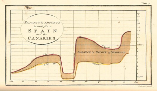
The term “information design” originated in the early 1990’s, however humans have been using visual aids to tell stories for a very long time (think cave paintings, hieroglyphics, etc.). Formal Information Design really hit its stride in the 18th century, with innovators like William Playfair creating some groundbreaking representations of data (http://www.humantific.com/making-sense-of-the-early-sensemakers). Playfair, a Scottish engineer and political economist, invented pie charts, line graphs, and bar charts. And you thought Scotch whisky was Scotland’s greatest invention! All kidding aside, Playfair’s charts were beautiful representations of imports and exports, giving life to previously abstract statistics.Playfair13-525x306

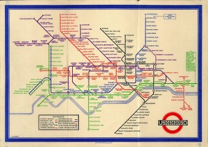
The evolution continued, and fast forward to 20th century: Harry Beck, an English technical draftsman creates the famous London Underground tube map in 1931 (http://britton.disted.camosun.bc.ca/beck_map.jpg).

beck_map

As a map lover, this is truly an iconic work, and set the standard of urban transit maps that we all know today. To me, Beck’s work truly achieves one of the key goals of information design: clearly visualizing something that is difficult to understand. Can you imagine the complexity of an actual map of the London Underground in its correct scale? It would likely look like an angry cluster of snakes. Beck’s map breaks down the complexity into something that even a novice traveller can visually digest over a cup of tea and a scone.

So with a little history under our belt, what are some tips for taking a modern approach to Information Design? Amy Balliett of Smashing Magazine wrote a fantastic article that gives some great examples of do’s and don’ts, that we can all use to approach our next presentation (http://www.smashingmagazine.com/2011/10/14/the-dos-and-donts-of-infographic-design/):

1) Show, don’t tell: Don’t miss an opportunity to visualize data. In other words, avoid putting into text what can better be conveyed with an image, chart, or graph.
2) If the client wanted an excel chart, they wouldn’t need you: This is clearly aimed at professional info designers, but you get the idea. Step your game up, and get creative! If possible, learning some design platform could really differentiate your skills from the rest of the pack.
3) Typography should not be a crutch: avoid leaning too heavily on fancy fonts that distract from the visualized data. I think this is great advice, and reflects back to “show, don’t tell.”

She goes on to make several other good points, but I’ll get right to the good stuff…

4) Tell a story: Funny how it always comes back to a good story. Great info graphics introduce a problem, back it up with data, and finish with a conclusion.

I highly recommend reading Ballet’s entire article, and hopefully it will provide some inspiration next time you attempt to convey a message visually. Now where did I put that Scotch?

Sharing a Helpful Resource

If your job is anything like mine, you use Microsoft Excel and/or PowerPoint on a regular (if not daily) basis. If you use either of these applications in conjunction with each other (which I know all of us have in our prior MP presentations), I have a very helpful resource to share with you.

One of the biggest challenges that I have faced is effectively incorporating data (particularly from Excel) into a concise PowerPoint presentation. Given that Excel and PowerPoint are both made by Microsoft, you would think that using these two applications in conjunction with one another would be fairly seamless and potentially even synergistic (1 + 1 = 3, right?).  However, integrating Excel and PowerPoint is not always straight forward, and conveying key takeaways rather than “data dumping” an entire financial model into your presentation can be a challenge. Additionally, I think that most of us are typically better at one than the other which doesn’t make things any easier.  I certainly have found this to be the case for myself, and while I have a strong background in using Excel, I have a lot of “room to grow” in terms of incorporating financial data from huge bulky models into a clean and concise presentation that conveys the underlying data effectively.

As I have searched for tools, resources, and articles giving guidance on this very topic, I have come across a particularly helpful website that I wanted to share with our class and hope that you will find it to be as useful as I have. This website is called ‘Think Outside the Slide’ and is as close to a “one stop shop” as I have found for guidance on just about everything relating to creating powerful presentations, with literally thousands of articles neatly organized by topic, as well as video tutorials if you’re more of a visual person. If you use Excel or PowerPoint at all, there is likely a specific article with tips and guidance on how to more effectively use the applications in a context relevant to you.

These are just a few that I have begun to frequently reference to give you a snapshot:

  • Using Excel Data in Powerpoint Presentations
  • Slide Design, Creation, and Editing
  • Linking Excel Data (and other content) to PowerPoint so that data in slides automatically updates
  • Tips on effectively cleaning up and animating graphs
  • Creating powerful visuals using Excel Data (waterfall graphs, diverging stacked bar charts, treemap diagrams, proportional shape comparisons, etc…)

For many business professionals, myself included, Excel and PowerPoint are critical tools, and learning to use data effectively in PowerPoint presentations can take time but is versatile skill with application to countless professions that can help to distinguish yourself from your peers/co-workers, and add value to your clients. I hope you find this to be a helpful resource, please feel free to share any other resources that you frequently use and have found helpful in your career. Thanks!

Helpful links referenced in this post:

http://www.thinkoutsidetheslide.com/free-resources/

http://www.thinkoutsidetheslide.com/using-excel-data-in-a-powerpoint-presentation/

http://www.thinkoutsidetheslide.com/articles/

Attention, Cleanup on Slide 6.

Engineers like numbers. Engineers like problems that can be solved with numerical analysis. Engineers like when others agree that their numbers are correct. However, all too often Engineers fail to clearly communicate their ideas, analysis, and solutions in a manner that quickly informs, educates, and persuades their audiences. I would know; I am an Engineer.

Presenters commonly overlook good information design in their presentations. Instead, they focus on providing the maximum amount of information and data in a manner that allows the audience to fully appreciate not only the solution but also the process of the analysis. In their attempt to wow the audience with slides dominated by tables, charts, graphs, best-fit lines, major and minor grid lines and the like, they instead produce confusion and lack of interest. I will be the first to admit that I am guilty of such techniques.

In Edward Tufte’s work on information design, “Visual Display of Quantitative Information” – yes it is indeed as interesting as it sounds – Tufte discusses Data-Ink and Graphical Redesign. In order to achieve maximum impact, Tufte outlines five principles for data graphics that can lead to significant improvements in graphical design: 1) Above all else show the data, 2) Maximize the data-ink ratio, 3) Erase non-data-ink, 4) Erase redundant data-ink, and 5) Revise and edit. To help clarify, Tufte describes data-ink as “the share of the ink on a graphic that presents the data-information”; it is “the non-erasable core of the graphic.” The key and the challenge of this topic is finding simplicity.

Tufte provides a great example of how to erase redundant data-ink within reason. Consider a simple bar chart with a single bar that is shaded and displays the value of the data point at the top of the bar. The height or value of the bar chart in this simple example is identified in six separate ways. Five of those ways can be considered redundant and removed, and the important data will still be present. The six ways include, 1) the height of the left vertical of the bar chart, 2) the height of the right vertical of the bar chart, 3) the height of the shaded region of the bar chart, 4) the vertical position of the horizontal top of the bar chart, 5) the vertical position of the value on top of the bar chart, and 6) the numeric value itself. Removing redundant information creates clearer presentation and more effective communication of a presenter’s ideas.

For most, this is likely not the most exciting of topics. However, for someone who works heavily in numerical analysis and who must convey outcomes to audiences of varying backgrounds, these suggestions on good information design are priceless. Does anyone else struggle in the area of good information design? Have you ever been complimented on your information design? Any other suggestions of how someone can improve their ability to display quantitative information?


Tufte, Edward R. “Data-Ink and Graphical Redesign.” The Visual Display of Quantitative Information. Second ed. Cheshire, CT: Graphics LLC, 2006. N. pag. Print.

Storytelling for the number cruncher

As someone who works in Excel everyday and prides myself on an ability to crunch any numbers or run any analysis, creating a “story” and selling that to an audience doesn’t come naturally. For me, I’d rather use a line graph or bar chart and let that do the convincing. But if Brandon Smith taught me anything, it’s that using a story works for persuasion.

So I came across an article written a few months ago in HBR by Harrison Monarth (author of The Confident Speaker and Breakthrough Communication) where he writes about the power of storytelling as a strategic business tool. An example he uses to illustrate the power of storytelling is from the latest Super Bowl commercials for Budweiser. In one advertising study looking at the effectiveness of ads based on content or structure, a researcher at Johns Hopkins noted “regardless of the content of the ad, the structure of that content predicted its success.” So I’m thinking: it’s not what you say, but how you say it? Monarth concludes by writing “A story can go where quantitative analysis is denied admission: our hearts. Data can persuade people, but it doesn’t inspire them to act; to do that, you need to wrap your vision in a story that fires the imagination and stirs the soul.”

Working in the healthcare industry, I found it particularly interesting when Monarth notes an example of how patients change their behavior for the better based on stories their physicians tell them, rather than presenting the data.

Does anyone have specific examples of storytelling in a presentation to actually change behavior or implement a proposal? I’d love to use these tactics, but am still a little skeptical my company’s executives could be moved to action by a story vs. data. What works in your industry?