One of the skills that I chose to work on this semester was improving my presentation skills and slide design. In the past, I have been guilty of using the standard slide template, including too much text and underutilizing images. Over the course of the semester, I have been tasked with giving two presentations at work and have found ways to visually enhance my slides that have resulted in more effective presentations.
I recently came across an article on the TEDBlog that was written by Aaron Weyenberg, a UX Lead at Ted, and internally referred to as the master of slide decks. Below are 10 tips on how to make effective slides that he identified, however I have highlighted 2 tips that I found the most insightful and provided excerpts from the article.
- Think about your slides last.
- Create a consistent look and feel.
- Think about topic transitions.
- With text, less is almost always more.
- Use photos that enhance meaning.
-
I love using simple, punchy photos in presentations, because they help what you’re saying resonate in your audience’s mind without pulling their attention from your spoken words. Look for photos that (1) speak strongly to the concept you’re talking about and (2) aren’t compositionally complex. Your photo could be a metaphor or something more literal, but it should be clear why the audience is looking at it, and why it’s paired with what you’re saying. Below is an example of a photo I used in a deck to talk about the launch of the new TED.com. The point I was making was that a launch isn’t the end of a project—it’s the beginning of something new.

- I found this tip to be eye-opening for me because I tend to be more literal in my presentations, so it was interesting to see how Aaron Weyenberg uses images to represent more tactical elements. For example, I am currently working on a deck outlining the new features of the upcoming relaunch of CNN.com, and instead of opening the presentation with an image from the new site, I’m planning on using a photo that represents the essence of the redesign and the impact it will have on the user.
6. Go easy on the effects and transitions.
7. Use masking to direct attention in images.
If you want to point something out in a photo, you could use a big arrow. Or you could do what I call a dupe-and-mask. I do this a lot when showing new page designs, particularly when I don’t want the audience to see the whole design until I’m finished talking about individual components of it. Here’s the original image:
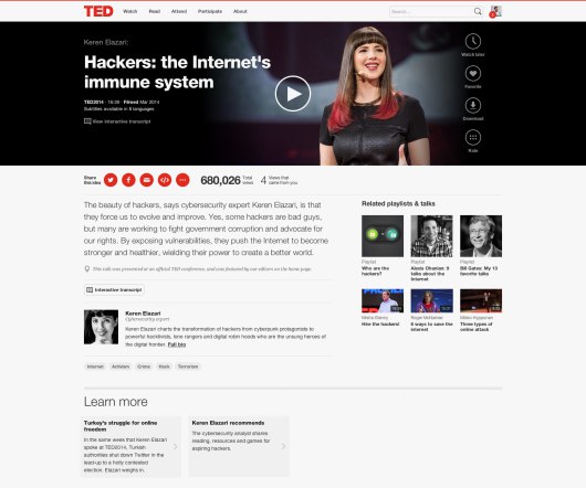
Here’s the process for masking it. (1) Set the image transparency to something less than 100. (2) Duplicate that image so there is one directly over the top of the other. (3) Set the dup’d image transparency back to 100. and (4) Follow the technique here to mask the dup’d image. You’ll end up with something that looks like this:

- I am often faced with this problem since my work is primarily focused on CNN.com, so many of my presentations include screenshots of our website. The tip above is a really great way to still show the site, but hone in on an area in a very interesting way.
8. Try panning large images.
9. For video, don’t use autoplay.
10. Reproduce simple charts and graphs.
Here’s the link to the full article where you can get the details on each tip.
Thanks for sharing the tip on masking. I never really knew how to obtain that effect.